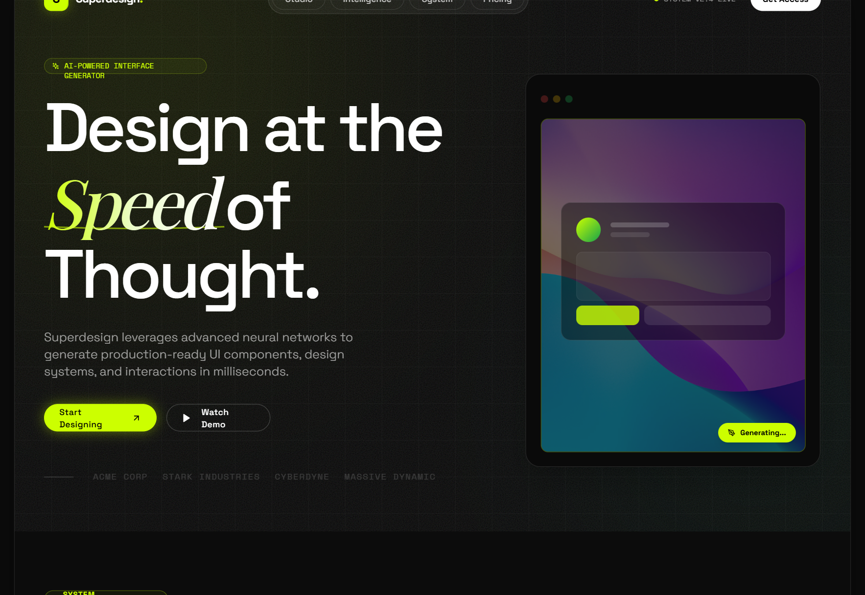
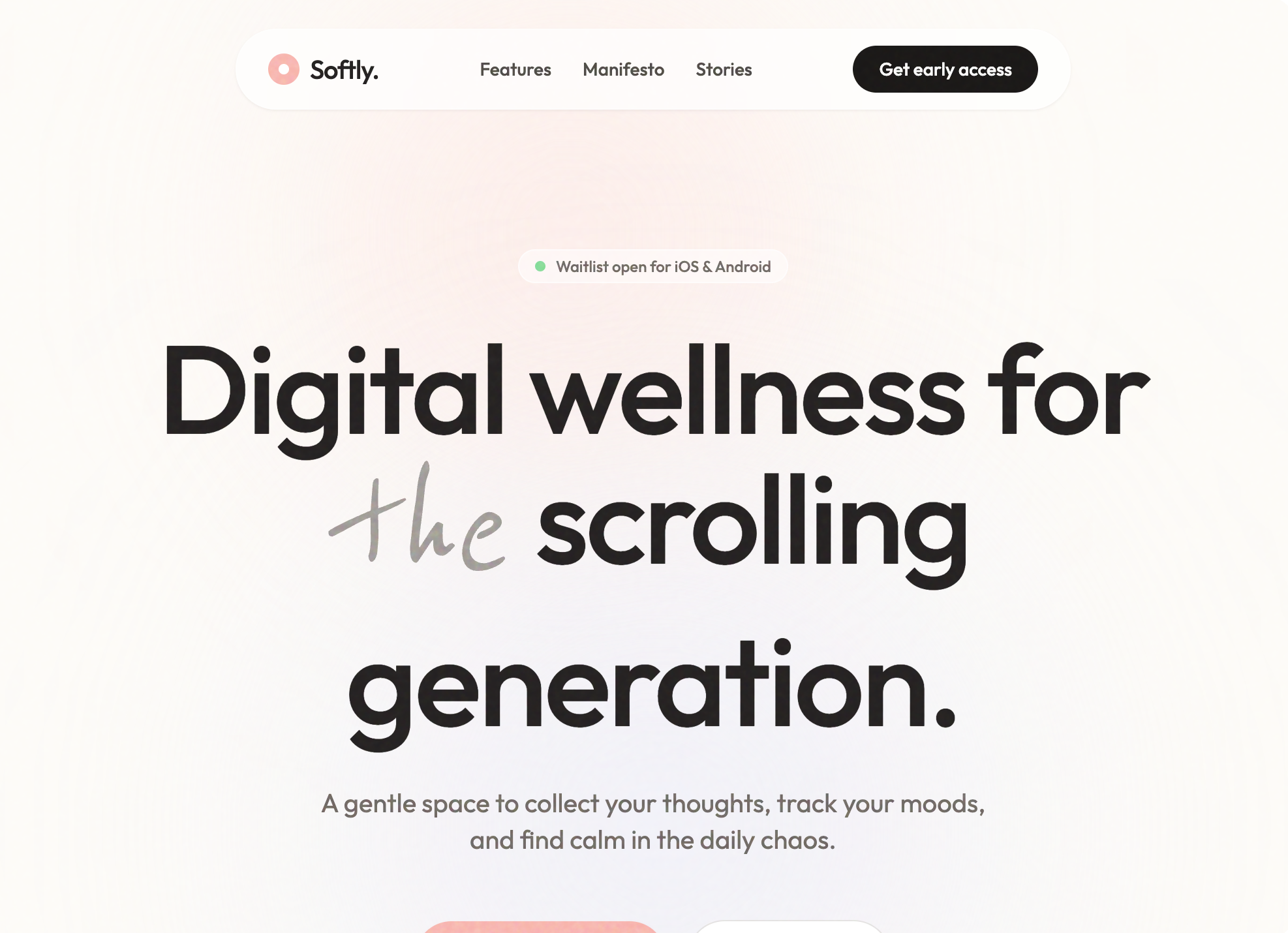
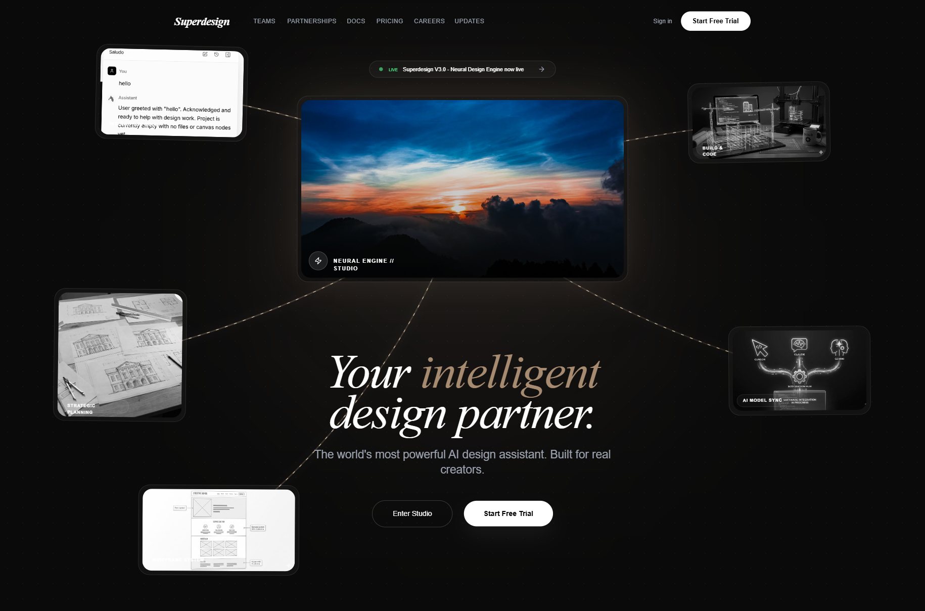
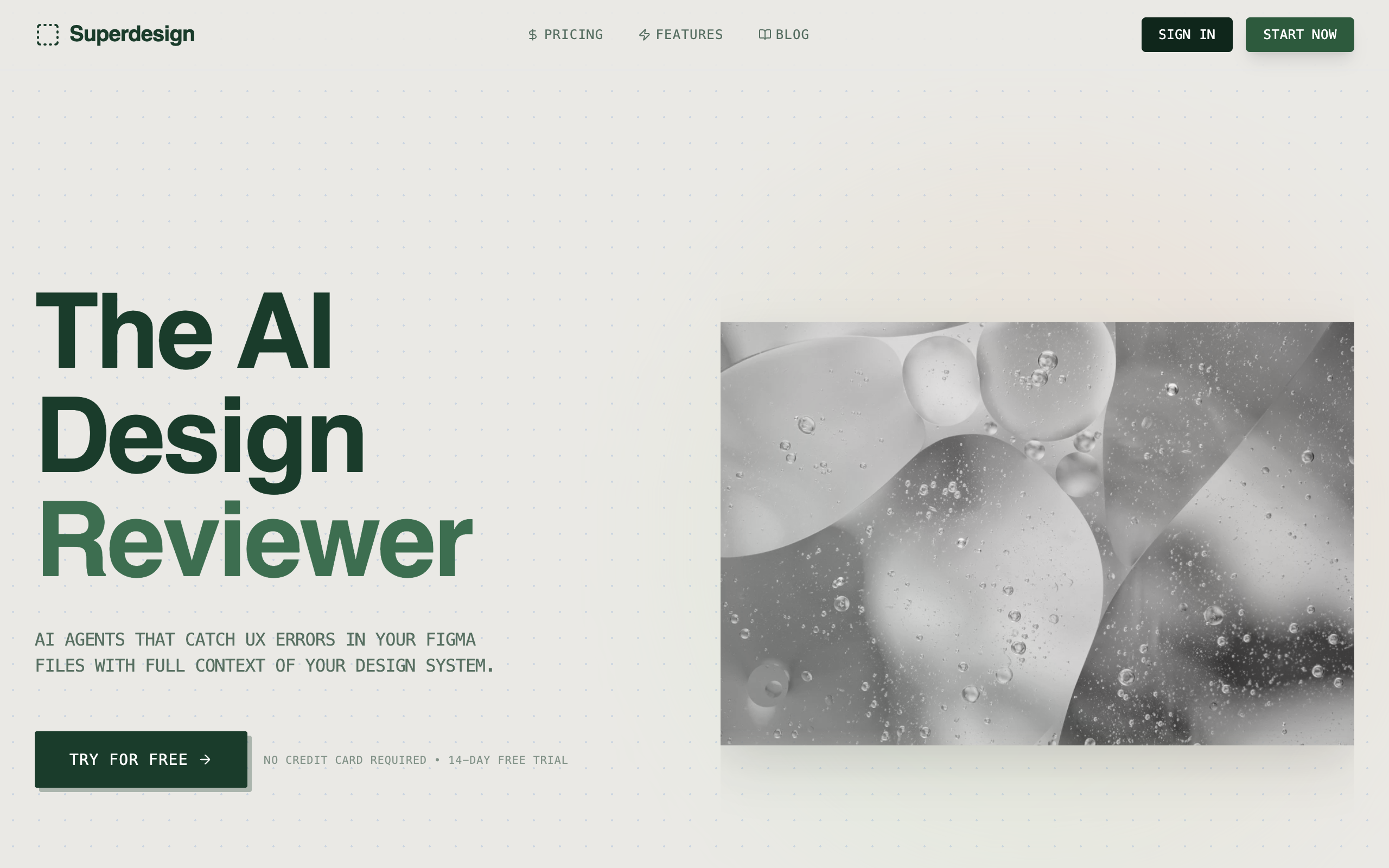
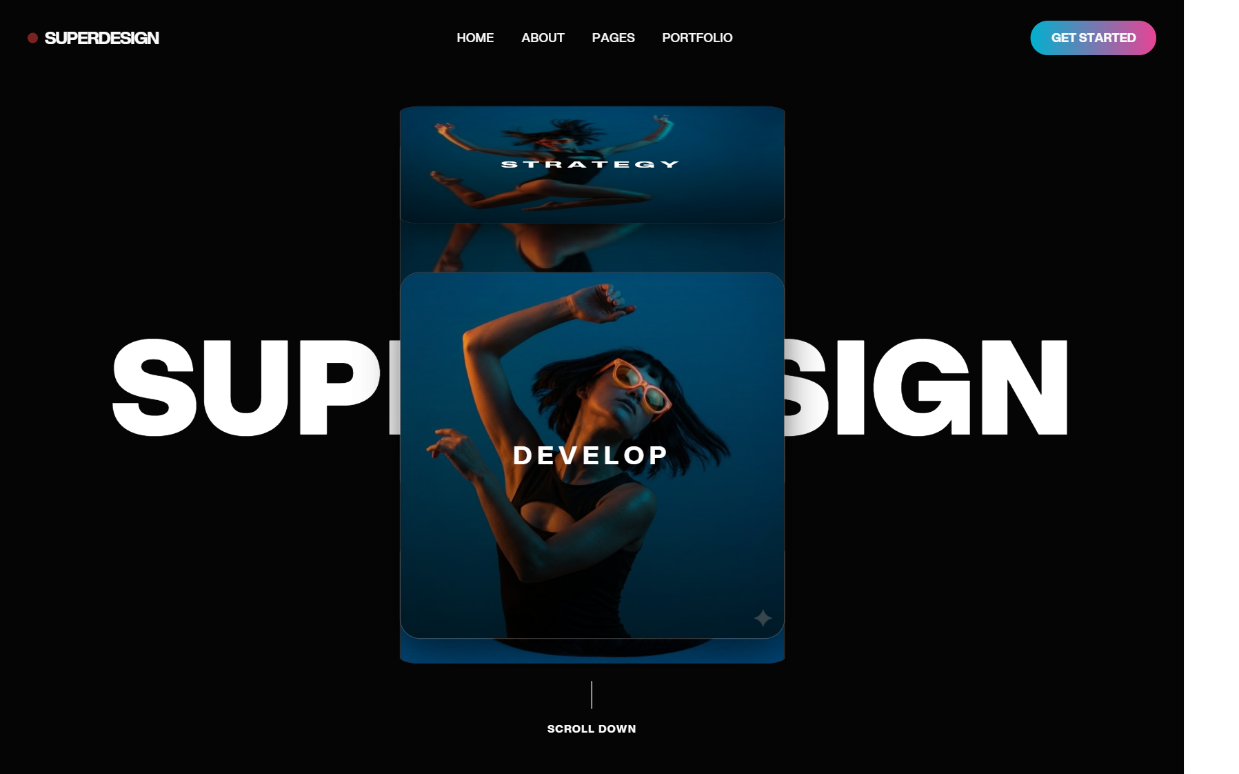
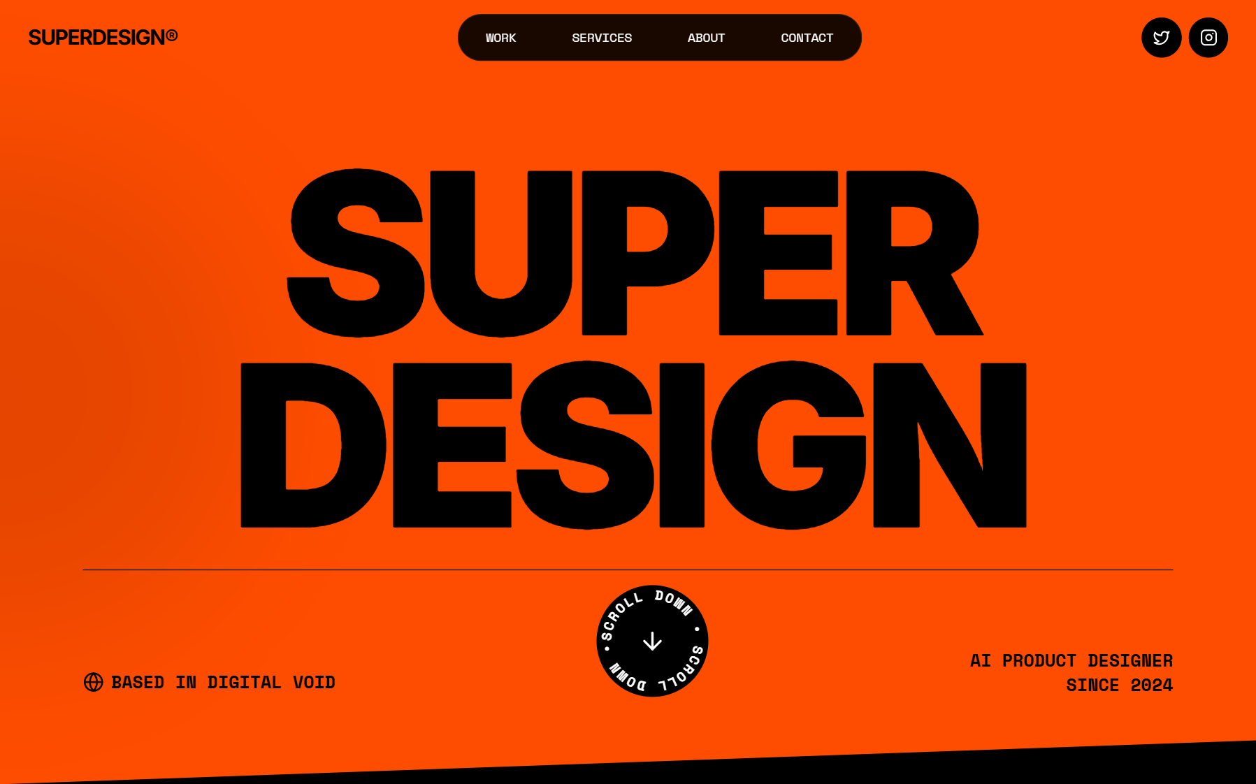
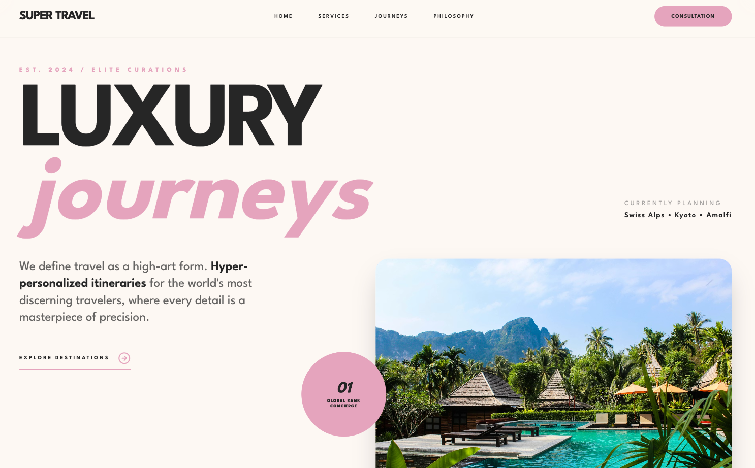
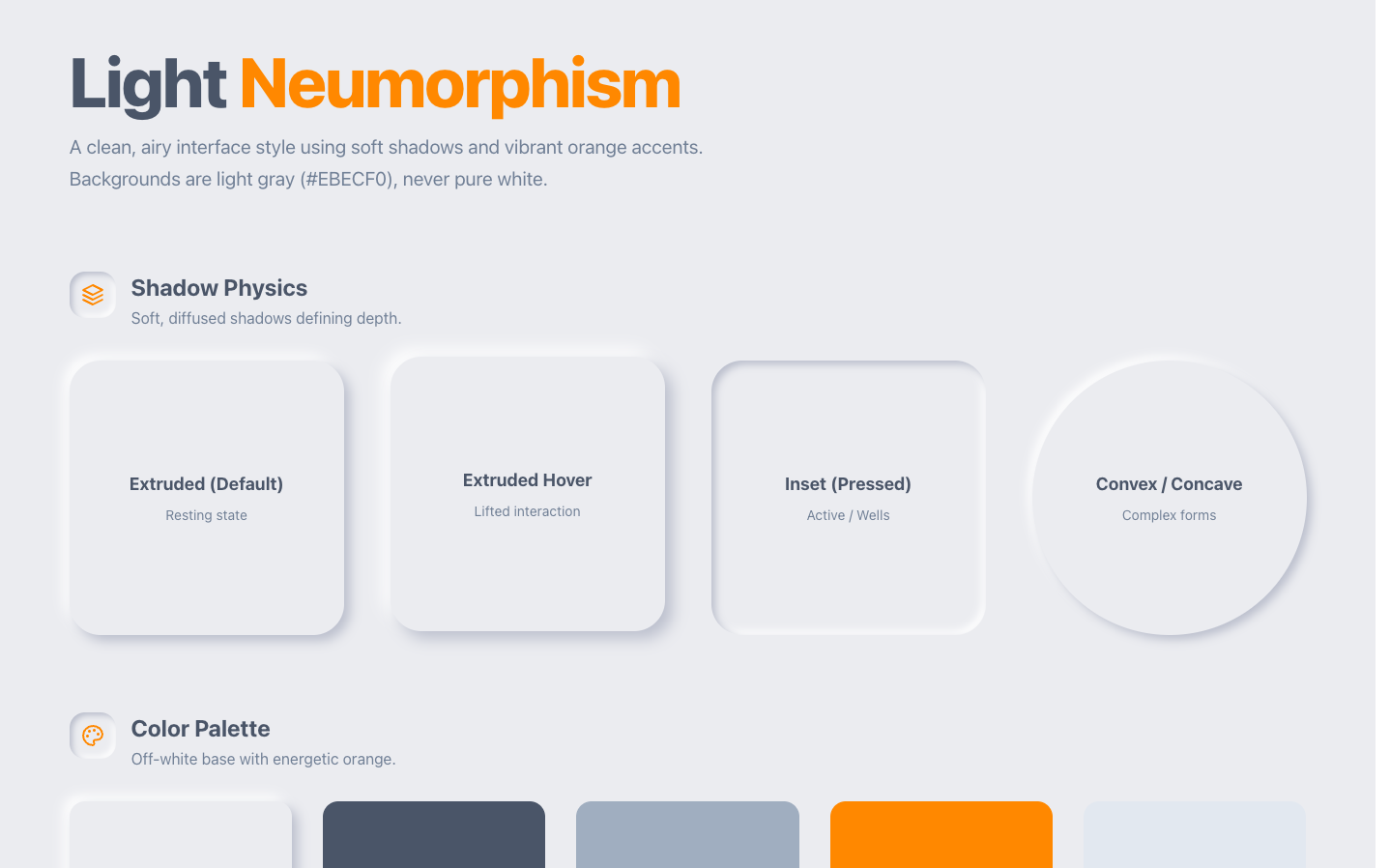
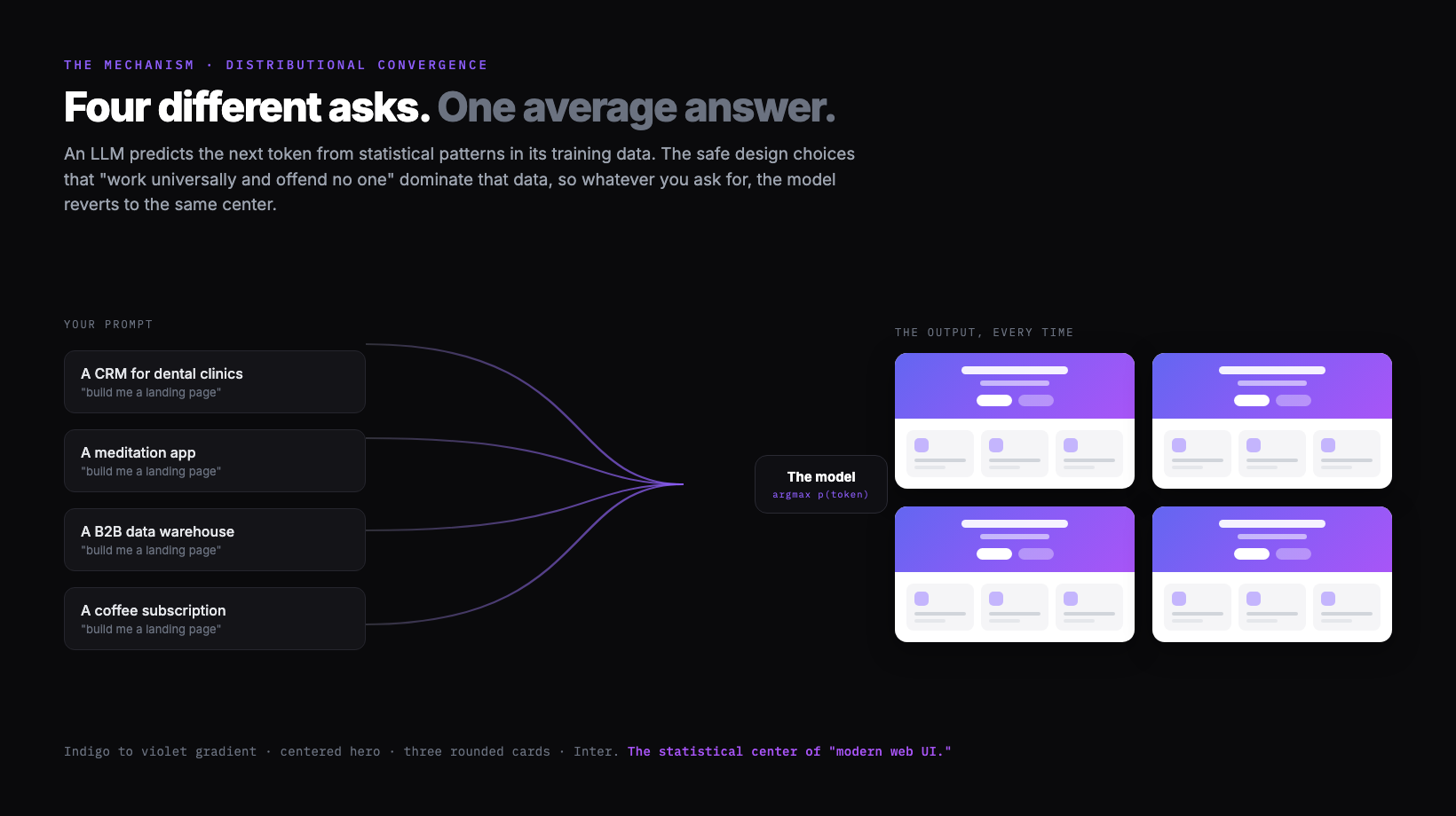
AI-generated UI looks generic for one structural reason, and I gave it a name: distributional convergence. A large language model predicts its next token from statistical patterns in training data, so the safe design choices that work universally and offend no one dominate that data, and the model reverts to them. Point ten completely different products at the same one-line ask and you get the same answer back: Inter, a purple gradient, a centered hero, three rounded cards. That average has a name now too: AI slop. This post is the honest version of why it happens, at two levels. The model reverts to the center, and the coding agent on top of it narrows the output further to whatever is easiest to build. The fixes are a separate job, and they live on their own page, linked at the end.
Part of the design agent vs coding agent series: this page is the why (the mechanism); the how-to make AI UI look less generic page is the fix.

Why AI design looks generic
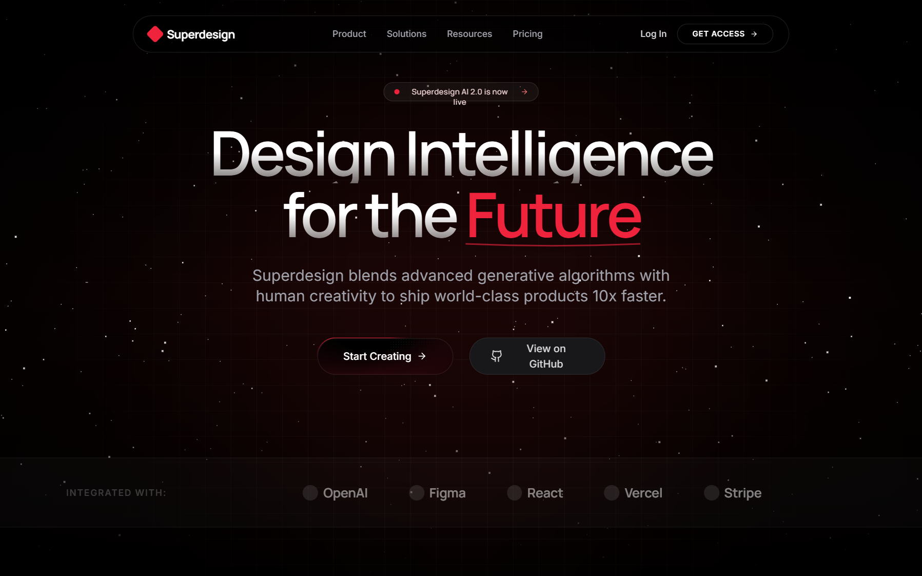
AI design looks generic because the model defaults to the statistical center of its training data, and the center of "modern web UI" is a very specific, very repeated look. Different products, the same vague prompt, and the same output every time. The community has even converged on a shared vocabulary for it: Inter or Roboto type, a purple-to-indigo gradient, a centered hero with one CTA, and a row of three rounded cards with little icons.
You do not have to take my word for the pattern, because people have catalogued it precisely. The blog post Why Your AI Keeps Building the Same Purple Gradient Website lists the hallmarks exactly:
The AI slop starter pack
- ✕Inter or Roboto font (never anything with personality)
- ✕Purple/indigo accent colors
- ✕Hero section with centered text and a CTA button
- ✕Three features in boxes below, each with an icon
- ✕White or light gray background
- ✕Rounded corners on everything
- ✕Subtle shadows (exactly 0.1 opacity)
Verbatim from prg.sh
It is not your imagination, and it is measurable. A teardown by Developers Digest, AI Design Slop: patterns that out your app as vibe-coded, audited a large batch of Show HN launches and found that more than half carried the same fingerprint: Inter everywhere, a lavender accent, glassmorphism, the badge-above-the-headline, the colored left-border card, the numbered 1-2-3 steps. When most new products share a tell that obvious, the cause is not a thousand bad taste calls. It is one shared default.
What is distributional convergence
Distributional convergence is the mechanism behind the sameness: because a language model predicts the next token from statistical patterns, the highest-probability answer to an open design question is the most common one in its training data, so the model keeps reverting to it. I coined the term to explain exactly why default AI design is generic, and I said it plainly in a Gemini 3 walkthrough: large language models "predict tokens based on statistical patterns in training data," and "safe design choices that work universally and offend no one just dominate web training data."
The important part is what the model does when it has to resolve ambiguity. In my words, its default behavior "will just revert back to something that's easier and common to implement." That is the whole problem in one sentence. A creative, considered layout is rare in the training data and harder to commit to, so a single open prompt lands on the safe, common version instead. It is not that the model cannot produce something better. I demonstrate that it can. It is that, with no direction, the most probable output is the average, and the average is the slop.
This is why the fix is never a cleverer one-shot prompt. If the cause is the model collapsing toward the center of a distribution, the cure is to change what it is reverting to: give it a deliberate direction, plan the creative work separately from the build, and feed it real references so the "most probable" answer is no longer the generic one.
Why purple and Inter win
Purple and Inter win because they are the literal statistical center of "nice modern web UI," so they are the highest-probability answer when the prompt leaves the choice open. The purple has a traceable origin. As the purple gradient writeup explains, Tailwind CSS shipped bg-indigo-500 as a prominent default in its examples years ago, that indigo saturated tutorials, landing pages, and component demos, and a model trained on all of it now associates "nice modern button" with that exact hue. Inter wins the same way: it is the most common safe sans on the web, so it is the highest-probability answer to "pick a font."
Here is the slop palette as actual values, so you can recognize it on sight (and so you know what to steer away from):
These are stock Tailwind values, not a real brand. They are the statistical center of AI UI output, shown here so you can spot the default and choose against it.
None of these colors is bad on its own. The problem is that they are nobody's deliberate choice. They are what you get when the question is open and the model picks the most likely answer. A real brand chooses a color because of what it means. An average chooses a color because it appears most often.
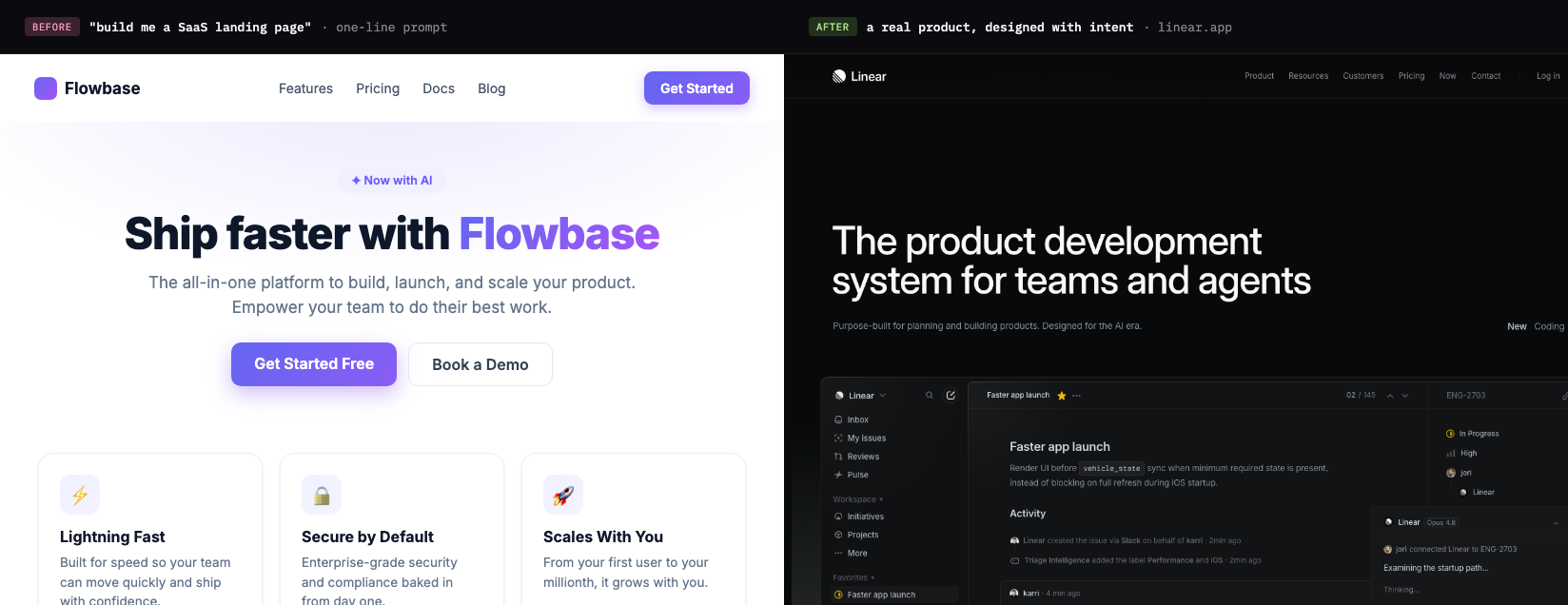
Coding agents make it worse
A coding agent narrows the output even further, because on top of the model reverting to the center, the agent only commits to what is easy to implement right away. I call this out directly in my Nano Banana plus Gemini 3 video: the genuinely interesting directions, "those kind of tilt UI," glass surfaces, and 3D objects, are the ones a coding agent "try not to do because it's not like that easy to implement right away." So even when a stronger look is reachable, the agent rounds it off to a safe, buildable layout.
His blunt version is worth keeping in your head the next time you re-prompt a coding agent and the result stays flat:
"There's no amount of prompt you can give a coding agent and expect it to just design something like this out of box."
That is the design agent versus coding agent split. A coding agent optimizes for "does it run," so it reaches for the standard layout it can ship fastest, which is why parallel coding agents and one-shot builds keep returning the same safe shapes. A design agent optimizes for "is it considered," which means exploring divergent directions before any code is committed, the way a designer forks variations in Figma. We unpack that whole argument in design agent vs coding agent; the short version is that the tool you use to think about the look should not be the tool optimizing to get it built.
Google's own stack now makes the same move, which is the strongest version of this point. The image model I demo in that video has since shipped as Nano Banana Pro (Gemini 3 Pro Image), Google's current model for generating designed visuals with reliable, readable text. And inside Google Antigravity, Google's agentic dev platform, the coding agents themselves now reach for it: per Google, "coding agents can now directly leverage these image generation capabilities to generate detailed UI mockups for user review or even new visual assets before implementing in code." When even Google's coding agent offloads the visual exploration to an image model, the split is not a Superdesign talking point. It is how the most capable teams already work.
If you are going to explore a look with an image model, here is a quick which-for-what. None of these writes your final UI; they are for the divergent, considered directions a coding agent rounds off, and you still hand the winner to your build step as a spec.
| Image model | Reach for it when |
|---|---|
| Nano Banana Pro (Gemini 3 Pro Image) | Creative directions that need reliable, legible text in the image |
| FLUX.2 | All-around product mockups, with multi-reference style and character consistency |
| Ideogram | Text-heavy work: signage, labels, packaging, typographic UI |
| Imagen 4 Ultra | The most photorealistic, high-fidelity output (native 2K) |
| Recraft | A mockup-focused workflow: place your art on real products and surfaces |
Earlier tools opened this up, and you will still see Midjourney and DALL-E recommended for general image generation, but they trail the newer models on the two things that matter for UI: readable text and faithful layout. Pick the model for the job, then bring the direction back into your build.
One prompt, three jobs
The human side of the problem is that most AI UI workflows collapse three distinct jobs into one prompt, which maximizes exactly the ambiguity the model resolves toward the center. When you say "build me a landing page," that single breath has to set the taste, explore the options, and write the final spec, and each of those needs a different kind of input.
| The job | The question it answers | What it actually needs |
|---|---|---|
| Taste direction | What should this feel like? | A point of view, references, constraints. Not a text adjective. |
| Visual exploration | What are the options? | Many distinct directions to compare, cheaply. |
| Implementation spec | What exactly do we build? | Concrete tokens, structure, components. A durable artifact. |
A human design process keeps these as separate steps on purpose. You gather references and set a direction, you sketch several options and pick one, then you write the spec and build it. Compress all three into one prompt and you hand the model maximum freedom at the exact moment it reverts to the average. The safest single output that satisfies all three jobs at once is, by definition, the center of the distribution. That is the slop, and it is a workflow problem layered on top of the model's default, not a model-capability gap.
Tip
A better prompt only goes so far
A sharper prompt helps, but it hits a ceiling fast, because it moves you off the exact center without changing what the model reverts to. The standard fix list is real and worth doing: name a specific font, give exact hex values, paste a reference, ask for a particular vibe. That nudges you away from the absolute average. But you can feel the ceiling the moment you start replying to the output with "hmm, make it cleaner," "more premium," "less slop." That sentence is the tell. You are no longer designing. You are negotiating with vibes, and vibes do not converge.
The popular counter-move is to go the other direction and write one giant binding spec up front. It helps, and a real design system absolutely helps, but a single mega-spec mostly relocates the problem. You still cannot write taste down in prose well enough to skip seeing it, so the "make it more premium" negotiation just moves upstream into the spec document. The issue was never too little instruction. It is that the model reverts to the center whenever a step is left open, and one fused prompt leaves all three steps open at once.
Why "make it a Qt app" works
Naming a strong, well-defined design language works because it collapses the model's options down to one coherent direction, which is just distributional convergence used on purpose. This is the trick from a Hacker News thread that hit 218 points and 134 comments: the linked post, "Slightly reducing the sloppiness of AI generated front end," found that one small instruction did most of the work. In the author's words:
"Simply asking it to make it look like a Qt app, to my tasteless eyes, removed almost all feeling of slop."
The top explanation in the thread, from commenter AmareshHebbar, nails the mechanism:
"This makes perfect sense. Qt has very clear and strict design rules. Standard web design has too many options. When the AI has too many options, it just guesses and makes a mess. Forcing a desktop style fixes that"
That is the whole thing in three sentences. "Standard web design has too many options," so the model guesses, so you get the average. Pin it to a language with strict rules and the guessing stops, because you have shifted the center it converges toward. It is a great hack, but notice what it really is: a one-word taste direction smuggled into a single prompt. It works only for looks that happen to be dense in the training data, it gives you no exploration, and it leaves you no reusable spec. It is a patch on the symptom. The cure is to make taste its own step instead of hoping a magic word supplies it.
The sameness problem
The deeper worry is fair: if everyone prompts the same models with the same vague asks, the web flattens toward one house style. This is not a niche gripe. A r/vibecoding thread titled "Let's be honest, AI UI all looks the same" drew 426 upvotes and more than 200 comments of builders describing the exact same fingerprint. A second Hacker News thread, Is AI causing a repeat of frontend's lost decade? (407 points, 334 comments, on Mauro Bieg's essay), is all about this anxiety: a quality collapse and a sameness, what people half-jokingly call the shadcn-ification of the web. One commenter put the quality side bluntly:
"Low accessibility, terrible performance, lack of any fundamentals of html and css, abuse of those awful solutions like Tailwind or using 2016 technologies like React for rendering what should mostly be static websites + some web component, all plagued by memory leaks and very basic usability bugs."
The essay frames it as deskilling, the same arc other crafts went through: a skilled job "being eliminated by the introduction of technologies, operated by semi- or unskilled workers." It is a real risk. But convergence is not destiny, it is a default. The web flattens only if we keep handing the model under-specified prompts and shipping its first guess. The way out is to put taste and exploration back into the loop as real steps, so the output reflects a point of view instead of the median of everyone else's.
How to get out of it
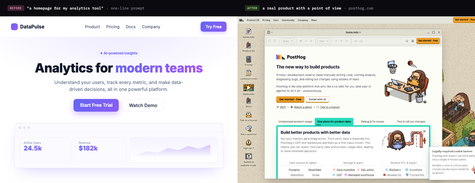
The escape from distributional convergence is process, not a better adjective: set a deliberate direction, explore several distinct options and compare them before any code exists, then pin the winner in a reusable spec the build follows. Each step gives the model something to anchor on, so the "most probable" output stops being the generic one. The practical, step-by-step version of that lives in its own guide, how to make AI UI look less generic, so this page can stay focused on the why.
Superdesign is built around that escape, because the anti-slop answer is structural. It is an AI design agent on an infinite canvas that feeds real references in before generating (you can browse the same patterns in our free prompt library), forks several distinct directions at once so you choose from options instead of nudging one thread, and captures your real design system as a file before it outputs React and Tailwind. You can drive it from your coding agent, so design happens with full context of your codebase and the handoff does not break, or from ChatGPT directly via the ChatGPT design plugin.
Generic was never the model's fault. It is what a probability machine does when you ask it to be a taste director, an explorer, and an engineer all at once, then ship its first guess. Give each of those jobs its own step and the model executes a decision you made instead of averaging the ones you skipped. Go deeper in the best AI UI generator guide or see the workflow framing in what is vibe design.