AI UI comes out generic for one reason: you gave the model a label, not a brief. "Build a clean, modern dashboard" is a label, so the model returns the average of everything it has seen with that label, which is the purple gradient, the centered hero, and the three icon cards. The fix is not a longer prompt, it is a better-shaped one: wrap the request in a small context block, then segment by the tool you are actually using, because a prompt that sings in one tool is mediocre in another. Yes, half of design Twitter is "I'm over AI" right now, and the generic output is why. These 11 prompts are the antidote: copy-paste, constraint-rich, and grouped by where they run.
Steal them as-is or swap the brackets for your product. Every one is useful even if you never touch Superdesign.
Paste this context block first
The single biggest quality lift is not a clever prompt, it is the context you paste before it. Most prompts fail because they hand the model a label and let it guess your stack, your tokens, and what "good" means to you. A reusable preamble removes all three guesses at once. VP0 frames it well as four parts: Target (what good looks like), Conventions (your stack and tokens), Constraints (the rules), and Scope (this task only). Paste this once, then every prompt below inherits it.
# Context block: paste before any UI prompt.

TARGET (what good looks like)
- Match the feel of [Linear / Stripe / my app], not a generic SaaS template.
- One named aesthetic: [calm and technical / editorial / brutalist]. Never "clean and modern".

CONVENTIONS (my stack and tokens)
- Stack: React, TypeScript, Tailwind, [shadcn/ui].
- Use my design tokens. Never hard-code hex or px: use bg, surface, text, border, accent, and the spacing scale.
- Reuse my existing components. Do not invent new ones for things I already have.

CONSTRAINTS (the rules)
- 8px spacing grid. One accent color, used sparingly. AA contrast on all text.
- Every interactive element gets hover, focus-visible, and disabled.
- Ship the empty, loading, and error states, not just the happy path.

SCOPE (this task only)
- Build only [the one screen or component]. Do not redesign anything else.
- Output real React and Tailwind, responsive. No lorem ipsum in shipped copy.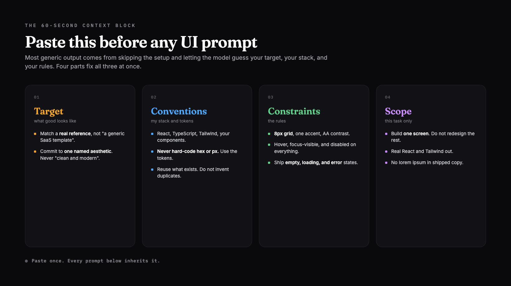
This is exactly what a good prompt library buys you: every item in the free Superdesign prompt library ships with this kind of context already wrapped around it, so you copy a working prompt instead of rebuilding the preamble each time.
5 foundation prompts (work in any tool)
These five run anywhere: ChatGPT, Claude, v0, a coding agent. Each is a constraint stack, and each comes with the vague version it replaces, so you can see why specificity wins.
1. The component brief
Name the behavior, the states, and the props, not a vibe. A component is the smallest unit where "make it nice" reliably produces the average, because the model has to guess the recommended-state treatment, the disabled look, and the edge cases all at once.
Design a [pricing card] component.
Behavior: shows tier name, price, period, 4 to 6 features, and one CTA. The CTA is primary on the recommended tier only.
States: default, hover, focus-visible, disabled, and a "recommended" variant.
Props: tierName, price, period, features[], ctaLabel, recommended (boolean).
Visual intent: calm and confident. One accent on the CTA only, tabular numerals on the price.
Output: one React and Tailwind component using my tokens.
Vague: "make a nice pricing card." The model guesses the recommended treatment and you get the lifted purple "most popular" card every time. Better: the block above names the variant, the states, and the props, so there is nothing left to guess.
2. The screenshot-to-UI prompt
Paste a picture, not paragraphs of adjectives. A reference image is the densest brief you can give, and it is the most underused input mode. You are not asking the model to copy a brand, you are anchoring spacing, type pairing, and density to something real.
Here is a screenshot of a UI I like: [attach image].
Rebuild this layout and visual language as a [settings page] for my product.
Match: the spacing rhythm, the type pairings, the density, and the border and shadow treatment.
Change: the content to [my domain], and use my accent [#hex] instead of theirs.
Do not copy their brand, logo, or copy. Keep my tokens.
Output: responsive React and Tailwind.
Vague: "make it look premium." Premium is not measurable, so the model picks the safe average. Better: a pasted reference plus "match the spacing and type, change the content" gives it a target it can actually hit. This is the prompt most people forget they can write.
3. The design-system context file
Stop the drift across screens by writing the rules down once. Without a persistent file, an agent re-guesses your fonts, colors, and spacing on every prompt, and screen three no longer matches screen one. Make it audit your repo and write the system down, then build against it.
Audit my codebase and write a DESIGN.md that captures my real design system:
color tokens, type scale, spacing scale, radius, shadow, and the components that already exist.
From now on, generate every screen against DESIGN.md so the UI stays consistent.
If something is missing from DESIGN.md, ask me before inventing it.
Vague: "keep it consistent." Consistent with what? Better: a written DESIGN.md is a thing the model can re-read, so consistency is enforced, not hoped for. More on the artifact itself in what is DESIGN.md.
4. States and accessibility add-on
Append this to any prompt above, because states are the work everyone skips and users hit first. The consensus list of what AI silently drops is short and predictable: the empty, loading, and error states, the focus ring, the touch target. Agents nail the typography and miss the focus-visible ring the user reaches for first.
Add to the spec for everything above:
States: empty, loading (skeletons), error, and a "too much data" overflow case.
Interaction: hover, focus-visible rings, disabled, and active.
Accessibility: WCAG AA contrast, 44px minimum touch targets, labels tied to inputs, aria roles on dialogs.
Motion: respect prefers-reduced-motion. No meaning carried by animation alone.
Vague: "make it accessible." Nice words, no checklist. Better: the explicit state and a11y list is the difference between a happy-path mockup and something shippable. The empty state especially is worth designing on purpose, not defaulting to the same prompt-box blank screen every AI product now ships, a pattern Adi Leviim calls the death of the empty state.
5. The anti-generic "give it taste" prompt
Name a real aesthetic, never an adjective. As Nick Babich put it after stress-testing 180-plus prompts, AI is great at structure but terrible at taste, so you have to supply the taste yourself. The trick is to make the model commit to one specific direction before it writes a line of code.
Before you write any code, commit to ONE specific aesthetic and describe it back to me in 3 lines:
the reference (a real product or era, e.g. "Things 3", "Bloomberg terminal", "Swiss editorial"),
the type personality, and the one rule that makes it distinctive.
Then design [the screen] in that direction.
Banned: Inter as the only font, purple-to-indigo gradients, a centered hero with three icon cards, glassmorphism.
Vague: "clean and modern." GenDesigns calls this the most useless descriptor you can give an AI: it is the oatmeal of prompts, beige and shapeless. Better: "Bloomberg terminal density" or "Swiss editorial" is a direction the model can resolve to one coherent look. We go deep on this in why AI design looks generic.
4 tool-specific prompts (same job, different dialect)
Here is the part most prompt lists miss: one universal prompt does not exist. As Mantlr argues in its 2026 prompt-engineering guide, a prompt that works beautifully in one tool produces mediocre output in another, because each tool wants a different dialect. The 2026 field is wider than v0 and Lovable too: Google Stitch, Figma Make, and Google's Antigravity all want image-first or product-first input. Match the prompt to the tool.
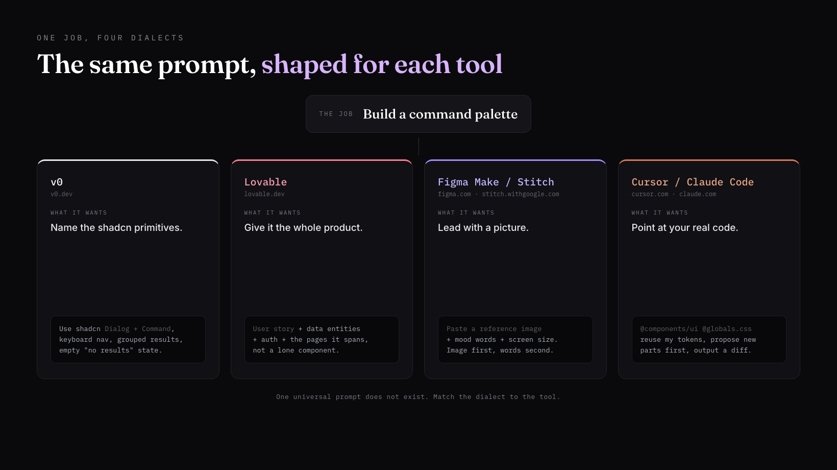
6. v0: component-level specificity
v0 is strongest one component at a time, and it speaks shadcn and Tailwind natively, so name the primitives. The more specific the component contract, the better v0 does.
Build a [command palette] component.
Use shadcn/ui primitives (Dialog, Command) and Tailwind. TypeScript.
Specifics: keyboard nav (arrow keys, enter, escape), grouped results with section labels,
a recent-items group, fuzzy-match highlighting, and an empty "no results" state.
Match my tokens (pasted below). One accent on the selected row only.
7. Lovable: the full product brief
Lovable wants a product, not a part. Give it the user story, the data entities, and the auth model, and it will scaffold the whole app coherently. Hand it a lone component prompt and you underuse it.
Build a [team feedback] web app.
User story: a manager signs in, creates a survey, shares a link, and views responses on a dashboard.
Data: User, Survey, Question, Response, with fields [list them].
Auth: email and Google. Roles: admin, member.
Pages: dashboard, survey builder, public response form, results.
Design: one accent, 8px grid, real empty and loading states on every page. Not a generic template.
8. Figma Make and image-first tools: lead with a reference
Figma Make and Google Stitch do the most with a pasted picture plus a few mood words. Lead with the image, set the hierarchy and mood in words, and pin the screen dimensions.
[Attach a reference image.]
Generate a [mobile onboarding flow, 3 screens] in the visual language of this reference.
Mood: warm, friendly, high-contrast. Hierarchy: one clear primary action per screen.
Screen size: 390px wide. Keep the type and spacing rhythm from the reference, change the content to [my app].
9. Cursor and Claude Code: reference files and tokens
In your editor, the leverage is not adjectives, it is file and token references. Cursor and Claude Code can see your real system, so point them at it with @-mentions and forbid improvising new styles.
Read @components/ui and @app/globals.css to learn my tokens and existing components.
Then build [a billing settings panel] using ONLY my existing components and tokens.
Reference @app/(dashboard)/settings/page.tsx for layout conventions.
If you need a component that does not exist, propose it first. Do not improvise a new style.
Output the diff.
For more on driving design from your editor specifically, see how to design good UI with Claude Code.
2 prompts for iterating and shipping
Generation is the easy 20 percent. The work is in the refine loop and the final review, and those need their own prompts.
10. The 3-pass iteration prompt
Do not re-roll from scratch, because re-rolling throws away the parts that were already right. Refine specific elements in passes instead, and make the model show its work between each one.
Do not regenerate from scratch. Iterate on the current design in 3 passes:
Pass 1 (layout): fix only spacing, alignment, and hierarchy. List what you changed.
Pass 2 (visual): fix type, color, and borders to match [reference]. One accent only.
Pass 3 (states and a11y): add hover, focus-visible, empty, loading, error, and AA contrast.
After each pass, stop and show me the diff before continuing.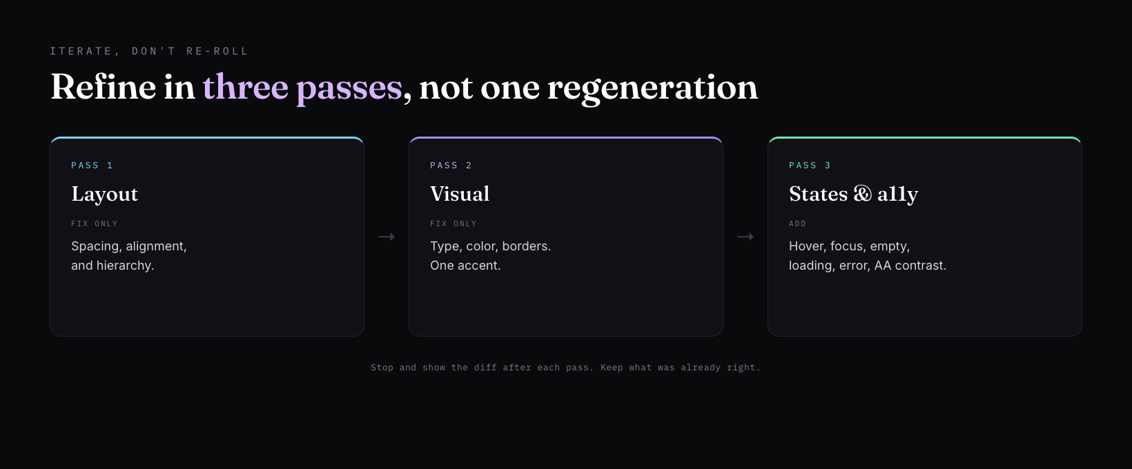
11. The review and critique prompt
Run a design review before you ship. A generation pass misses things a review pass catches, especially the Frankenstein layout. NN/g uses exactly that term for what vague prompts produce: a Frankenstein layout, parts stitched together that do not belong to one system.
Critique this UI like a senior designer before I ship. Check for:
- Frankenstein layout: mismatched components or spacing that do not belong to one system.
- Missing focus-visible rings and broken tab order.
- Touch targets under 44px.
- Lorem ipsum or placeholder copy left in production.
- Missing empty, loading, or error states.
- More than one accent color, or a purple-to-indigo gradient.
List every issue with the element and a one-line fix. Do not rewrite the code yet.
The fastest path
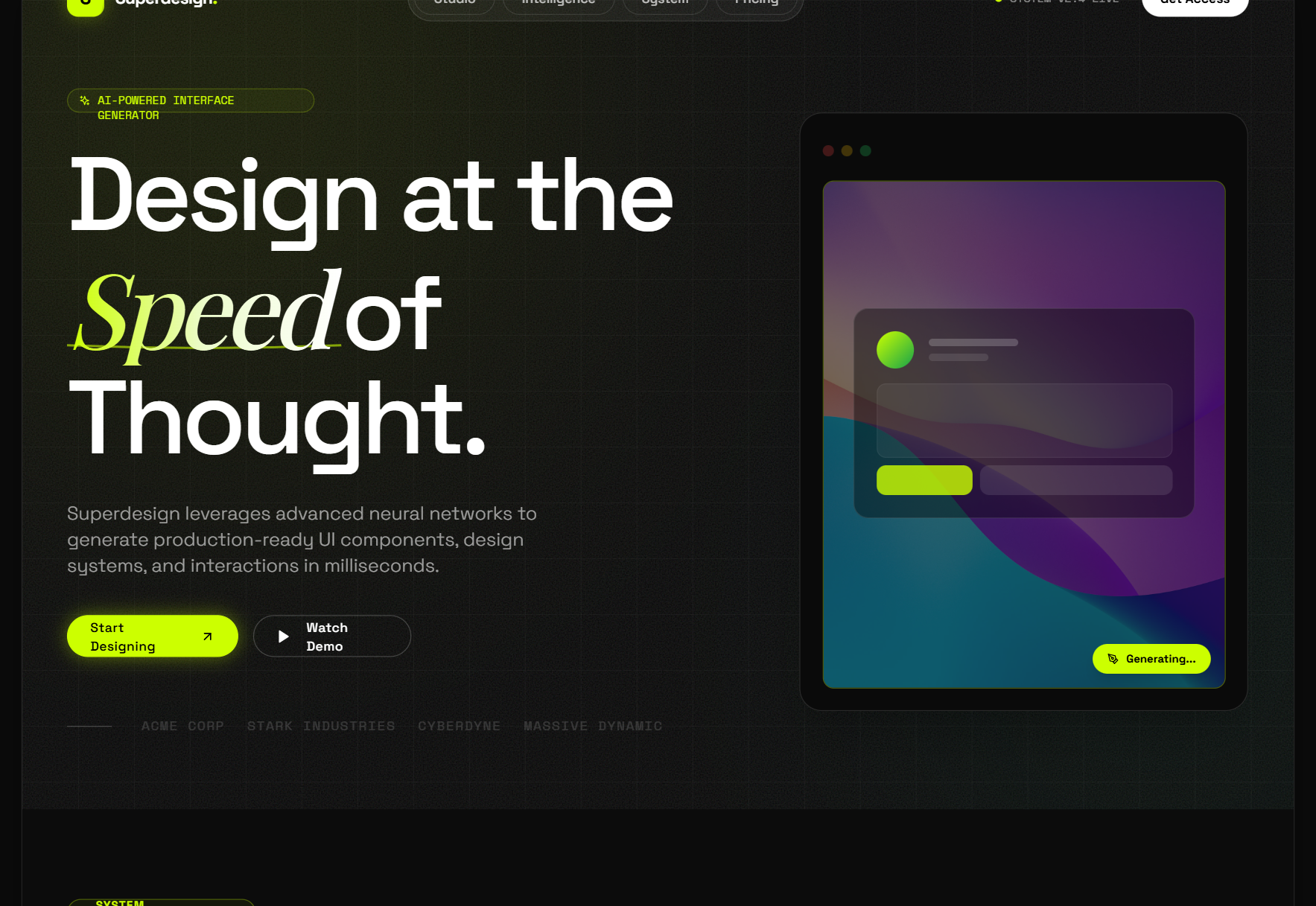
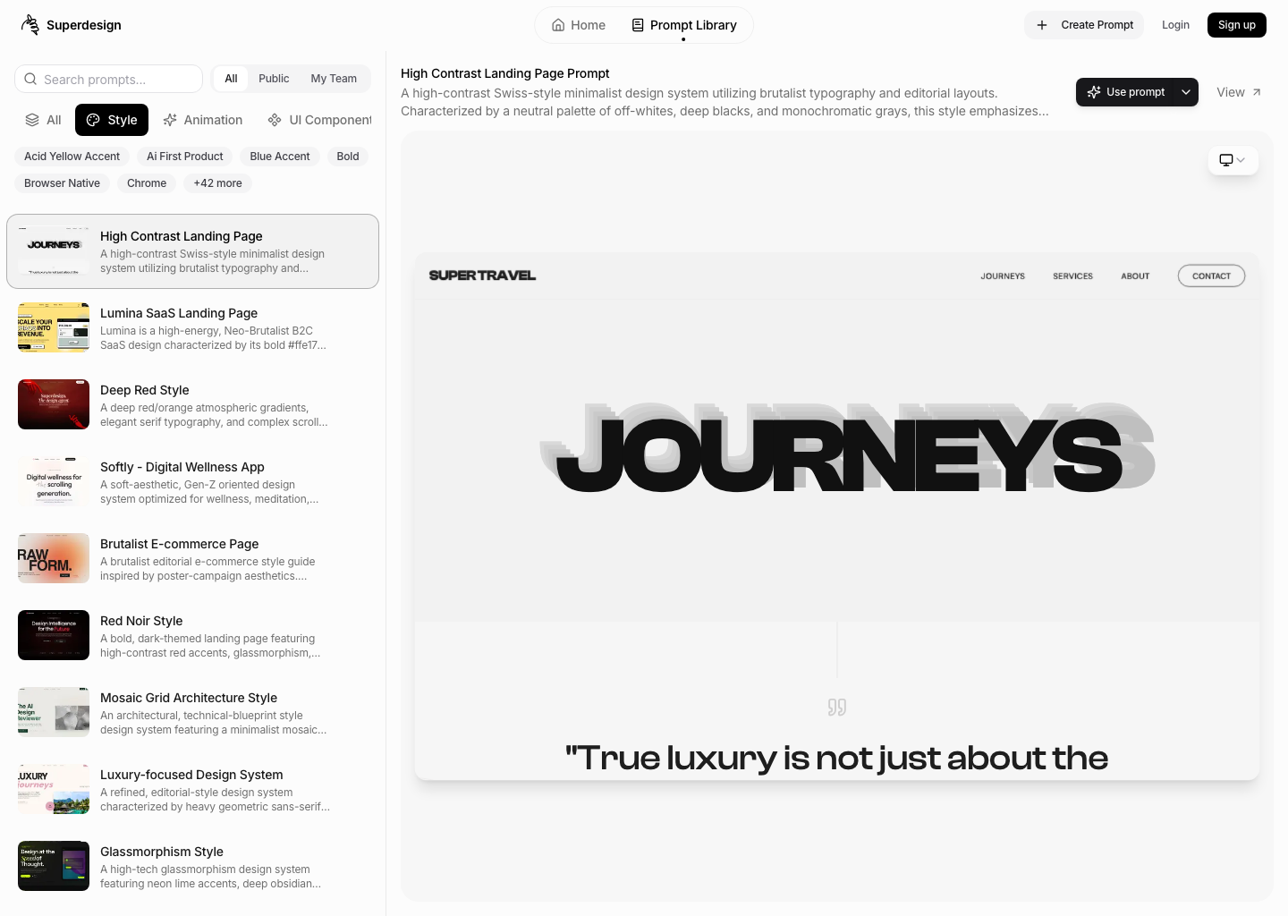
The 11 prompts above are the manual version of one habit: never hand a model a blank box. If you would rather start from a working prompt than rebuild the context block every time, that is what the free Superdesign prompt library is for. It is a large, browsable set of UI prompts, each already wrapped in this kind of context, with a live preview of what it produces, so you copy a proven direction instead of guessing the wording.
And because the dialect changes by tool, it helps to design where you already code. Superdesign installs as a skill inside Claude Code or Cursor with one line, npx skills add superdesigndev/superdesign-skill, then explores several directions at once on a canvas before handing the chosen one back as real React and Tailwind.
Pick the prompt closest to what you are building, paste the context block in front of it, and iterate one state at a time. That is the whole trick. Specific in, designed out.