TL;DR
An AI landing page generator turns a written prompt into a full page: hero, social proof, features, pricing, and a call to action. The catch is that most of them hand you the same template with your words dropped in. The thing that actually separates a generic page from a converting one is not the tool, it's the prompt, section by section.
Key takeaway: don't ask an AI to "make me a landing page." Build the page one section at a time, each with a prompt that names the audience, the offer, the desired action, and the design constraints. Start from a real, proven prompt instead of a blank box, then iterate on a canvas until each section earns its scroll. That's how you get a designed page, not a filled-in template.
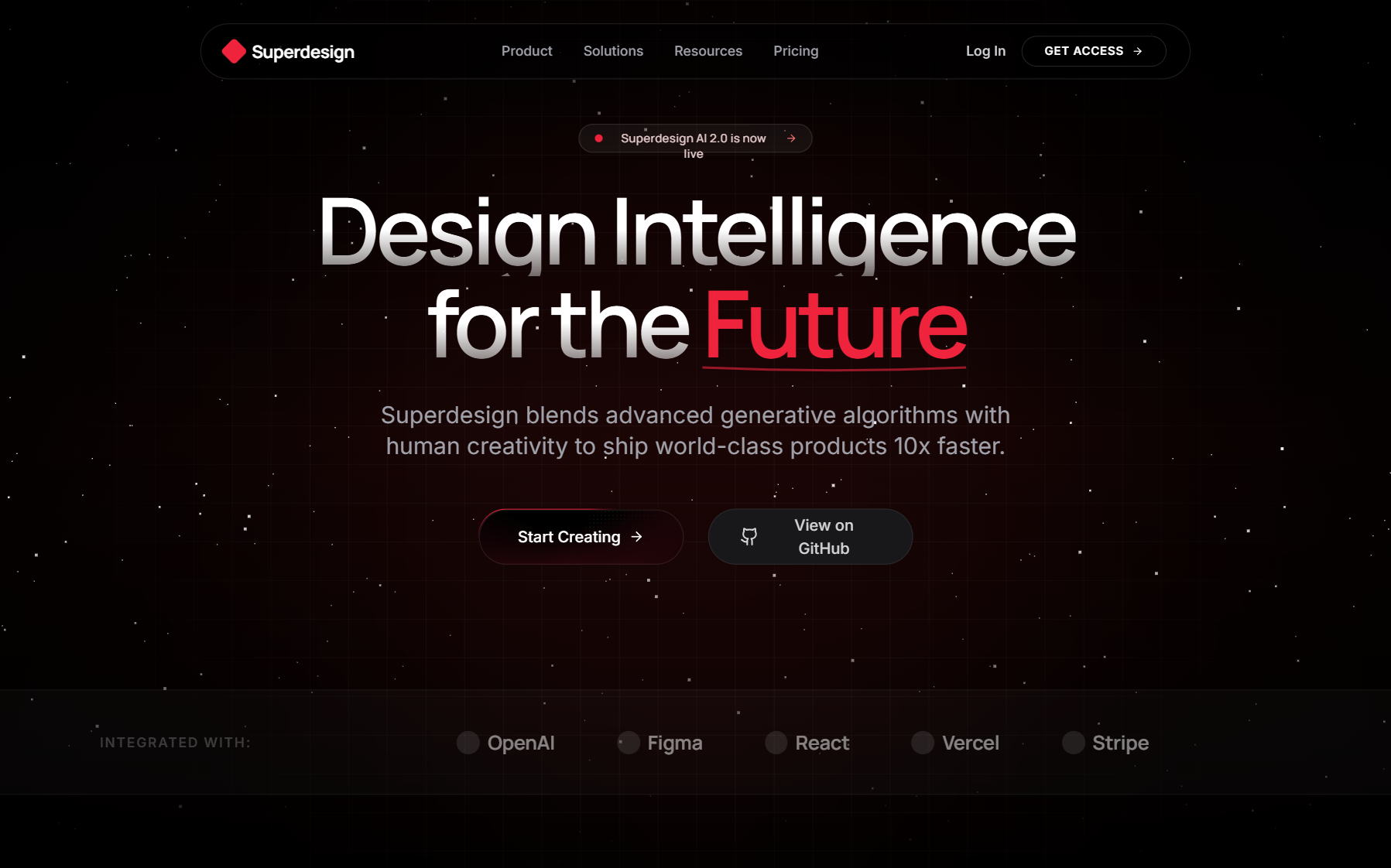
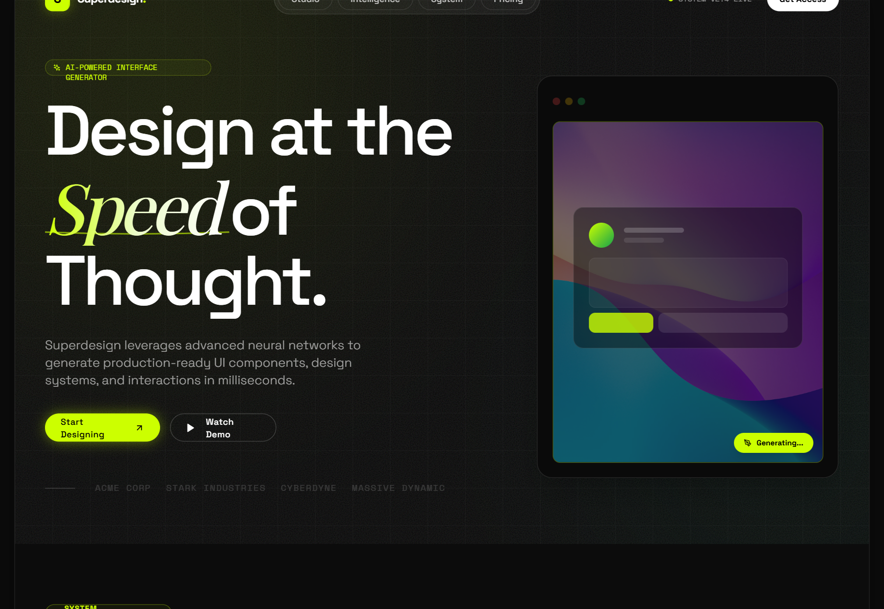
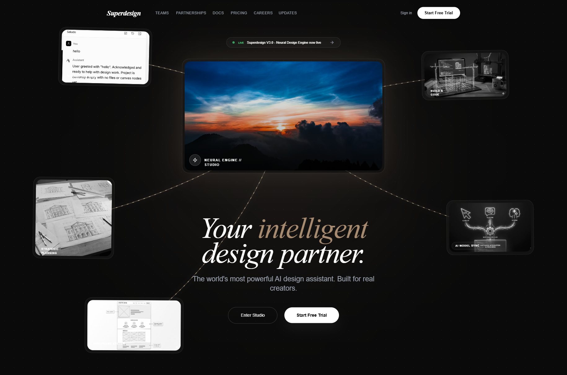
This is a practical how-to. You'll get the section-by-section prompt structure, 5 copy-paste example prompts (hero, social proof, features, pricing, CTA), how to iterate on an infinite canvas, and why a prompt-library approach beats a fixed template. We'll demonstrate it with Superdesign, the AI product design agent I build, but the method works with any decent generator.
Why "make me a landing page" gives you a generic page
Here's the failure mode almost everyone hits. You open an AI builder, type "landing page for my SaaS," and get back a page that looks like every other AI page: centered hero, three feature cards, a pricing table, a gradient nobody asked for. It's structurally fine and completely forgettable.
The reason is simple. A one-line prompt has almost no information in it, so the model fills every gap with its default guess. Default audience, default layout, default tone. Defaults are, by definition, average. Average pages don't convert.
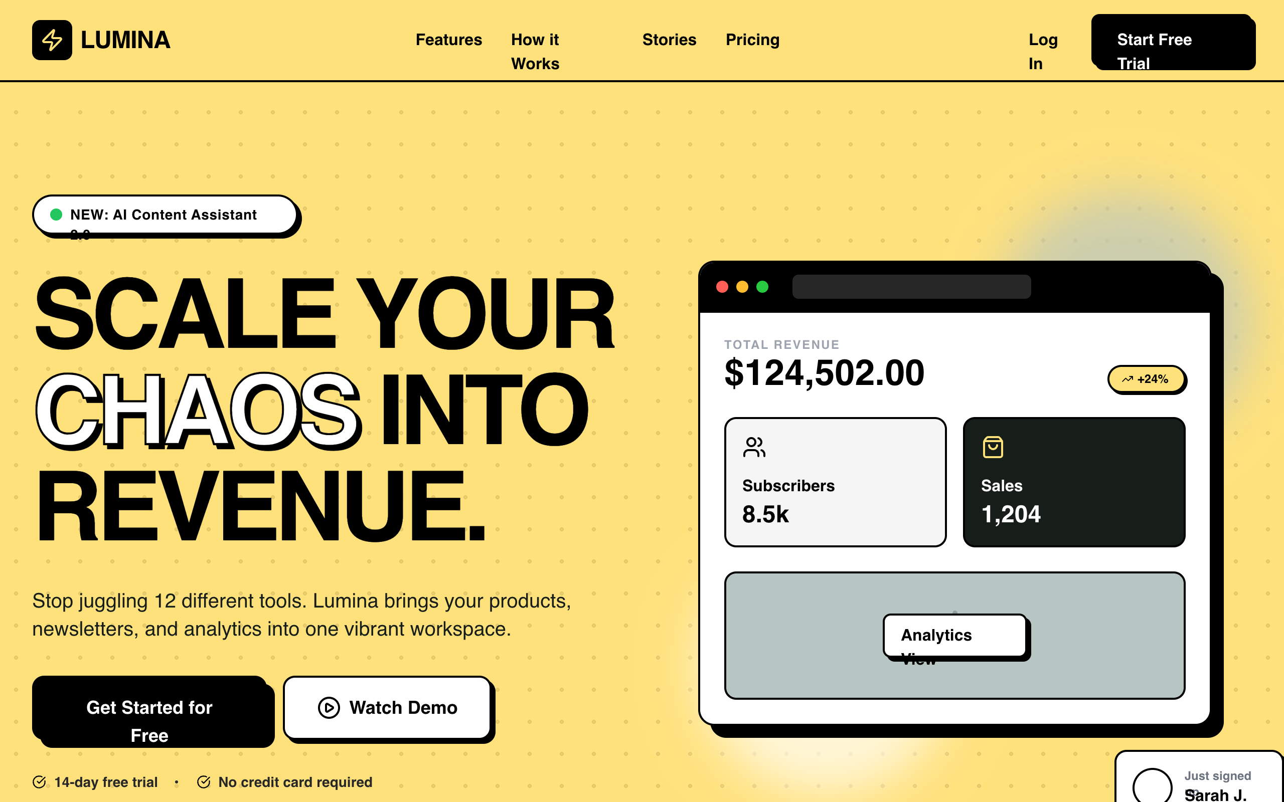
The fix isn't a better tool. It's giving the model enough constraints that it has nothing generic to fall back on. Every specific you add (the audience, the exact headline promise, the number of feature cards, the accent color, the vibe) is one more place the AI can't reach for a template. We call this going from default to constraint, and it's the single biggest lever on output quality.
One definition, one sentence: An AI landing page generator is a tool that produces a complete, designed landing page (structure, copy, and visual layout) from a natural-language prompt, instead of you dragging blocks or picking a template.
The section-by-section method (the part that matters)
A landing page isn't one thing. It's five or six distinct jobs stacked vertically, and each one wants a different prompt. Trying to nail all of them in a single mega-prompt is why single-shot pages feel muddy: the model averages across every goal at once.
So build it in layers. First a full-page scaffold to lock the structure and the visual system, then one focused prompt per section to make each one actually good. On an infinite canvas this is natural, because you can see all the variants side by side and keep the winners.
A converting page, top to bottom, usually runs: hero → social proof → features/benefits → pricing → final CTA (with an optional problem/solution beat between hero and features if the pain needs naming). We'll write a prompt for each.
Every good section prompt carries the same four ingredients:
- Who it's for (the specific audience, not "users")
- The offer / value promise (what they get, in outcome terms)
- The action (the one thing you want them to do)
- Design constraints (layout shape, section count, color, vibe, density)
Miss one and the model guesses. Include all four and you've boxed it into your page.
Step 1: The full-page scaffold prompt
Start wide. This prompt sets the structure and the visual system everything else inherits, so you're not re-specifying the brand on every section.
Prompt (scaffold): "Design a one-page landing page for TaskPilot, an AI task-prioritization app for busy engineering managers. Sections in this order: hero, logo social-proof strip, problem, 3-card feature grid, 3-tier pricing table, final CTA. Clean, high-contrast layout on a near-white background with a single indigo accent (#4F46E5). Modern SaaS feel, generous whitespace, one accent color only, no gradients. Desktop-first, readable at a glance."
Notice what that does: it names the product and audience, fixes the section list and order, sets the exact accent hex, and bans the two things AI over-uses (gradients, multiple accent colors). You now have a real skeleton and a design system. From here, every section prompt says "keep the existing style" and just refines one block.
Step 2: The hero prompt (get this right, the rest is confirmation)
The hero does most of the work. Outcome-driven headlines beat feature-driven ones by a wide margin, so the prompt should force a promise, not a description.
Prompt (hero): "Refine the hero. Headline is an outcome promise for engineering managers: 'Ship projects without the chaos.' Subheadline, one line: AI prioritizes your team's tasks so the important work happens first. Primary CTA button: 'Start free trial'. Secondary text link: 'See how it works'. Left-aligned text, product screenshot on the right. Keep the existing indigo-on-white system. No stock-photo people."
Why it works: the headline is a result the reader wants, not a feature list. There's exactly one primary action and one low-commitment secondary. The layout is specified (left text, right product shot) so the model doesn't default to the centered-everything hero. And "no stock-photo people" kills the most generic AI instinct.
Step 3: Social proof, features, pricing, CTA
Same discipline, four more prompts. Keep them short and each pointed at one job.
Prompt (social proof): "Add a slim logo strip directly under the hero: 'Trusted by teams at' followed by 5 monochrome company logos, evenly spaced, muted gray so they don't fight the hero. Below it, one short pull-quote testimonial with a name, role, and company. Keep it to a single quiet band, not a full section."
Prompt (features): "Build the feature grid as 3 cards. Each card is a benefit, not a feature: lead with the outcome, then one sentence of how. Card 1: 'Never miss the critical task' / AI ranks your backlog by real impact. Card 2: 'Cut planning meetings' / auto-generated weekly priorities. Card 3: 'See what's actually blocked' / dependency view across the team. Simple line icon per card, equal height, indigo accent on the icons only."
Prompt (pricing): "Design a 3-tier pricing table: Starter (free), Team ($12/user/mo, highlighted as 'Most popular'), Business ($24/user/mo). List 4 to 5 features per tier, checkmarks aligned in a column. The middle tier is visually lifted with the indigo accent and a subtle border. Each tier has its own CTA button: 'Start free', 'Start trial', 'Contact sales'. Clean, scannable, no feature-comparison overload."
Prompt (final CTA): "Full-width closing CTA band in solid indigo. Headline restates the core outcome: 'Ship projects without the chaos.' One line of reassurance underneath ('Free to start, no card required'). Single white CTA button: 'Start free trial'. Centered, high contrast, nothing else competing."
Five focused prompts, five sections that each do one job well. That's a designed page. Compare it to "make me a SaaS landing page" and the difference is night and day.
Step 4: Iterate on the canvas (this is where it gets good)
Prompting once is a draft. Converting pages come from iteration, and an infinite canvas is what makes iteration cheap. Instead of overwriting one page, you branch: generate three hero variants, three feature layouts, keep them all on the board, and compare them literally side by side.
In Superdesign this is the normal loop. You keep the version that reads best, then feed it back in with a small nudge: "make the hero tighter," "try the pricing table with monthly/annual toggle," "warmer accent, less corporate." Each iteration is a branch off the last good one, so you never lose a version you liked. The point isn't infinite tweaking, it's giving yourself real options at each section instead of gambling on a single generation.
A few iteration prompts that pull real weight:
- "Tighten the hero: less vertical padding, headline one size larger."
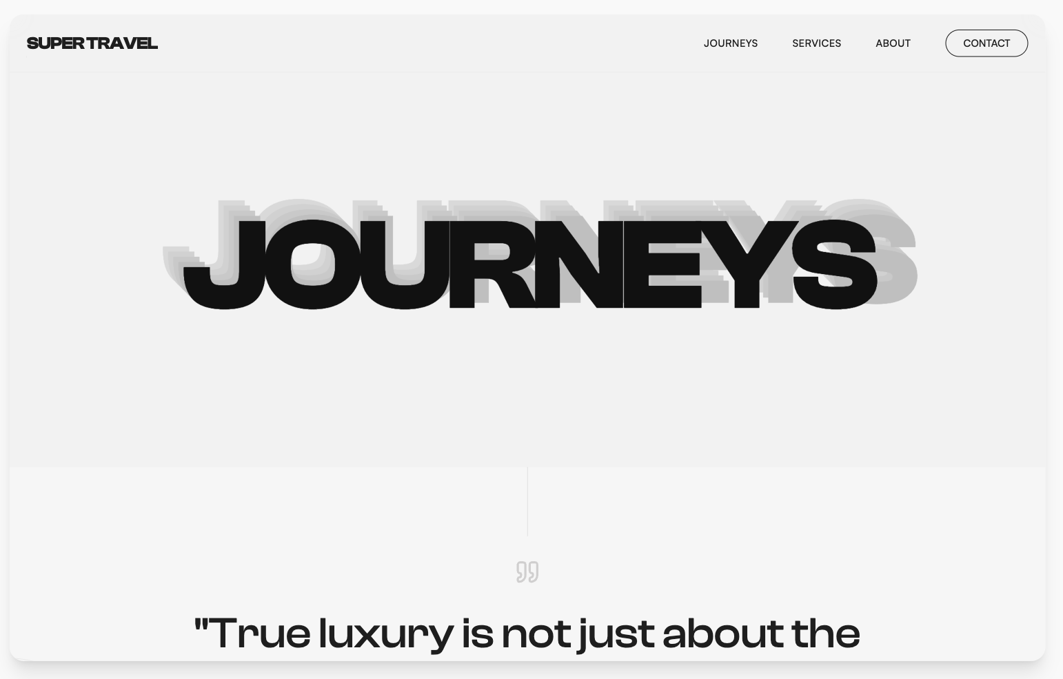
- "Make it feel less generic, more editorial: bolder type contrast, asymmetric hero."
- "Reduce to one accent color and remove every gradient." (the fastest de-genericizer there is)
- "Add a mobile version of this section." (design the responsive state, don't hope for it)
Why prompt-library beats a fixed template
Here's the strategic bit, and it's why I keep pushing the section-by-section method over "one tool, one template."
A fixed template locks the structure before you know your page. Every user of that template ships the same skeleton, which is exactly the sameness that makes AI pages forgettable. A prompt library flips it: instead of a frozen layout, you start from a proven prompt for the section you're building, and the design is generated fresh each time. You get the head start of a good starting point without inheriting a page that looks like everyone else's.
That's the bet behind Superdesign's prompt library. It's our most-used surface, and landing-page prompts are a whole category in it. You grab a battle-tested hero prompt or pricing prompt, swap in your product, your audience, your accent color, and generate. The proven structure carries; the specifics make it yours. If you want the full tour of how to write and reuse prompts like these, that is its own guide: UI Design Prompts.
The mental model: a template gives you the same page faster; a prompt library gives you a better page from a better starting line.
Right now the landing-page prompt category holds 70+ prompts. Browse it, grab the hero, pricing, or feature-section prompt closest to your page, and generate from there.
Common questions
Can AI actually build a converting landing page, or just a pretty one? It builds the page. Conversion comes from the inputs you give it: an outcome-driven headline, a single clear action, real social proof, honest pricing. AI executes the structure fast; you still supply the strategy. Feed it those specifics per section and the design will support conversion instead of fighting it.
What's the best prompt for a landing page? There isn't one master prompt, and that's the point. Build it in layers: a scaffold prompt for structure, then one focused prompt per section (hero, social proof, features, pricing, CTA), each naming the audience, the offer, the action, and the design constraints. A single mega-prompt averages across every goal and gives you a muddy page.
How do I make an AI landing page not look generic? Add constraints until the model has nothing default to reach for: exact accent hex, one accent color only, no gradients, specified layout shape, section count, "no stock-photo people." Then iterate on a canvas and branch variants instead of accepting the first generation.
Do I need to know how to code? No. You describe each section in plain language and refine it visually on the canvas. Superdesign is an AI product design agent, so the design work is prompt-and-iterate, not hand-coding.
How is a design agent different from site builders like v0, Framer, or Bolt? They solve different halves of the problem, honestly. v0 generates React/shadcn code, Framer publishes a hosted site on its own platform, Bolt scaffolds a working app: all three are builders, optimized for getting something live fast on their stack. A design agent works one step earlier, on the design itself: you iterate section by section on a canvas, branch variants, compare them, and only then hand the winning design to whatever implements it (your coding agent, your stack, or a builder). Use a builder when you want a page live today and the default look is fine; use a design agent first when you want the page to look like yours before anything ships. They combine fine, in that order.
Is Superdesign free to try? Yes, free to start. There's a free tier, and a flat paid plan when you want more.
My AI page looks generic. How do I fix it? That's the most common follow-up, so it has its own guide: Why Your AI Landing Page Looks Generic (and How to Fix It). It walks the six "generic tells" and the exact constraint prompts that kill each one.
About Superdesign
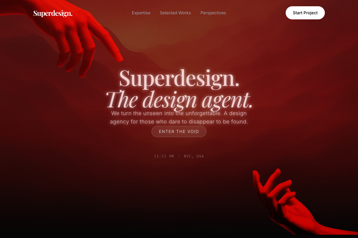
Superdesign is an AI product design agent. Describe what you want in plain language and it generates UI mockups, components, and full designs on an infinite canvas, so you can branch variants, compare them side by side, and iterate to something genuinely good. Two ways to use it: prompt directly in the web app, or drive it from your coding agent (Claude Code or Cursor) with the Superdesign skill. Built for developers, indie hackers, and product designers who want to go from idea to shippable UI fast. Free to start.
(Note: Superdesign is not open-source. The old ~6k-star IDE extension is an unmaintained, separate legacy project. The current product is the web app + the coding-agent skill.)