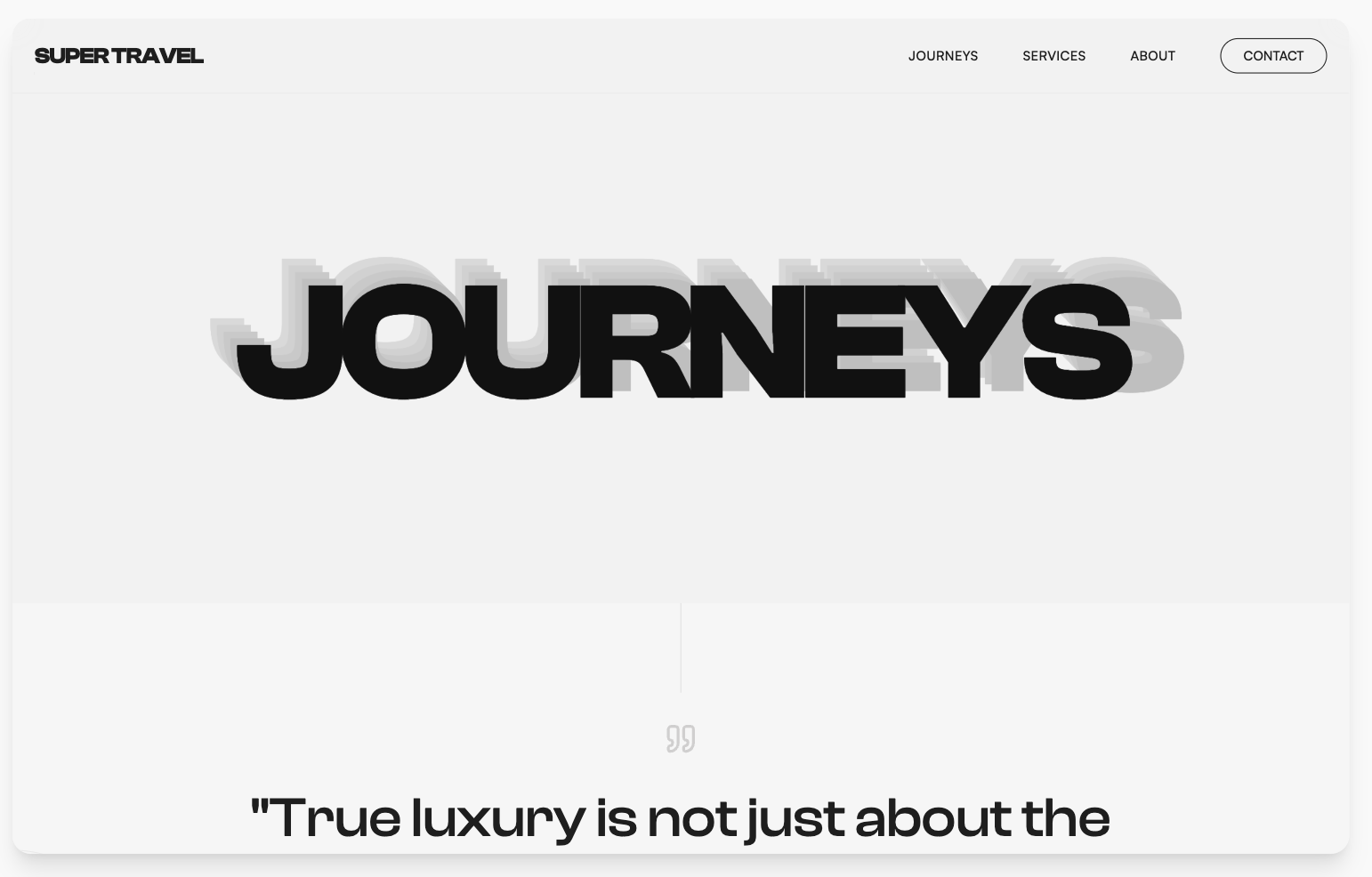
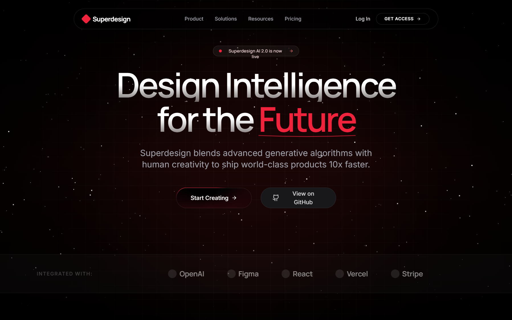
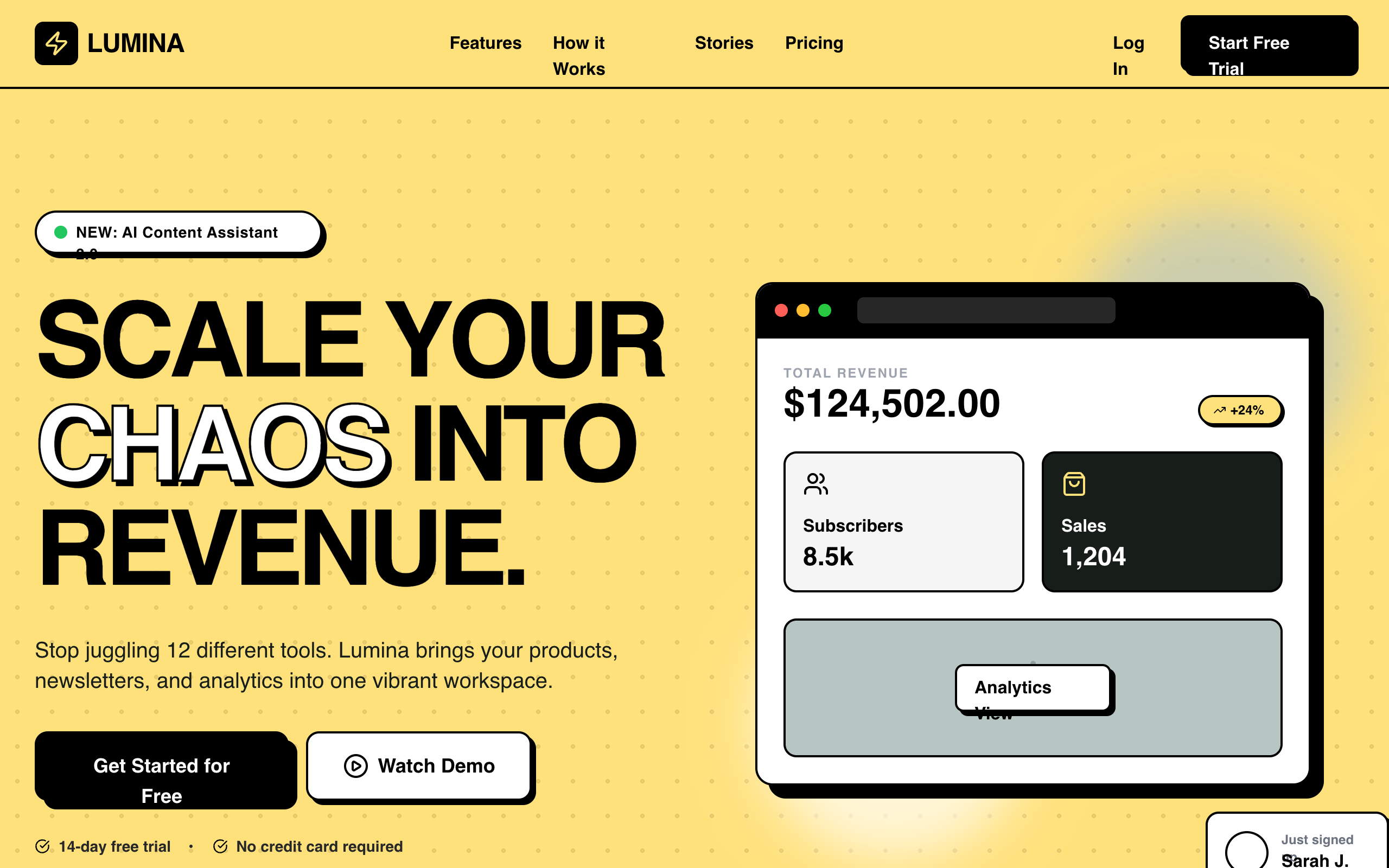
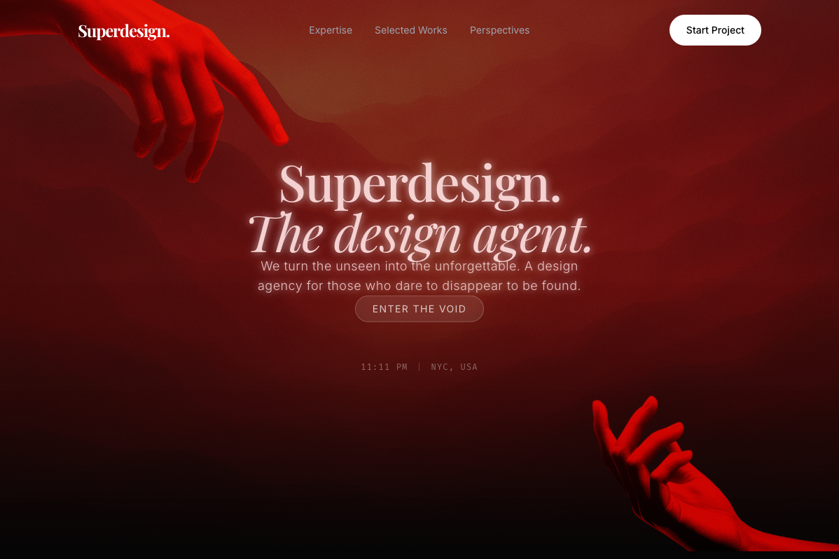
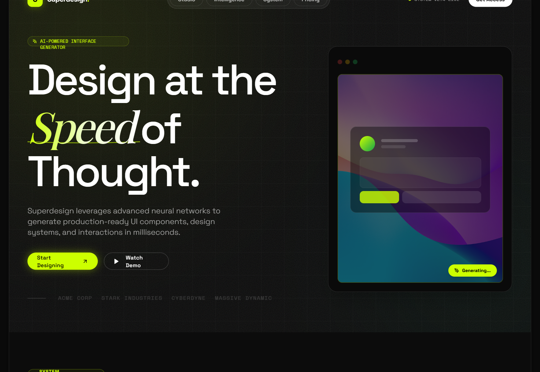
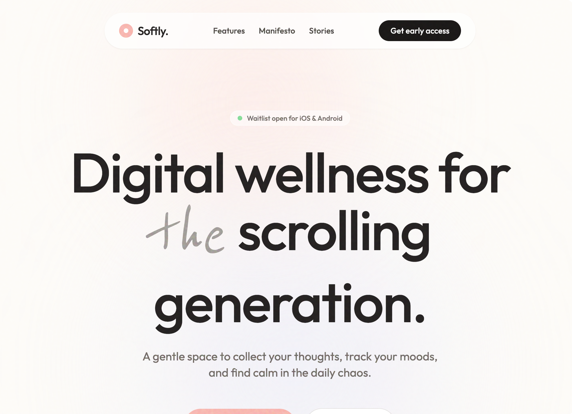
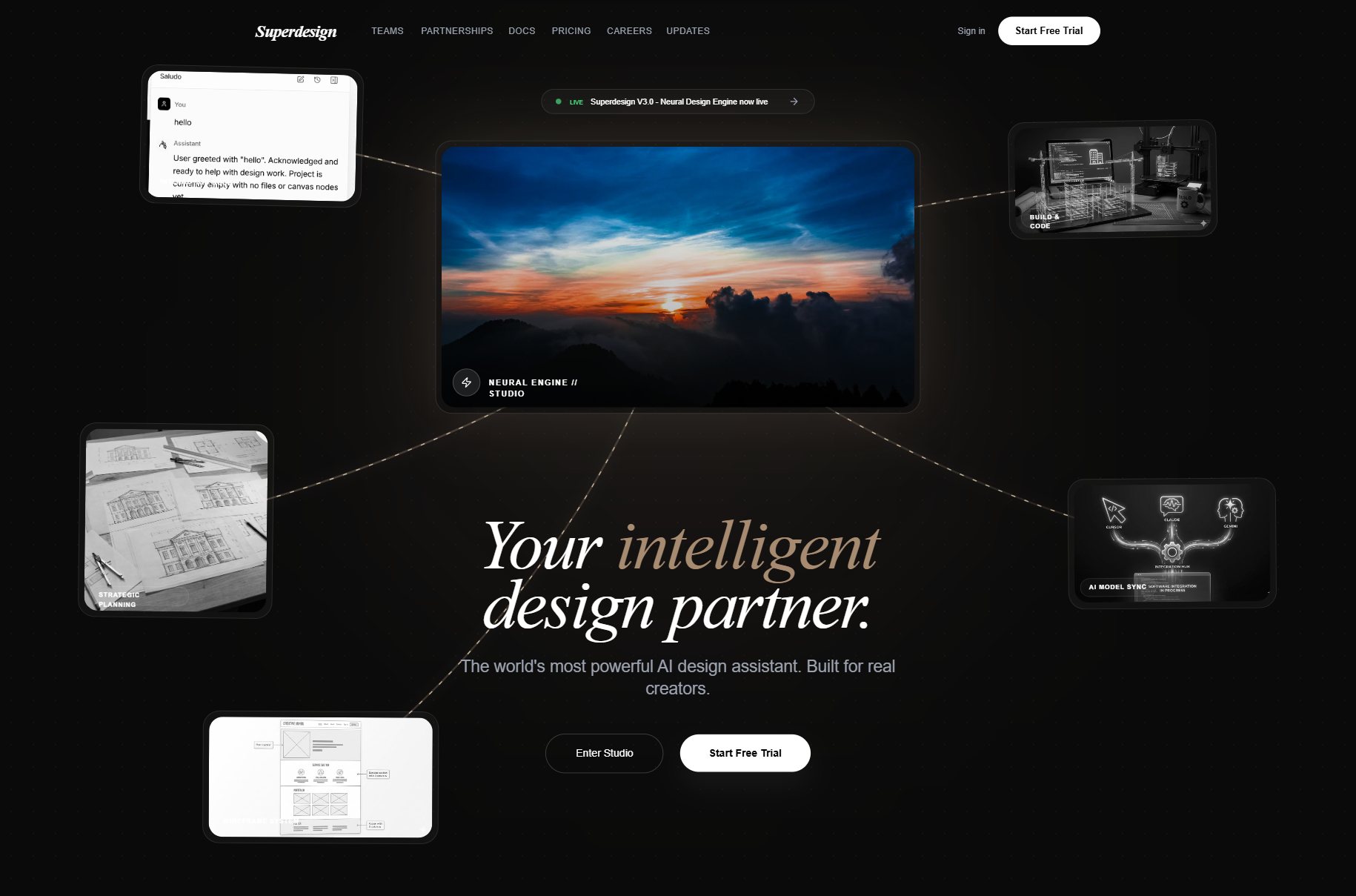
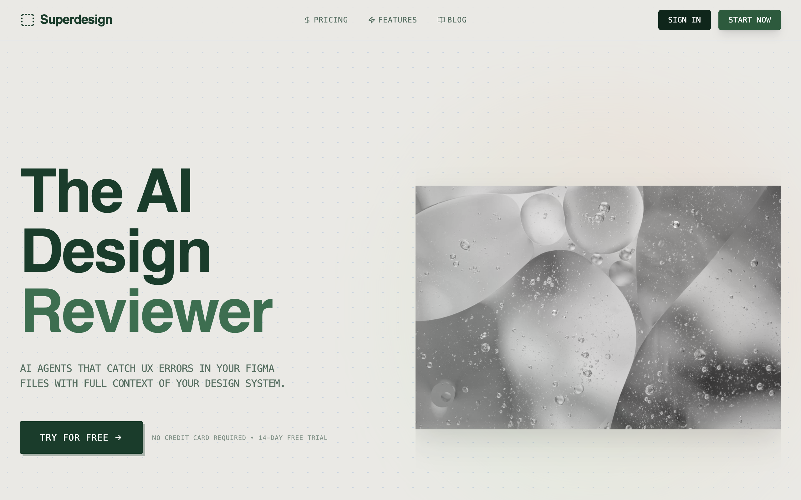
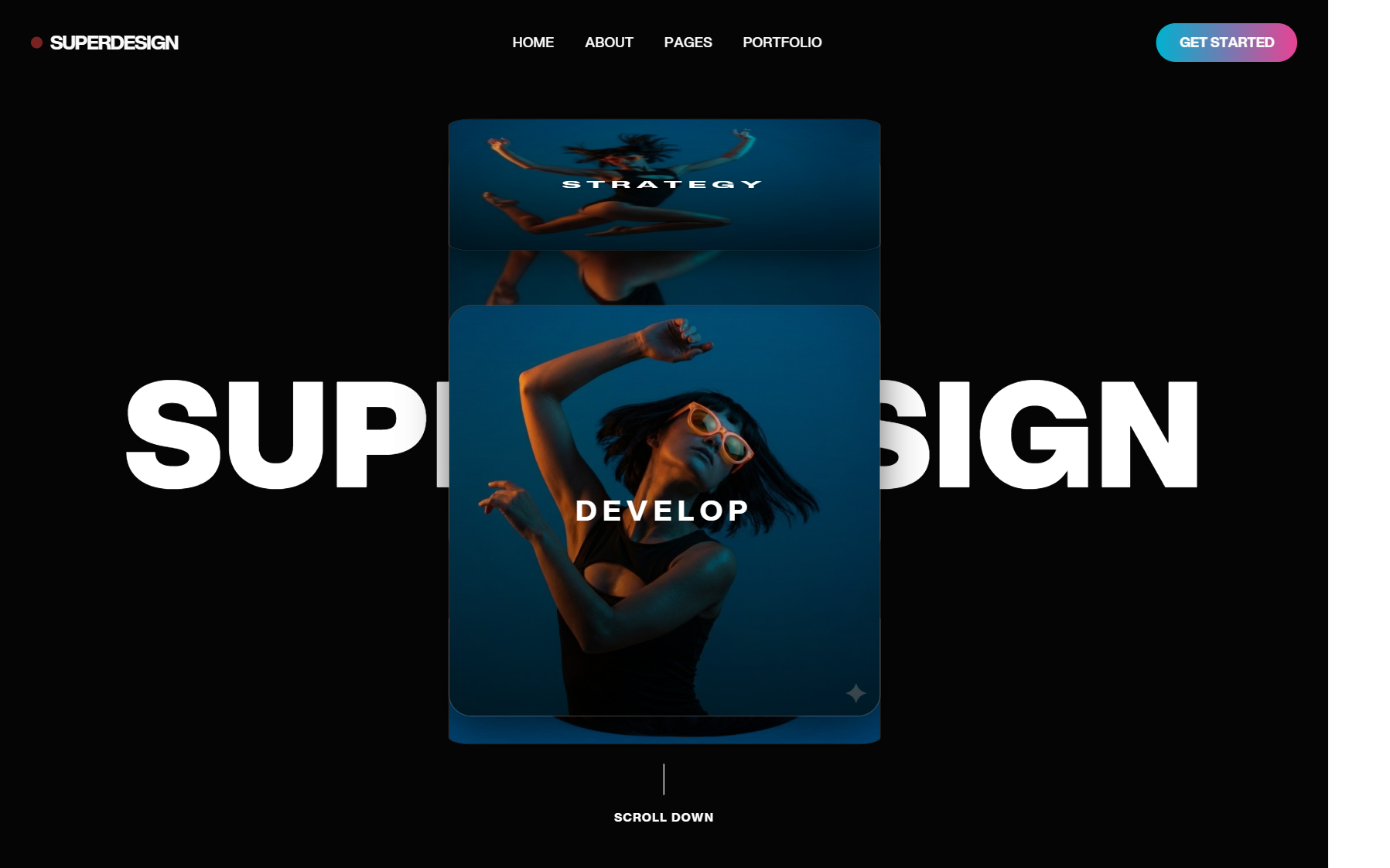
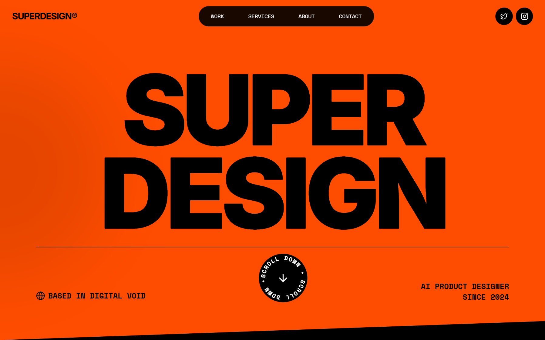
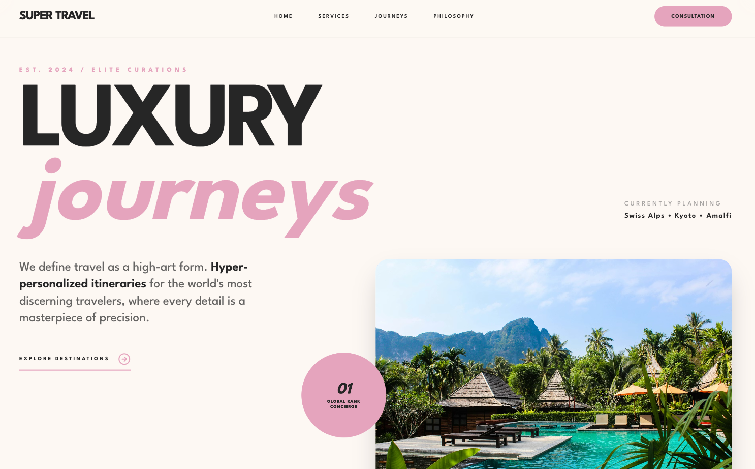
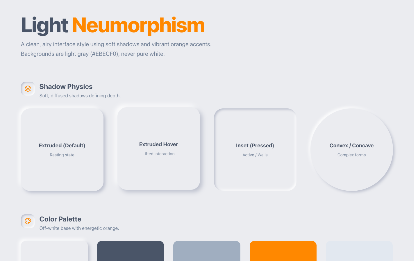
To make AI UI look less generic, stop asking one prompt to do everything and split the work into five concrete moves: plan the creative in text before anyone writes code, explore layouts with an image model instead of a coding agent, extract a design system before you generate a single screen, give explicit specs instead of adjectives, then add real motion so it feels premium. These are the actual levers I use, not theory. The short version of why they work: a single prompt is being asked to pick the taste, explore the options, and write the final code all at once, so it reverts to the safe average. We unpack that mechanism in why AI design looks generic. This is the fix-it companion.
Part of the design agent vs coding agent series: the mechanism lives in why AI design looks generic, and the practical fixes are here.

The five fixes
Generic is a workflow problem, not a model problem. The model is plenty capable; it just defaults to the easy, common layout whenever a prompt leaves the call to it. Each fix below takes one of those calls away from the default and makes it on purpose.
Make AI UI look less generic
- ✓Plan the creative in text first, then hand the builder an explicit spec
- ✓Explore layouts with an image model, not a coding agent
- ✓Extract a design system before you generate any screen
- ✓Give explicit specs (layout, type, motion), never 'make it cool'
- ✓Add real motion, GSAP for scroll and Motion.dev in-app, to feel premium
If you only change one thing, change the first one. The other four are versions of the same idea applied to a specific step.
Split creative from implementation
The single highest-leverage move is to separate the creative thinking from the implementation, because asking for both in one breath is what produces the average. When I design something, I start by talking to the best reasoning model to do the planning, and the output is a spec. Plan the layout, the style, and the motion in text first, the cheapest and fastest medium there is, then hand that spec to a builder whose only job is to implement it. Do both at once and the model quietly reverts to whatever is easiest and most common to build.
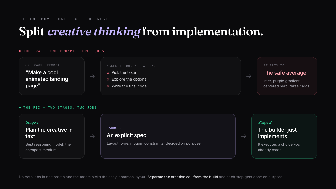
This is the same discipline good engineers already use with coding agents (plan first, then implement), applied to design. It is also why a coding agent on its own keeps giving you standard layouts: it optimizes for what runs, so it builds what is considered, not what is interesting. That distinction has its own piece, see design agent vs coding agent.
Explore with an image model
Use an image model for the creative exploration step, then hand the result to your coding agent to build. This is the move almost nobody makes, and it is the one that unlocks layouts a coding agent will never propose. The current default is Nano Banana Pro, Google's Gemini 3 Pro Image model, which is fast and, unusually, renders legible text right inside the mockup so your buttons and labels are real words instead of garbled glyphs. An image model gives you a creative direction in seconds without worrying about implementation, so you can spin up a dozen of them in the time a coding agent spends building one. And crucially, it explores the layouts coding agents avoid: the tilted UI, the glass panels, the 3D objects sitting behind the hero. Those are exactly the layouts a coding agent tries not to do, because they are not easy to implement right away.
The model you reach for depends on the job. Nano Banana Pro is the reliable creative default, but a few others are worth knowing for UI work:
| Image model | Reach for it when |
|---|---|
| Nano Banana Pro (Gemini 3 Pro Image) | Creative exploration with personality, and legible in-image text. Fast, the reliable default. |
| FLUX.2 | All-round product mockups: photorealism plus up to ten reference images to keep style and product consistent. |
| Ideogram v3 | Text-heavy UI where every label has to be readable; it leads on typography. |
| Imagen 4 Ultra | The most photorealistic output, for hero shots and real-looking imagery. |
| Recraft | Placing your own art onto product mockups: devices, packaging, apparel. |
Earlier tools opened this up and still work fine: Midjourney, DALL-E, and the original Nano Banana. The five above are where UI-mockup quality sits today, so start there for design exploration.
The honest catch: the most creative mockups are the hardest to build. The workflow that makes it practical is to use the image model twice. Once for the mockup as a source of truth, and again to generate the high-resolution image assets (the 3D object, the textured background) so your coding agent implements the interactive parts in code and drops the heavy visuals in as assets. There is no amount of prompt you can give a coding agent and expect it to design something like that out of the box.
Extract a design system first
Pull a design system out before you generate anything: capture the color, type, spacing, and radius into a style guide, then generate against that file instead of prompting from raw references each time. Handing the agent a reference image and asking it to design straightaway works far worse than first extracting the reference into a structured design system and pointing the generator at that. The reason is simple: whatever the first page you design looks like sets the standard for every page after it, so it is worth getting the foundation explicit before the volume starts.
STEP 1 (extract, do this once)
Analyze this reference [paste screenshot or URL]. Extract a
design system as a file: exact color tokens, the type scale
and font pairing, the spacing increment, corner radius, and
shadow depth. Save it as design-system.md. Do not design a
page yet.

STEP 2 (generate against it)
Using design-system.md as the source of truth, design the
dashboard. Pull every color, size, and spacing value from the
file. Ask before inventing anything that is not in it.
A reusable version of this is a DESIGN.md: the extracted system written once and read on every generation so the look stays consistent across screens. Full walkthrough in what is DESIGN.md. The same constraint thinking that sharpens a prompt also fixes hand-built UI, see UI design tips for developers.
Give explicit specs, not adjectives
Trade every "make it cool" for an explicit spec the model can actually execute. "Help me make a cool animated landing page" returns exactly what you would expect: the model breaks your text into a few full-screen slides with some token animation, because that is the safe, common interpretation. The same request, broken down into specific instructions about layout, motion, and behavior, produces something genuinely creative from the same model. You are not making the model smarter, you are removing the ambiguity it was resolving with the average.
BEFORE
Make a cool animated landing page with scroll interactions.

AFTER
Build a horizontal scroll animation with GSAP ScrollTrigger.
Layout: not full-screen slides, one continuous horizontal text
flow, a single long sentence in one container so items flow next
to each other with variable gaps. Embed SVG curves and inline
icons that act like punctuation between phrases, not separate
sections. It should feel like reading one long line, not flipping
a slide deck. Animate text in with SplitText, character by
character, eased to the scroll.
The trick for writing a spec that good when you are not a designer: have the reasoning model write it. Give it a system instruction to act as a world-class motion designer, ask it to plan the timeline and every animated element one by one, and you get a real brief to hand the builder. The slop checklist below is the other half: name the defaults you are forbidding so they stop creeping back in. If you would rather start from a spec someone already wrote, our UI design prompts page collects the ones worth copying, screen by screen.
The slop starter pack: forbid every one of these
- ✕Inter or Roboto with no personality
- ✕A purple or indigo gradient
- ✕A centered hero with one CTA
- ✕A row of three icon cards
- ✕Drop shadows at 0.1 opacity on everything
- ✕Rounded corners on every element
- ✕White or light-gray everywhere, no point of view
Verbatim from prg.sh
Add real motion to feel premium
The gap between a good-looking page and one that feels designed is almost always the motion. Micro-interactions and animation are what make a UI feel premium and separate it from a template, and the models already know the libraries well, they just need the right spec to use them. Two libraries carry most of it, and they split by job: use GSAP for complex scroll-driven animation on a landing page, and Motion.dev (formerly Framer Motion) for UI-state and micro-interaction animation inside an app. Keep the touch light. One memorable scroll moment or a cursor that demonstrates the product beats motion on everything.
We have this to-do app UI. Build a self-playing looping
animation for a landing-page showcase using Motion.dev.
Scenario: a simulated cursor types a new to-do and hits enter,
then completes an existing one, which fades out of the list.
Do not hard-code cursor coordinates: use a ref to read each
target element's bounding box and drive the cursor from that,
so it stays accurate. Make it loop seamlessly.
Like every fix above, the leverage is in planning the motion before implementing it. Animation is creative work, so a generic "add cool animation" reverts to the boring default, while a planned timeline handed to the builder gets you the version worth shipping.
Where Superdesign fits
Superdesign is built to make these five moves the default instead of a discipline you have to remember. It is an AI design agent on an infinite canvas, so the steps a chat box fights you on become the easy path: a plan mode with built-in image generation so you can plan in text and explore Nano Banana Pro mockups in one place, a design-system file extracted from your real project so your constraints stay reusable, parallel directions you compare side by side instead of nudging one output, animation knowledge for GSAP and Motion.dev baked in, and real React and Tailwind out. You can drive it from your coding agent (Claude Code, Cursor, or any agent) with full context of your codebase. None of this takes the taste call away from you, it just gives each decision its own step so the model executes choices you made instead of averaging the ones you skipped.
Generic was never the model's fault. It is what one prompt does when you ask it to be a taste director, an explorer, and an engineer all at once. Split those jobs apart, plan the creative work in text, explore with an image model, extract the system first, spec it explicitly, and add motion on purpose, and the output stops looking like everyone else's. If you want that chain to be the tool instead of a routine you maintain, that is what Superdesign is for.