Prompt v0, Lovable, or Bolt with "build me a SaaS landing page," and about thirty seconds later you have working React. It runs, it is responsive, and it looks exactly like every other AI app: Inter, an indigo-to-violet gradient, a centered hero, three rounded cards. That is not a bug in the model. It is what you get when you ask a coding agent to do design. A coding agent is graded on "does it run." A design agent is graded on "is it considered." Those are two different jobs, and almost every AI UI tool only does the first.
Coding agent vs design agent
A coding agent optimizes for "does it run": correct, functional code, fast. A design agent optimizes for "is it considered": an interface a real person would be proud to ship, with deliberate type, color, layout, and motion. Most AI UI tools are coding agents that emit a UI as a side effect of getting code to compile, which is why their default output is competent and generic at the same time. A design agent treats the look as the actual deliverable, not a byproduct.
This is not a knock on coding agents. They are genuinely great at their job, and that job is hard. The point is narrower: "generate me a UI" quietly bundles two jobs, and a tool graded on the first ships the second as an afterthought. Slop is not the model failing. It is the model succeeding at the wrong objective.
The 30-second slop demo
The fastest way to feel the difference is to watch a coding agent design. You type one line, you get back working code in under a minute, and the result is fluent and forgettable. It is the visual equivalent of grammatically perfect prose with nothing to say. The code is real and it runs. The design is the average of everything the model has seen.
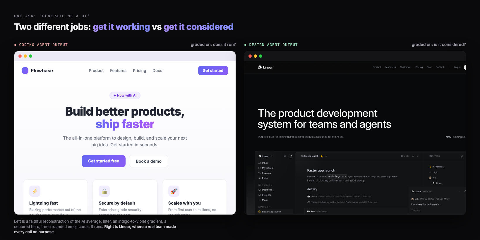
The left panel is not a real product. It is a faithful reconstruction of the default, built to show the pattern. The right is Linear, screenshotted as-is. The gap between them is not effort or model size. Both took seconds. The gap is which question the tool was trying to answer.
Two jobs inside "generate UI"
"Generate me a UI" is really two requests fused into one sentence, and they want different things from the model. Get-it-working needs correctness: components that render, props that match, a layout that does not break. Get-it-considered needs judgment: a point of view on type, a color that means something, a hierarchy that guides the eye, restraint about what to leave out. When one prompt has to satisfy both at once, the safe move is to nail the first and average the second.
| The job | The question | What it is graded on | What it needs |
|---|---|---|---|
| Get it working (coding) | Does this compile and render? | Correctness, speed, no runtime errors | A spec to implement faithfully |
| Get it considered (design) | Would I be proud to ship this? | Taste, hierarchy, restraint, intent | References, several options to compare, a decision |
A coding agent is built and tuned for the left column. Hand it the right column and it does not refuse, it just defaults: the highest-probability "nice modern UI," which is exactly the look everyone else's prompt also lands on. You usually want both jobs done. The mistake is asking one tool, optimized for one of them, to do both in a single shot.
Why the default converges
The reason the default looks generic is structural, and it has a name. I call it distributional convergence: a language model predicts the next token from statistical patterns in its training data, and as I put it, "safe design choices that work universally and offend no one just dominate web training data." So when the question is open ("design something nice"), the model reverts to the center of that distribution. The center of "modern web UI" is a very specific, very repeated look, which is why a thousand different prompts produce the same gradient.
This is the deepest reason a better prompt only goes so far. You can nudge the model off the exact center by naming a font or pasting a hex, but you are still asking it to commit to taste it was never given, in one pass, against the gravity of its own average. We go deep on this in why AI design looks generic. The short version: the cure is not a cleverer adjective, it is a different process.
Only what is easy to build
A coding agent has a second bias on top of the average: it favors what is cheap to implement. In my Nano Banana plus Gemini 3 walkthrough, I point out that the tilted, glassy, layered-3D directions a strong designer would reach for are exactly the ones a coding agent quietly avoids, "because it's not that easy to implement right away." The model steers toward layouts it can ship without trouble, which trims away most of the interesting design space before you ever see it.
His blunt version is the line this whole category turns on: "there's no amount of prompt you can give a coding agent and expect it to design something like this out of the box." That is the design agent thesis stated as a limit. It is not that the model lacks the knowledge. It is that one-shot, implement-as-you-go generation is the wrong shape for creative work, so the model "reverts back to something that's easier and common to implement." Design needs a step where exploring is free and nothing has to compile yet.
You do not have to take that from a design tool, because Google reached the same conclusion inside its own coding product. In Google Antigravity, its agentic development platform, the coding agents now call an image model, Nano Banana Pro (Gemini 3 Pro Image), to "generate detailed UI mockups for user review" before they write any code (Google for Developers). That is the whole thesis shipped as a feature. When even a coding agent offloads the look to a separate model, it is conceding that deciding what a considered UI should be is a different job than writing the code to build it.
Parallel suits design, not code
Here is the cleanest tell that design and code are different jobs: parallelism is wrong for one and perfect for the other. Last year a widely-shared engineering argument made the case against multi-agent systems for coding, because when you fork parallel agents on the same codebase they hit merge conflicts: each sub-agent has no context for what the others changed. For code, where every action implies a specific decision, you usually want one coherent thread.
Design is the opposite. The way I think about it: "when we do design in Figma, what we often do is that we'll just fork and do a few different variations and compare them side by side, and eventually we get the final version." Divergence is the point. You want many options to choose from, not one merged answer. That is why I "customized my Claude Code into a Claude Designer": the same parallel capability that is dangerous for code is exactly the right pattern for design.
This is the part a linear chat box structurally cannot give you. A chat returns one thing at a time and loses the previous version when you re-prompt. A design surface forks several directions at once and lets you compare them, which is how human designers have always worked. Exploration is not a luxury step. It is the step that kills sameness, because you are choosing from real options instead of accepting the first guess.
Coding agents are great (honestly)
To be clear, none of this means coding agents are bad, and a design agent does not replace them. Cursor, Claude Code, v0, Lovable, and Bolt are genuinely excellent at turning intent into working software, fast. That is a hard, valuable job, and most of the time you still want a coding agent to do it. The honest claim is smaller and more useful: they are graded on "does it run," so when you also need "is it considered," you should not expect the same tool to supply it for free.
The right mental model is not design agent versus coding agent as rivals. It is design agent then coding agent, in sequence. Decide the design where exploring is cheap and nothing has to compile. Then hand a clear spec to the coding agent, which is brilliant at exactly that: implementing a decision you already made. Each tool does the job it is actually graded on.
Design first, then hand off
The workflow that beats slop puts the design agent in front of the coding agent, with a real handoff in between. My process maps onto three moves anyone can run. First, explore and compare directions before any production code exists, so taste is a choice, not a default. Second, extract a design system from the direction you picked, because, as I put it, "whatever the first page you design sets the standard for the rest." Third, hand that system to the coding agent as an explicit spec so it "just focuses on implementation."
The design-first handoff
- ✓Explore several distinct directions and compare them side by side, before production code
- ✓Pick one, then extract a design system from it: tokens, type, spacing, components
- ✓Write the system down as a DESIGN.md the coding agent reads on every generation
- ✓Hand off the chosen design as a spec, and let the coding agent do what it is great at: build it
That handoff artifact is the hinge. A screenshot alone gets you most of the way and loses the details (in my experience a screenshot gets you "60 to 70 percent," with color, spacing, and font drifting). A written design system plus real code is what carries the intent across the gap intact. It is the practical analog of a DESIGN.md: the place the considered decisions live so the coding agent stops guessing the look and starts executing it.
---
name: "Chosen direction, extracted after exploring"
principles:
- "Flat surfaces. No glassmorphism, no 0.1-opacity drop shadows."
- "One decisive accent per screen. Color must mean something."
- "Density over decoration: show the data, skip the three-icon cards."
colors:
background: "#0B0B0F"   # near-black, not white
ink:        "#F5F5F7"   # high-contrast text
accent:     "#5B8CFF"   # the single accent, used sparingly
line:       "#1E1E26"   # hairline borders, not shadows
type:
font: "A grotesque or serif with personality. Not Inter, not Roboto."
scale: "Big, confident headings. Generous body line-height."
layout:
hero: "Left-aligned. Lead with one real sentence, not a slogan."
cards: "Avoid the three-icon-card row. Use a list or table for data."
handoff: "Implement exactly this. Do not redesign. Ask before deviating."
---
Where Superdesign fits
Superdesign is the design agent you put in front of your coding agent. It is an AI design agent on an infinite canvas, built for the "is it considered" job that a coding agent is not graded on. A few specifics, kept honest:
- Explore in parallel, like forking in Figma. It forks several distinct directions at once and carries context down each branch, so you compare and converge instead of nudging one chat thread. That is the step that beats the average.
- Taste fed in, not guessed. Mid-design it can pull real, proven patterns from sources like Mobbin, Dribbble, and Behance, so a generation starts from a reference instead of the median of the internet. Browse the same idea in our free prompt library.
- A clean handoff to your coding agent. It learns your real project, captures your existing design system as a file, and outputs real React and Tailwind. You can drive it from Claude Code, Cursor, or any coding agent, so design happens with full context of your codebase and the build step gets a spec, not a vibe.
You do not have to take the design agent framing on faith. Next time a coding agent hands you a UI in thirty seconds, ask which question it was answering. If the answer is "does it run," it did its job, and the considered part is still yours to add. The fastest way to add it is a design agent up front.
This piece is the hub of a short series, so here is where to go next. For the mechanism, why the default converges in the first place, read why AI design looks generic. For the fixes you can run today, read how to make AI UI look less generic. For the definition of the workflow itself, read what vibe design is. And for the full tool landscape, the best AI UI generator guide compares the options. A coding agent gets it working. A design agent gets it considered. You want both, in that order.