Google's design system is Material Design, now in its third generation (Material 3, also called Material You) and documented in full at m3.material.io. Unlike Apple or Airbnb, almost nothing here is guesswork: Material publishes its tokens, type scale, elevation levels, and shape system openly. The signature ideas are dynamic color (a whole UI generated from one seed color through the HCT color space), Roboto on a 15-style type scale, tonal elevation for depth, and a three-tier design token model. Here is the annotated breakdown, with a copyable DESIGN.md.
This is a teardown that teaches the taste, not a token dump, even though Material would let us dump real tokens all day. The honest twist is the opposite of the Apple post: Material's reference values are all public, but because dynamic color regenerates the palette from the user's wallpaper at runtime, a shipped Material app often has no single "final" hex either. The lesson both systems share is to design to color roles, not raw hex. For the format itself, see what is DESIGN.md; this post is the applied example.

What is Material Design?
Material Design is Google's open design system, the visual language behind Android, Google's own apps, and thousands of third-party products. It launched in 2014 with the original "material metaphor" (digital paper and ink with realistic shadows), was refreshed as Material 2 in 2018, and was rebuilt as Material 3 (Material You) in 2021 alongside Android 12. The latest evolution, Material 3 Expressive, arrived in 2025 with more vibrant theming and motion and complements the Android 16 visual style (Material Design, Android Developers).
Set the frame honestly up front. Because Material is fully documented and ships as open-source component libraries (Jetpack Compose, Material Web, Flutter), you can read the real values instead of reverse-engineering a live product. That makes this the most "official" teardown in the series. The one place precision gets slippery is dynamic color, where the rendered hex depends on a user's wallpaper, which we cover next.
How does dynamic color work?
Dynamic color is Material 3's headline feature: a single source color is expanded into an entire accessible palette, so the UI can theme itself from a user's wallpaper. Starting in Android 12, the system extracts a seed color, then uses the HCT color space (Hue, Chroma, Tone, a perceptually accurate model Google built for this) to derive five key colors (primary, secondary, tertiary, neutral, and neutral variant). Each key color becomes a tonal palette of 13 tones from 0 (black) to 100 (white), and color roles pull fixed tones from those palettes (Android Developers, dynamic color).
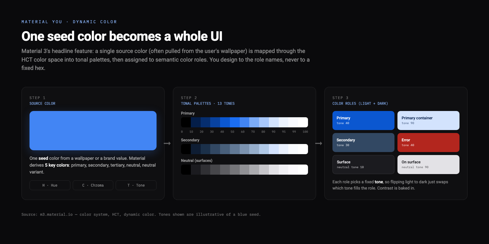
Why it works, and the one idea to copy: because every role is defined as a tone rather than a literal hex (primary is tone 40 in light mode, tone 80 in dark mode, for example), contrast and dark mode come almost for free. You design to roles like primary, on-primary, primary-container, surface, and on-surface, and the system guarantees a legible pairing. This is the same "semantic roles over raw hex" lesson as Apple's adaptive system colors, just made fully public and generative.
What colors is Material built on?
Before dynamic color personalizes anything, Material ships a baseline scheme, the default theme generated from the seed #6750A4. These are the brand roles you get out of the box, and they are real published values, not community guesses:
Public source: the Material 3 baseline color scheme (seed #6750A4) from m3.material.io. With dynamic color enabled on Android 12 and above, these are replaced at runtime by a palette derived from the user's wallpaper, so treat them as the default reference, not a fixed brand spec.
Why it works: a single primary family carries the brand, while the neutral palette does all the surface and text work, so screens stay calm even when the accent is saturated. When you adopt Material, you almost never invent a one-off color, you reach for a role.
What font does Material use, and what is the type scale?
Material's default typeface is Roboto, Google's open neutral sans, with Roboto Flex as the modern variable version (both free on Google Fonts). Be honest about the brand caveat: Google Sans is Google's own proprietary brand typeface, used across Google's products and not licensed for general third-party use, so for your own Material-style work you stay on Roboto or a close substitute.
The M3 type scale is five roles times three sizes, 15 styles total, each role chosen by purpose rather than size alone. These are the official default sizes and line heights, with Roboto as the baseline (Android Developers, M3 typography):
| Role | Size / line height (px) | Weight |
|---|---|---|
| Display Large | 57 / 64 | Regular |
| Display Medium | 45 / 52 | Regular |
| Display Small | 36 / 44 | Regular |
| Headline Large | 32 / 40 | Regular |
| Headline Medium | 28 / 36 | Regular |
| Headline Small | 24 / 32 | Regular |
| Title Large | 22 / 28 | Regular |
| Title Medium | 16 / 24 | Medium |
| Title Small | 14 / 20 | Medium |
| Body Large | 16 / 24 | Regular |
| Body Medium | 14 / 20 | Regular |
| Body Small | 12 / 16 | Regular |
| Label Large | 14 / 20 | Medium |
| Label Medium | 12 / 16 | Medium |
| Label Small | 11 / 16 | Medium |
Why it works: the roles are device-agnostic, so the same headline-medium style means the same thing on a phone and a tablet, and the big jumps (Body 16px up to Display 57px) create hierarchy without a pile of one-off sizes. Pick a subset, you rarely need all 15.
How does Material handle elevation and shadows?
Elevation is Material's signature, and Material 3 changed how it works. There are six levels measured in dp (Level 0 through Level 5: 0, 1, 3, 6, 8, and 12 dp), and depth is now expressed mainly through tonal elevation, a semi-transparent overlay pulled from the primary color slot that gets more prominent as a surface rises, with the classic drop shadow as a secondary cue (m3.material.io, elevation tokens).
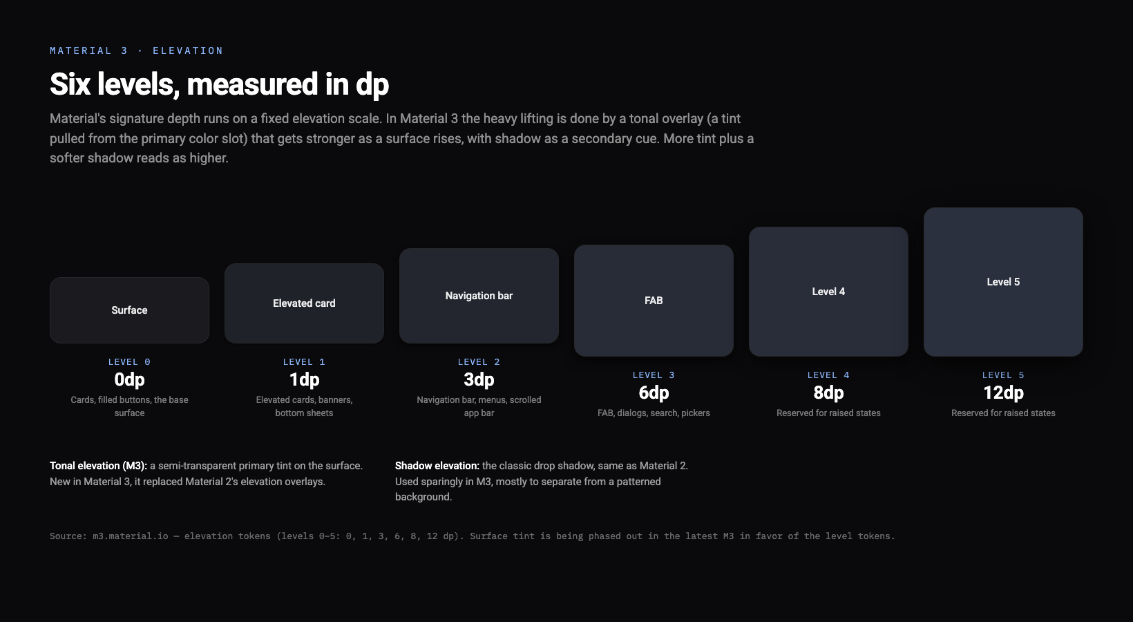
This is the clearest Material 2 versus Material 3 difference, so we mark it: Material 2 leaned on drop shadows and dark-theme elevation overlays, while Material 3 does the heavy lifting with tonal color and treats shadow as a hint. One version-specific honesty note: in the latest Material guidance, the surface tint color is being phased out in favor of the elevation level tokens (0 through 5), so check the live docs before hardcoding a tint. Why it works: tone reads as depth even on a flat, shadow-light dark UI, which is exactly the kind of interface designers build in 2026.
What is Material's shape system?
Material defines a shape scale of seven corner styles, from square to fully circular, so roundedness is a token instead of a guess. The default corner radii (Material Components):
| Shape token | Corner radius |
|---|---|
| None | 0dp |
| Extra small | 4dp |
| Small | 8dp |
| Medium | 12dp |
| Large | 16dp |
| Extra large | 28dp |
| Full | 50% (pill) |
Why it works: shape becomes semantic, the same way type and color are. Cards default to Medium (12dp), a FAB to Large (16dp), and a search bar to Full, so corners stay consistent across a product without anyone eyeballing a radius. Newer Material versions add increased steps (a 20dp and a 32dp variant, plus a 48dp extra-extra-large), so treat the seven above as the core scale, not the whole list.
What is the Material design token model?
Material's tokens are organized in three tiers, which is the part most worth stealing for your own system. Reference tokens are the raw palette and type values (a tone in a tonal palette). System tokens assign those to a role with semantic meaning, like md.sys.color.primary or md.sys.typescale.body-large. Component tokens map system tokens to a specific component part, like the container color of a filled button. You design and theme against the system tier, and every component updates underneath.
Why it works: the same indirection that makes dynamic color possible (roles, not hex) is what lets a single theme change cascade through hundreds of components. It is the cleanest public example of the token layer the what is a design system guide describes as the foundation everything else is built on.
What are Material's signature components?
The taste section: the components that make a screen read as Material. The Floating Action Button (FAB) is Material's own invention, a circular Large-shape button for the single most important action on a screen, raised to elevation Level 3. Cards come in filled, elevated, and outlined variants on the Medium corner. And navigation is a family: the navigation bar at the bottom on phones, the navigation rail on the side for larger screens, and the navigation drawer for deep app structures. Why it works: each component already knows its shape, elevation, and color roles, so a default Material screen is coherent before you change a thing.
Your copyable Material DESIGN.md
The take-home asset, built from the verified public values above, in the canonical section order. Dynamic color means the hexes are a baseline reference, so the file says so and points your agent at the role names.
---
name: "Material 3 (Material You)"
colors:
# Material 3 BASELINE scheme (seed #6750A4). With dynamic color on Android 12+,
# these regenerate at runtime from the user's wallpaper. Design to the ROLE names.
primary: "#6750A4"
on_primary: "#FFFFFF"
primary_container: "#EADDFF"
secondary: "#625B71"
tertiary: "#7D5260"
error: "#B3261E"
surface: "#FEF7FF"
on_surface: "#1D1B20"
outline: "#79747E"
roles: [primary, on-primary, primary-container, secondary, tertiary, error, surface, on-surface, outline]
note: "13-tone tonal palette (0 to 100) per key color, derived via the HCT color space"
typography:
# Roboto is the open default; Roboto Flex is the variable version.
# Google Sans is Google's proprietary brand face, not for general third-party use.
font_family: "'Roboto', 'Roboto Flex', system-ui, sans-serif"
scale:
  display: { large: 57, medium: 45, small: 36 }
  headline: { large: 32, medium: 28, small: 24 }
  title: { large: 22, medium: 16, small: 14 }
  body: { large: 16, medium: 14, small: 12 }
  label: { large: 14, medium: 12, small: 11 }
shape:           # corner radius in dp
none: 0
extra_small: 4
small: 8
medium: 12     # default card corner
large: 16      # default FAB corner
extra_large: 28
full: "50% (pill)"
elevation:       # dp, levels 0 to 5
levels: [0, 1, 3, 6, 8, 12]
model: "tonal overlay from primary, plus an optional shadow"
principles:
- "Design to color ROLES, not raw hex; light and dark come for free."
- "Depth from tone first, shadow second."
- "Let tonal palettes carry hierarchy; one primary family, neutrals do the rest."
---

## Overview
Open, generative product UI. Roles and tones carry the system; dynamic color personalizes it.

## Colors
Use role names (primary, surface, on-surface), never raw hex. Each role is a fixed tone,
so dark mode is a tone swap, not a second palette.

## Typography
Roboto on the M3 scale. Pick a subset of the 15 styles; roles are device-agnostic.

## Layout
Corners from the shape scale (cards 12dp, FAB 16dp, search Full). Depth from tonal elevation.

## Components
FAB for the one key action, cards on the Medium corner, a bottom navigation bar.

## Do's and Don'ts
- Do: design to color roles so dynamic color and dark mode just work.
- Do: use tonal elevation for depth before reaching for a shadow.
- Don't: ship Google Sans; it is proprietary. Use Roboto.
- Don't: hardcode a dynamic-color hex as final; it regenerates from the wallpaper.
Design a Material-style UI in one prompt
The values pin the look; the prompt drives the layout and feel. Paste the DESIGN.md above as context, then run this:
Design a Material 3 (Material You) analytics dashboard: a dynamic-color scheme
from a single seed color with semantic roles (primary, primary-container, surface,
on-surface), Roboto type on the M3 scale, 12dp Medium corners on cards, tonal
elevation for depth, a bottom navigation bar, and one floating action button for
the primary action. Output React and Tailwind.
Run it in the web app, or drive it from Claude Code or Cursor via the Superdesign skill so it reads your repo first and reuses your real components. Copy the file, paste the prompt, fork a few directions on the canvas, and you have a Material-flavored dashboard in about a minute. Ping us if it drifts and we will tune the file together.
For the bigger picture, start with what is a design system, then see the format behind the file in what is DESIGN.md and designing by feel in what is vibe design. Browse more visual languages in the design styles encyclopedia, and grab tested prompts from the community prompt library. Want the same teardown on another company? See how Apple, Airbnb, Atlassian, and Uber build their UI.