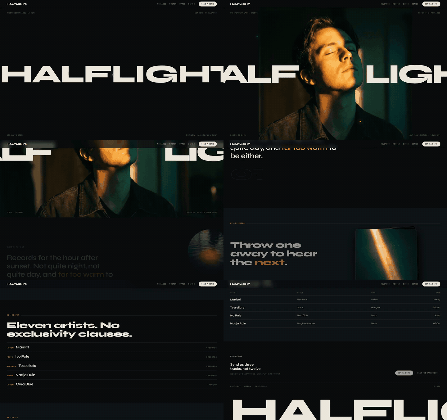
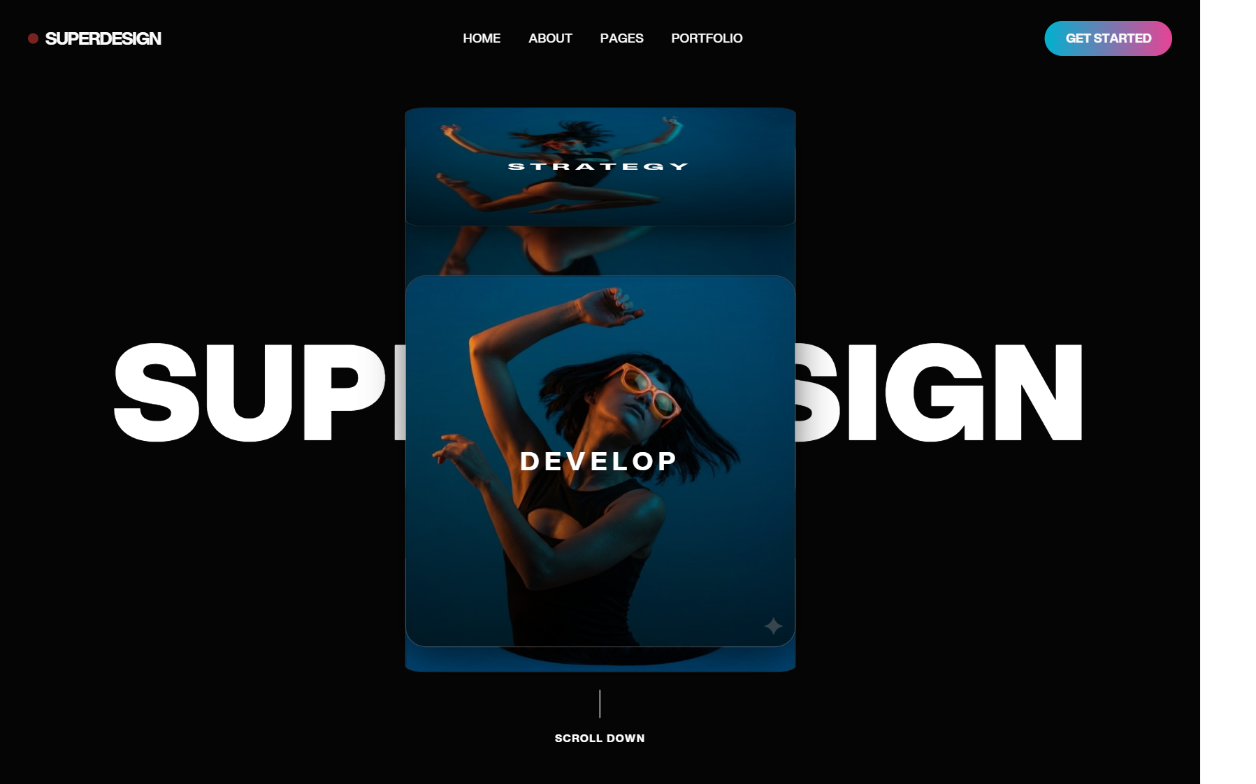
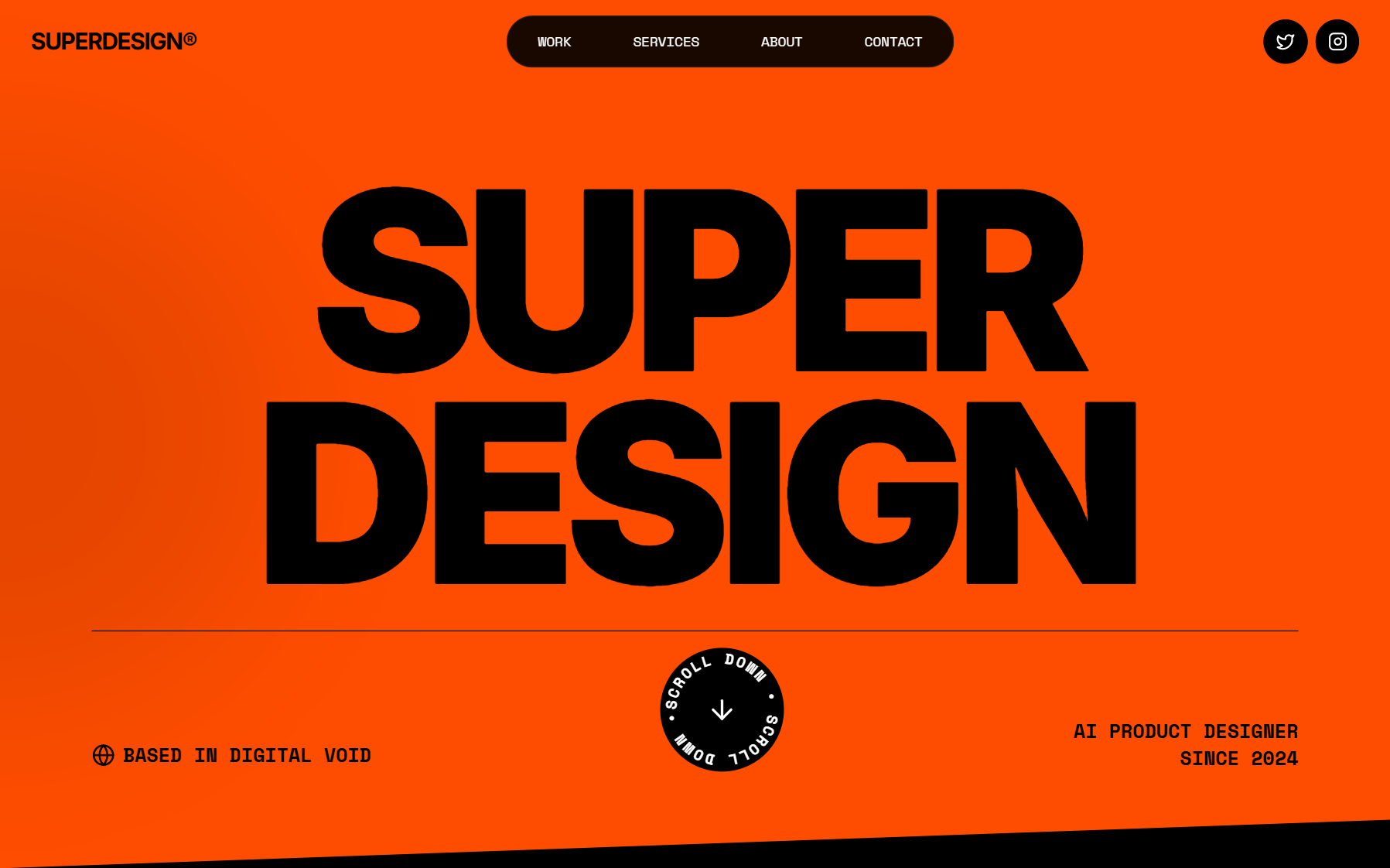
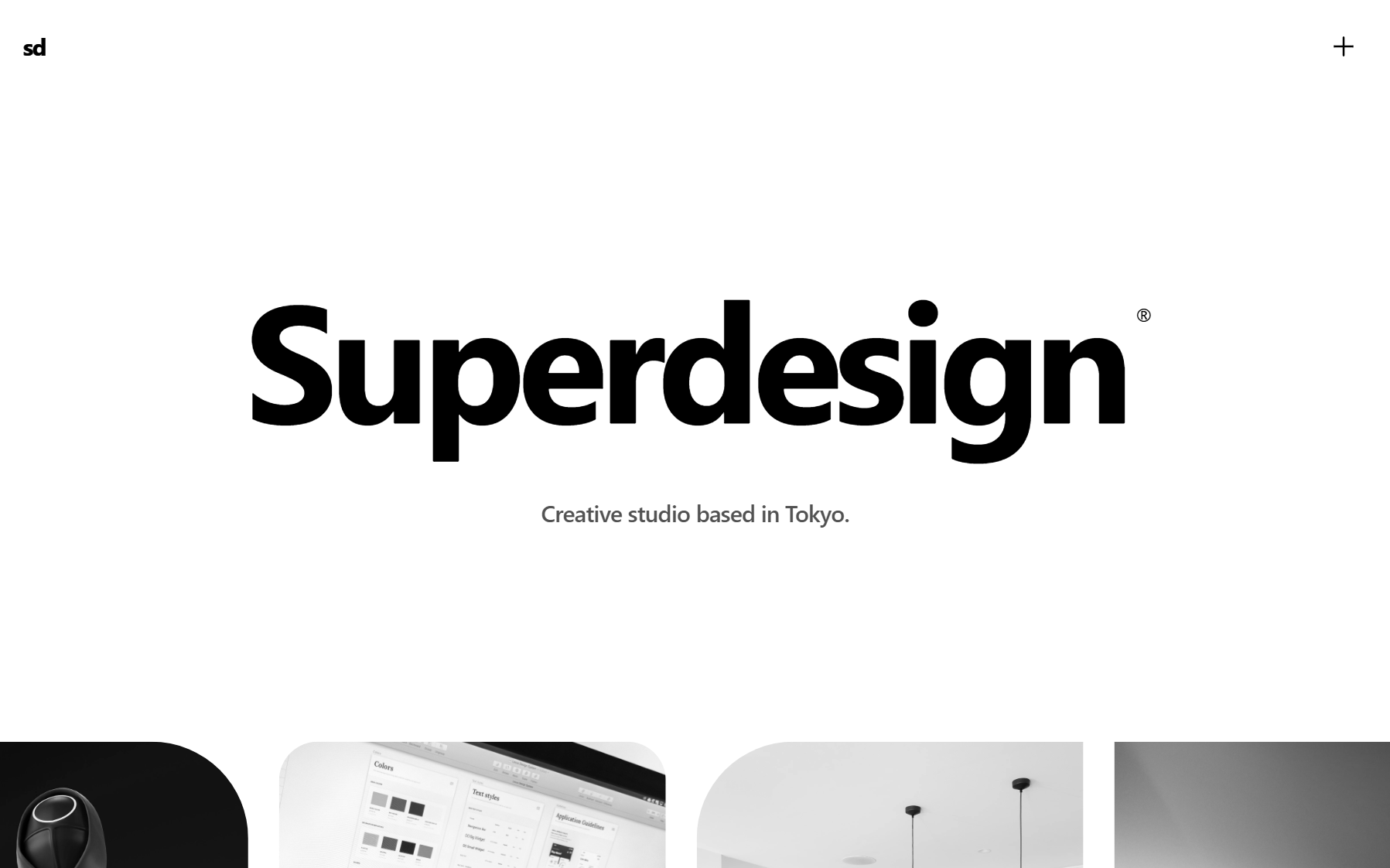
This is the landing-page fix list. For why it happens at all, read why AI design looks generic; for the same fix across UI generally, see our broader guide. If you want the from-scratch landing-page workflow first, start with How to Build a Converting AI Landing Page From a Prompt, then come back here to make the result not look like everyone else's.
TL;DR: AI landing pages look generic for a boring reason: every generator is trained on the same web, so from a vague prompt they all reach for the same seven headline formulas, the same centered hero, the same three feature cards, and the same purple gradient. The fix is not a cleverer first prompt. It is a short critique-and-fix loop: generate, name the generic tells, then re-generate specific sections with real constraints. Below are the six tells to look for and the exact constraint prompt that kills each one.
The first draft is not the deliverable anymore
If you have generated a landing page with AI recently, you have probably felt it: the page is fine, it is fast, and it looks exactly like the last ten AI pages you saw. You are not imagining that. Every AI landing page tool produces the vast majority of the same copy, because they are all fine-tuned on the same public web and they all default to "The AI-powered [thing] for modern [audience]" when your prompt is thin.
The interesting shift in 2026 is that people have stopped treating the first draft as the answer. The pattern showing up everywhere right now is "AI builds it, you fix it": generate a draft, then critique what is working, what feels off, and fix it deliberately. That refinement pass, not the generation, is where a page stops looking generic. This piece is that pass, written down.
The six generic tells (a 60-second audit)
Open your AI-generated page and check for these. If you have four or more, you have an average page, not a distinctive one.
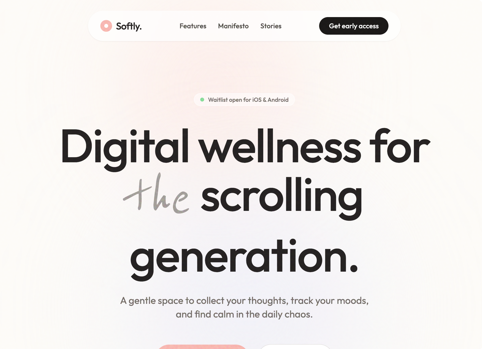
- The mad-lib headline. "The AI-powered [X] for modern [Y]." It describes a category, not a promise. A real headline names the outcome the visitor wants.
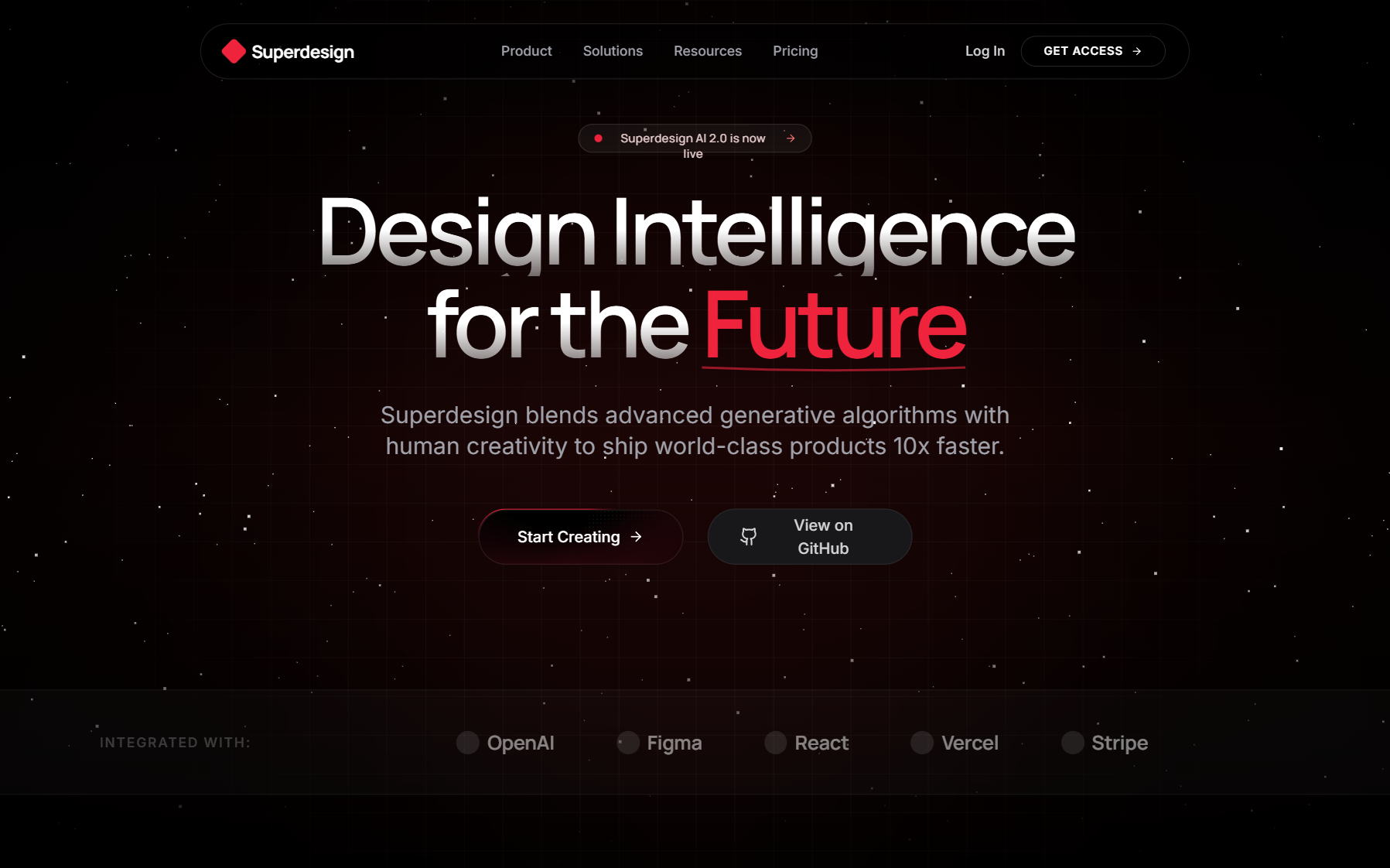
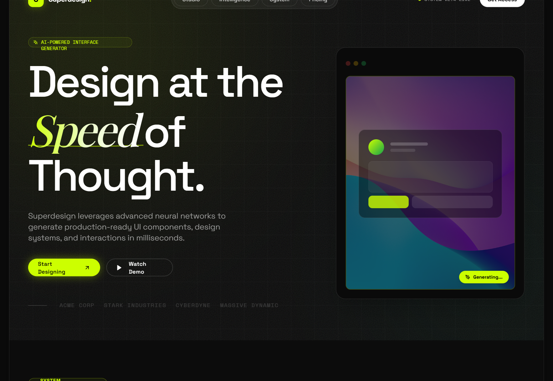
- The centered hero with a gradient blob. Big centered H1, subhead, two buttons, a soft purple-to-indigo glow behind it. It is the default because it is safe.
- The three-feature-card row. Always three, always an emoji or a thin-line icon, always a two-word title and a lorem-ish sentence. Three is what the model picks when you did not say.
- The default palette. Indigo/violet on white, one accent, subtle gradients. It is the "AI startup" uniform.
- Stock section order. Hero, logos, three features, a testimonial, pricing, CTA - in that exact order, every time.
- Benefit copy that could belong to anyone. "Save time. Work smarter. Scale faster." True of every product, specific to none.
None of these are broken. They are just average, and average is invisible.
The fix: a critique-and-fix loop, section by section
The mistake is re-rolling the whole page with a slightly longer prompt. You get a different average page. Instead, keep the structure that works and fix the specific tells, one section at a time. Here is the loop.
Step 1: Fix the promise, not the page. Before touching design, rewrite the headline against a real buyer. Constraint prompt:
Rewrite the hero for [specific buyer, e.g. "solo founders launching their first SaaS"].
Headline = the single outcome they want in their words, not a category description.
Subhead = who it is for + the one reason to believe. No "AI-powered", no "modern", no adjectives
that would be true of any competitor.
Step 2: Break the default hero shape. Constraint prompt:
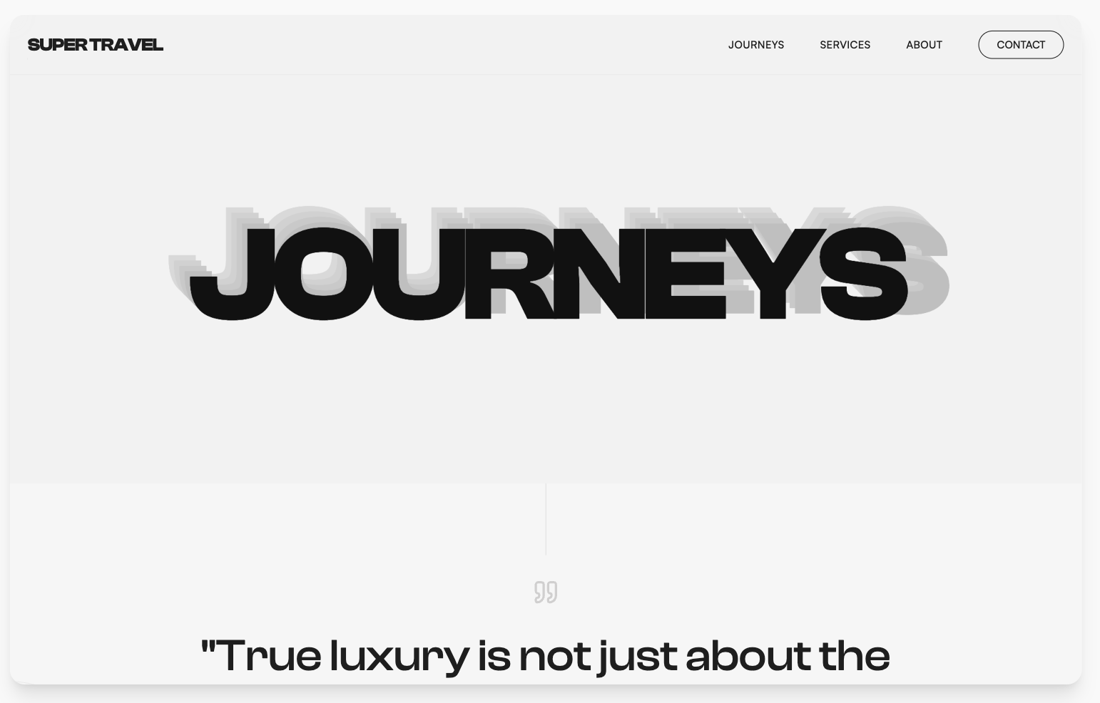
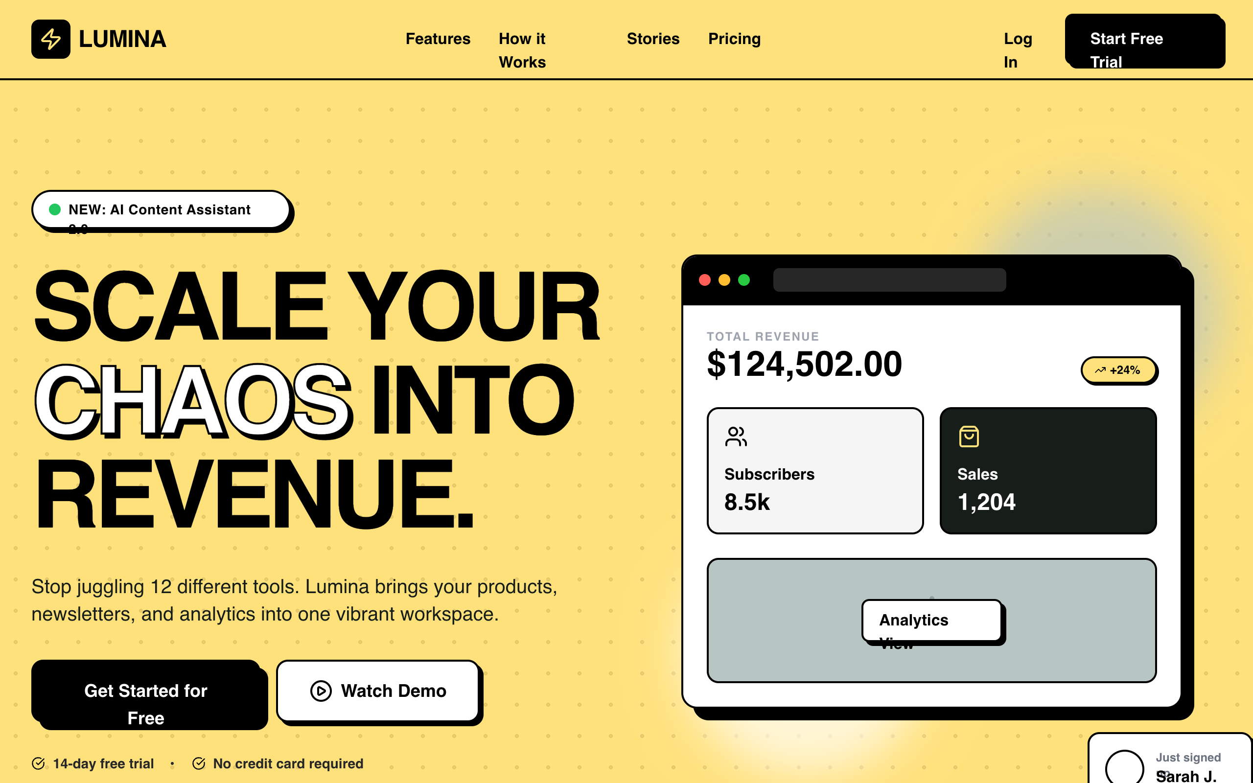
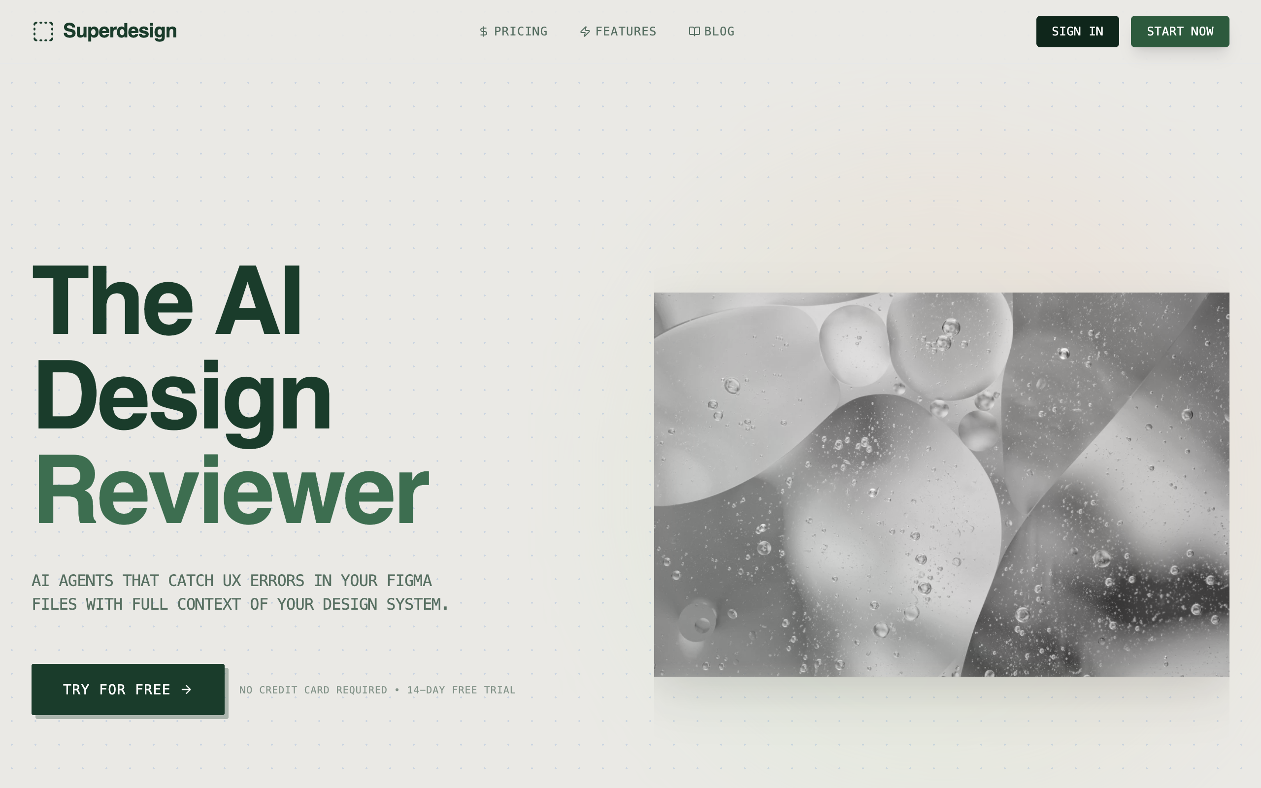
Redesign the hero away from the centered-with-gradient default. Try a left-aligned hero with a
real product screenshot on the right, no gradient blob, one accent color drawn from the product,
generous whitespace. Show the product, do not decorate around it.
Step 3: Make the features specific and asymmetric. Constraint prompt:
Replace the three identical feature cards with 2 to 4 sections of different sizes, each tied to a
concrete job the buyer is trying to finish. Lead each with a real specific (a number, a before/
after, a named workflow), not a two-word title. Drop the emoji icons.
Step 4: Constrain the visual system. Pick a palette that is not the default. Constraint prompt:
Re-theme with a specific palette: [name 2-3 real hex values or a mood, e.g. "warm off-white
background, ink-black text, a single burnt-orange accent"]. No purple, no gradients, one accent
used sparingly. Type: one strong display face for headings, one readable sans for body.
Step 5: Reorder for your actual argument. The stock order (hero, logos, features, testimonial, pricing, CTA) is a template, not your story. If your proof is stronger than your features, move proof up. If price is your wedge, do not bury it.
Step 6: Generate variants and pick, do not settle. This is where an infinite canvas beats a single-output builder. Instead of one page you either keep or re-roll, lay down three real directions of the hero side by side, keep the strongest, and branch it. This is also how the e-commerce crowd A/B tests: spin up multiple versions of a section and compare, rather than betting the launch on one draft.
Where Superdesign fits
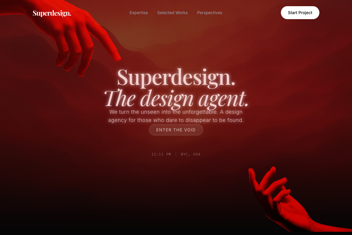
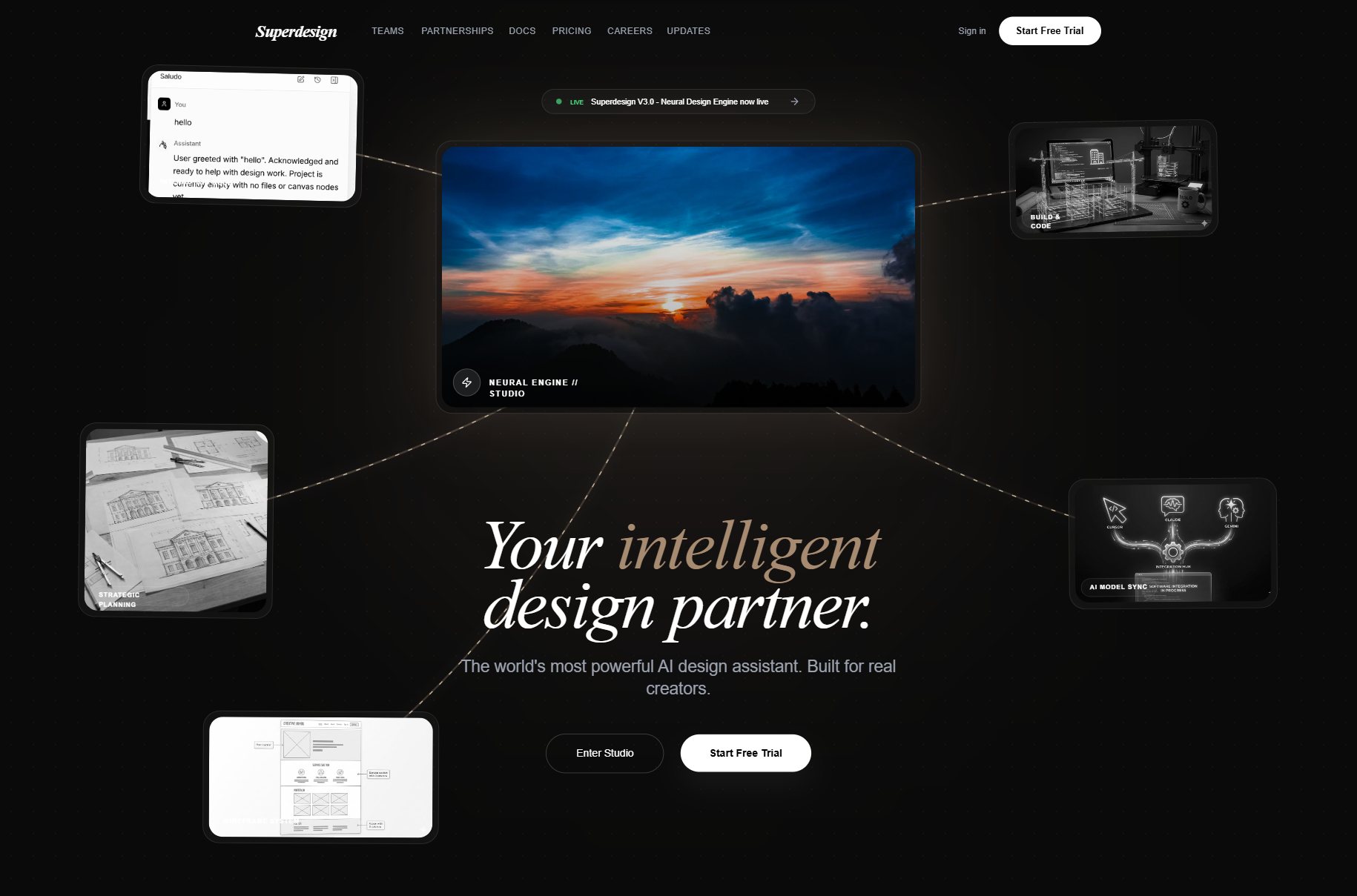
This critique-and-fix loop is the whole point of designing on a canvas instead of accepting one generated page. You describe the page in plain language, Superdesign generates it as real components, and then you iterate: fix the headline, re-shape the hero, branch three palettes, keep the winner. You can drive it two ways, from the web app or as the Superdesign skill inside Claude Code or Cursor, so the "fix it" pass lives right next to where you build.
Two links worth having open while you do this:
- The hub, for building the page in the first place: How to Build a Converting AI Landing Page From a Prompt.
- The prompt library for landing-page prompts you can start from instead of a blank box.
FAQ
Why do all AI landing pages look the same? Because the generators are trained on the same web and default to the same safe patterns (the mad-lib headline, centered gradient hero, three feature cards) whenever the prompt is vague. Specific constraints are what break the default.
Is the fix just a longer prompt? No. A longer prompt usually gives you a different average page. The fix is a section-by-section critique-and-fix loop: keep what works, name each generic tell, and re-generate that one section with a real constraint.
What is the fastest single change? Rewrite the headline against a specific buyer as the one outcome they want. It resets the tone of the whole page and it is a 30-second edit.
Can I do this without design skills? Yes. You are not drawing anything. You are describing constraints ("no gradient", "one accent", "lead with a number") and picking between variants.
What does it cost? There is a free tier to start, plus a flat $20/month plan when you need more.
Superdesign is an AI product design agent. Describe the interface you want in plain language and it generates UI mockups, components, and full designs on an infinite canvas, then iterates with you. Two ways in: prompt it on the web app, or drive it from your coding agent with the Superdesign skill for Cursor and Claude Code. It is free to start. (Note: this is our current product, not the old open-source IDE extension.) Start at superdesign.dev or browse the prompt library.