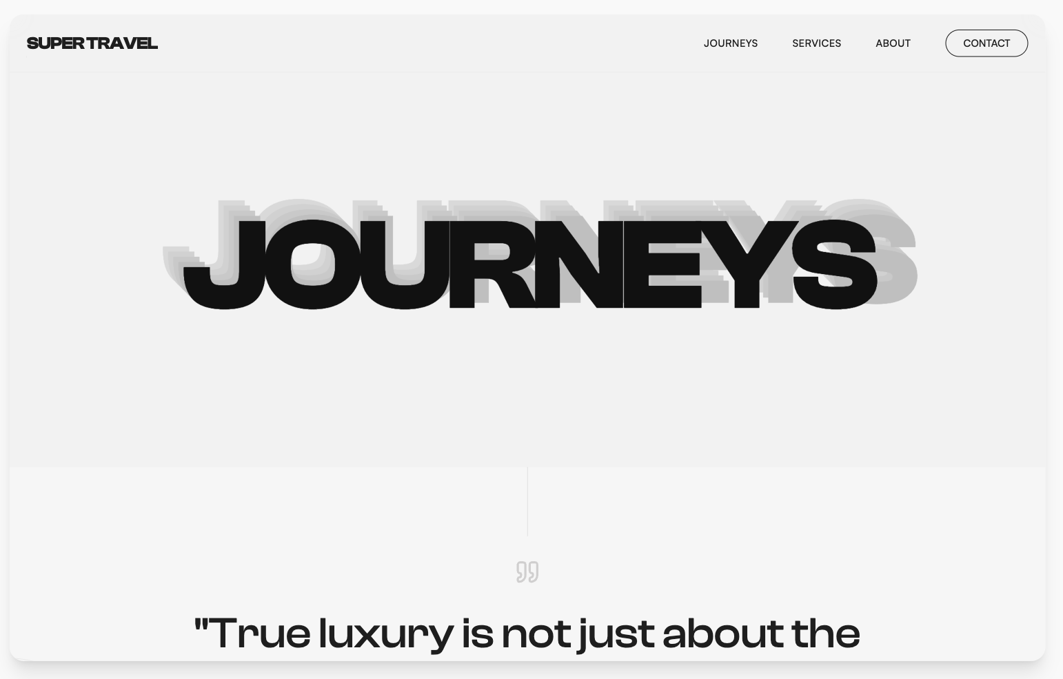
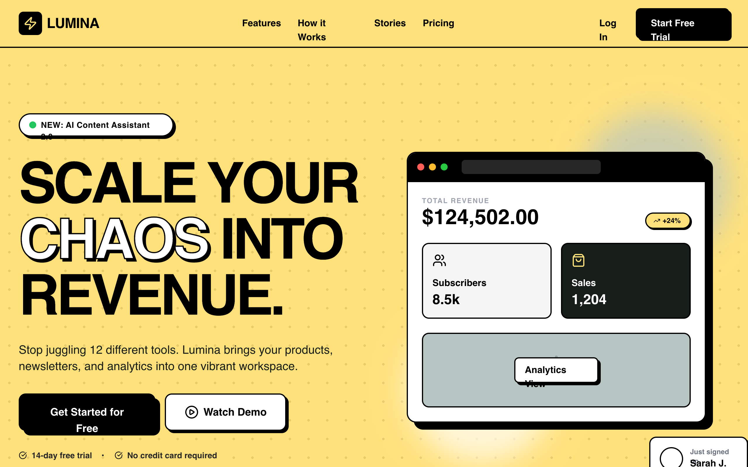
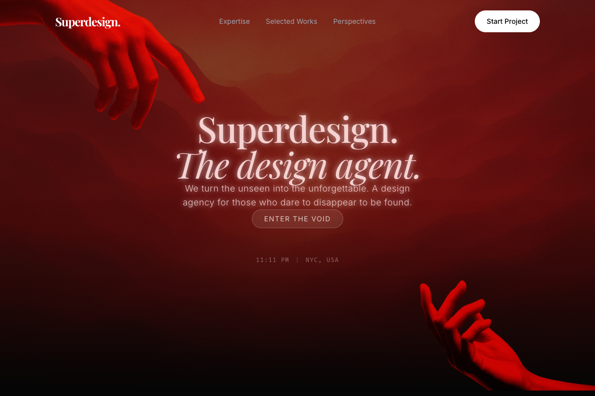
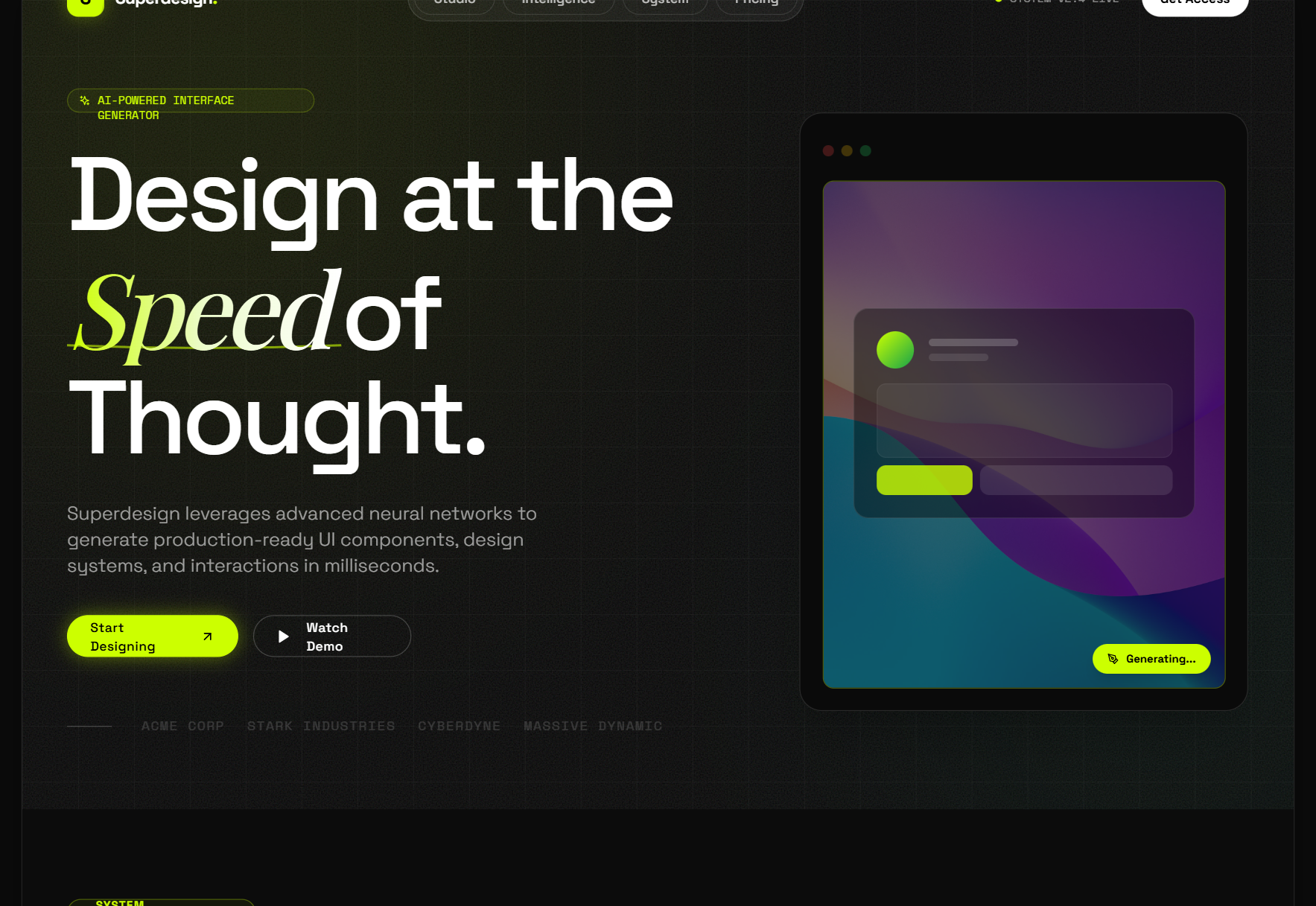
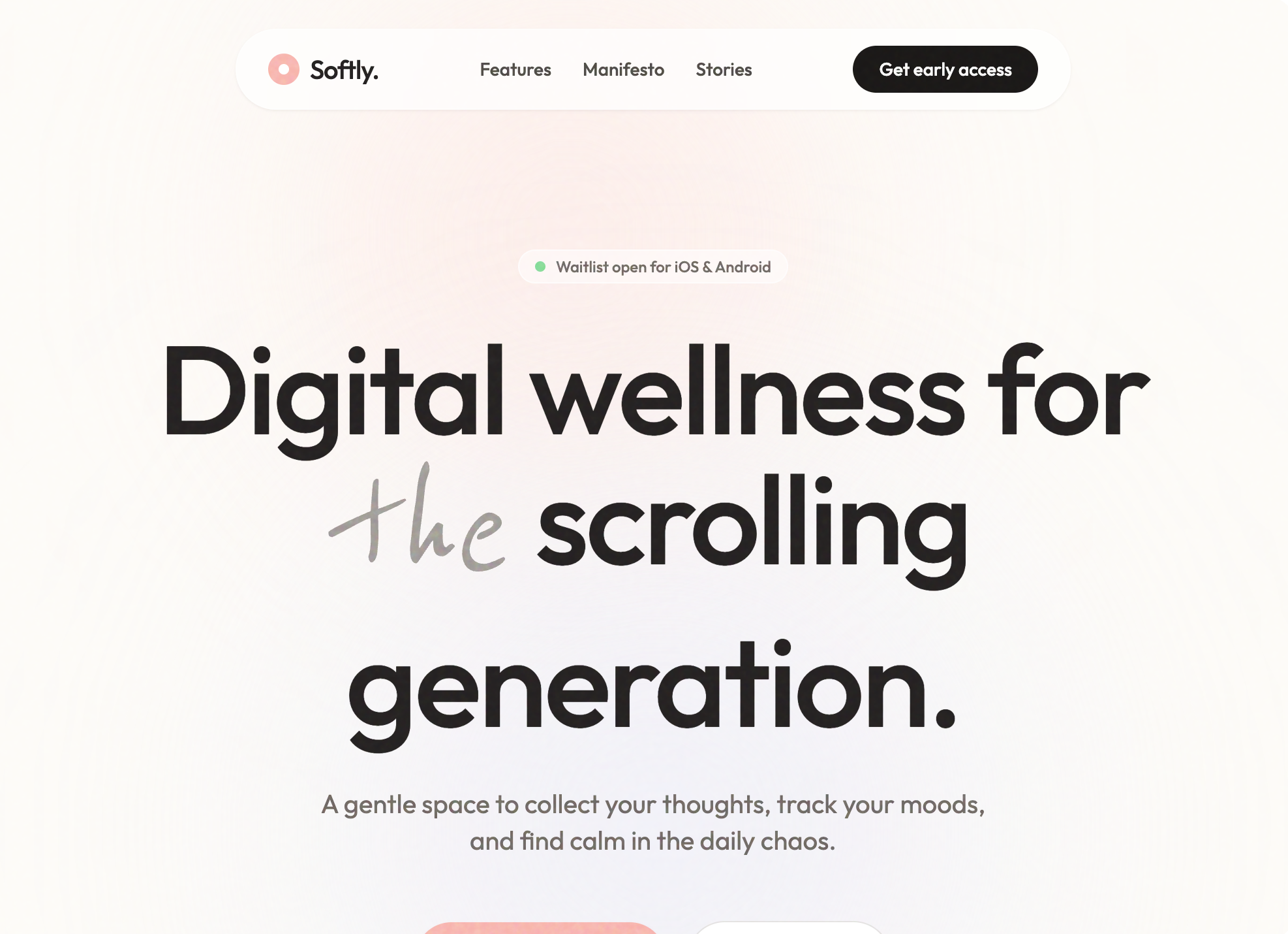
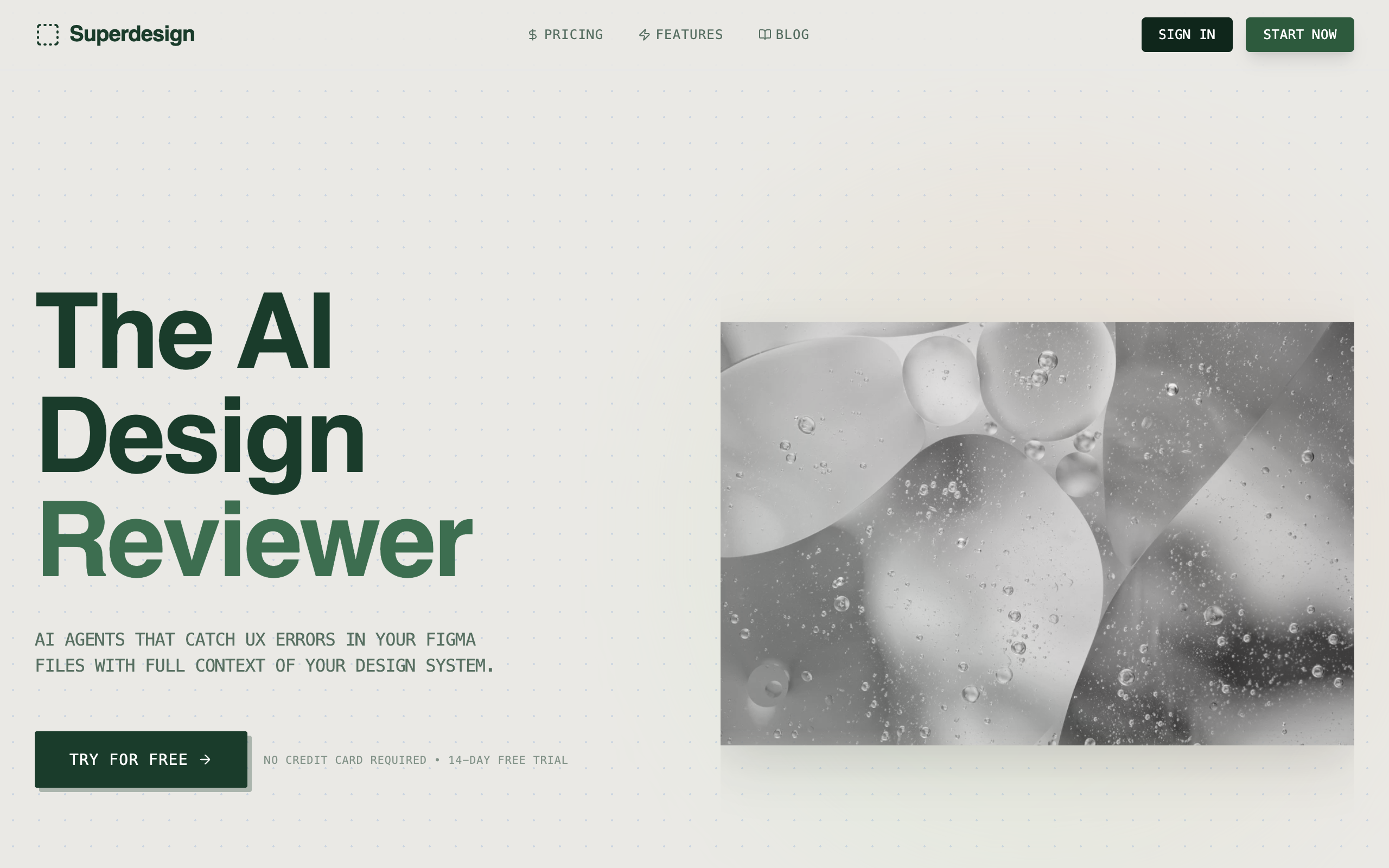
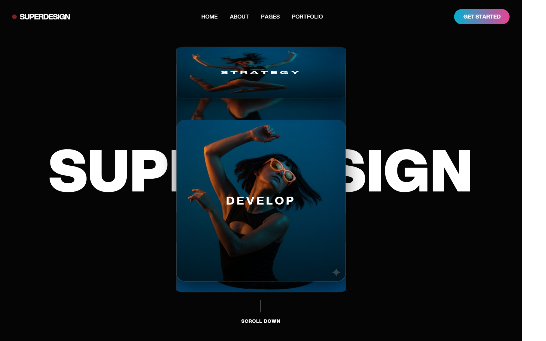
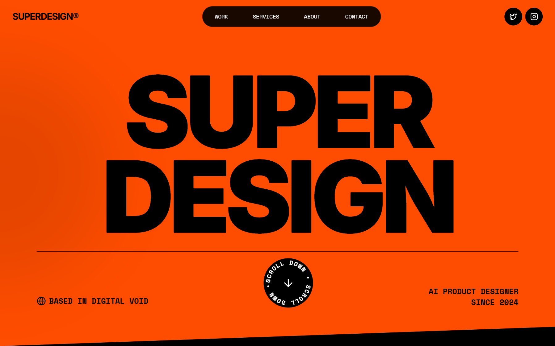
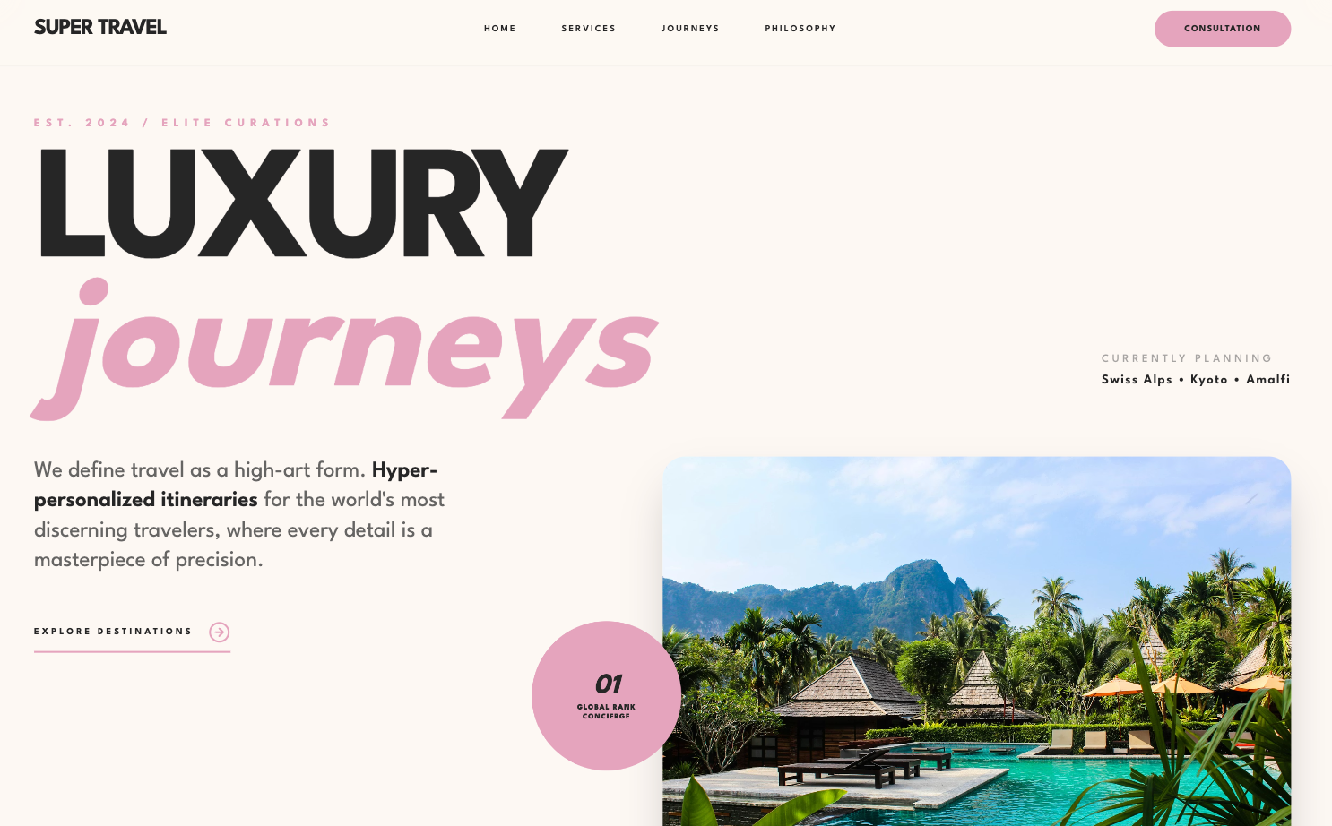
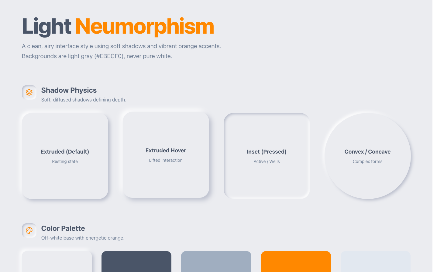
These are eight ChatGPT design prompts you can copy, paste, and use today. None of them is a "make it beautiful" line, because those do nothing. Each one is engineered around what ChatGPT actually gets wrong when you ask it to design: it answers with a description or a single image instead of a usable interface, it forgets your style between asks in the same chat, and left alone it converges on the same generic look as every other model. Fix those three and the same chat that gave you a purple gradient yesterday gives you screens you would ship.
One thing up front. ChatGPT now has a plugin directory again, and design plugins change what some of these prompts can do: with one connected, the output is an editable draft instead of a picture of one. I reviewed the whole shelf in ChatGPT design plugins, and ours lives at Superdesign for ChatGPT. The prompts below note where a plugin changes the answer, but every one of them also works in a bare chat.

Why ChatGPT needs different design prompts
Because its failure mode is different from a coding agent's. Claude Code or Cursor will write you working CSS it cannot see. ChatGPT's problem is earlier in the pipeline: ask it to "design a dashboard" and you get either an essay about dashboards or an image of one, with garbled labels and fake data you cannot edit. Then ask for the pricing page and it restyles everything, because nothing in the chat pinned the first screen's decisions down.
So the prompts that work are the ones that force three things the chat does not do on its own: commit to one named direction before generating, write the design decisions down as an artifact the rest of the conversation must obey, and change the thing it already made instead of rolling a new one. That is what the eight below do, in order.
1. The design brief prompt
Run this before asking for any screen. It stops the "average of everything" output by making ChatGPT commit to a direction first, in words, where you can veto it cheaply.
Before designing anything, propose 3 distinct visual directions for [product,
one line on who it is for]. For each: a name, the typeface pairing, the color
stance (one dominant, one accent), the layout personality, and one real product
that feels adjacent. Make the three genuinely different, not variations of one
safe idea. No purple gradients, no Inter, no glassmorphism unless you can argue
for it. Wait for me to pick one before you design a single screen.
The point is the veto. Ten seconds of reading three named directions beats twenty minutes of "hmm, make it cleaner" against a screen that was never pointed anywhere.
2. The design-system prompt
ChatGPT has no design memory inside a conversation, so give it one. After you pick a direction, make the decisions an explicit artifact. Everything later in the chat gets held against this.
Turn the direction I picked into a design spec I will reuse. Format it as a
short rules block: fonts (display, body, mono), the full color set as
variables (background, surface, text, one dominant, one accent, semantic
states), spacing unit, corner radius, border and shadow treatment, and three
DO NOT rules for this direction. From now on, every screen, image, or deck you
produce in this chat must follow this spec exactly. If I ask for something that
violates it, tell me before doing it.
In a bare chat this is a pinned block of text and it works better than it has any right to. With a design plugin connected, the design system is an actual object that persists across chats and projects, which is the difference I care most about; the pillar covers which plugins treat the system as state.
3. The reference prompt
"Clean and modern" is not a reference, it is an invitation to the average. ChatGPT is multimodal, so hand it the real thing.
[attach 1-2 screenshots of UI you admire]
First, tell me WHY this interface works: the type scale, the spacing logic,
the color discipline, what it refuses to do. Then apply those principles, not
the pixels, to a [screen type] for [product]. Keep my design spec from above.
Do not copy the reference's brand, copy its decisions.
The "why first" step matters. Made to articulate the principles, the model designs from them; skipped, it pastes the reference's surface onto its own defaults. Finding a good reference is the genuinely hard part, and the last section covers where I get mine.
4. The multi-screen consistency prompt
This is the ask where bare ChatGPT breaks hardest, and the one that matters most if you are designing a product rather than a poster. Screens two and three drift because nothing holds them to screen one.
Now the [pricing page]. Same product, same design spec, and I mean exactly:
same fonts at the same scale, same color roles doing the same jobs, same
spacing unit, same component shapes. Before you show me anything, list the 5
elements you are reusing from the previous screen to prove continuity. A
stranger should believe both screens shipped from the same repo.
The "list what you are reusing" line is doing the work: it forces a continuity check before generation instead of an apology after. In a bare chat this gets you maybe eighty percent of the way. A plugin that holds the design system as state closes the rest, because a whole flow becomes one operation against one set of tokens instead of a chain of asks that each decay a little.
5. The doc-to-deck prompt
The most underrated design job ChatGPT can do: turn a document into a designed deck instead of a bullet wall. Most decks fail on sameness, every slide the same template with different text.
[attach the doc, report, or notes]
Turn this into a slide deck, and design it, do not template it. One idea per
slide. Vary the slide layouts by what each idea needs: a full-bleed statement
slide, a two-column comparison, one big number, a diagram slide. One visual
system through all of it per my design spec. Flag any slide where my source
material is too thin to carry a slide, instead of padding it with filler.
Bare ChatGPT gives you a solid outline and canvas-style slides. With a design plugin the same prompt returns an actual designed deck you can edit slide by slide and export, which is the demo that convinced me this category is real.
6. The iterate prompt
The default failure loop: you get a draft that is 70 percent right, ask for a change, and receive a brand new draft that is 70 percent right in different places. Cut the re-roll off explicitly.
Change ONLY what I name, keep everything else identical: [make the hero
darker / tighten the pricing card spacing / swap the chart to horizontal].
Do not regenerate the layout, do not refresh the copy, do not "improve"
anything I did not mention. If my change breaks something else, say what,
and wait.
This works better the more concrete your ask is, which is a taste skill, not a prompting skill: you have to see what is wrong. In a plugin that supports draft iteration the instruction is enforced by the tool, because the edit applies to the stored draft rather than to the model's memory of it.
7. The anti-slop block
Paste this once per project, after the design spec. It is the negative space of the system: the list of defaults the model falls into whenever a decision is left open.
Standing bans for everything you produce in this chat: no Inter, Roboto, or
system-ui as display type. No purple-to-blue gradients. No three-feature-cards
row. No emoji as icons. No lorem ipsum, write real placeholder copy for this
product. No drop shadows heavier than the spec allows. No centered wall of
text on a hero. When in doubt, choose the quieter option and tell me the
louder one existed.
Every line targets a specific tell that makes readers think "AI made this" in under three seconds. I wrote up where those tells come from in why AI design looks generic; the ban list is the applied version.
8. The handoff prompt
A design that stays a picture is a to-do item. End the chat by converting the decision into something a build can consume.
We are done exploring. Produce two artifacts from the final direction:
1) The design spec as a complete rules file I can drop into a repo for my
coding agent to follow: tokens, type scale, spacing, components we defined,
the ban list.
2) The [chosen screen] as clean semantic HTML with Tailwind classes, real
copy, and all states included: hover, focus-visible, empty, loading, error.
No frameworks beyond Tailwind, no comments explaining what divs are.
States are the part every model drops and every user hits first, so they are named explicitly. If your workflow ends in a coding agent rather than a chat, the same handoff logic runs in reverse and I keep a separate prompt set for it: Claude Code design prompts.
Where to get references and ready-made prompts
The single variable that decides how far these prompts take you is the reference you feed them. Two habits cover it.
First, keep a swipe folder. Screenshot every interface that makes you pause, and note one line about why. Ten of those beat any adjective you will ever type.
Second, steal from a library instead of starting from zero. The Superdesign prompt library is free and every entry is a browsable pattern: preview the result, tweak the bracketed variables, paste it into ChatGPT or whatever agent you use. Disclosure, I build Superdesign, and the library exists precisely because the gap between a vague prompt and a specific one is the whole game. The wider tool-agnostic collection lives in UI design prompts, and the workflow that sits above all of this is in how to design with AI.