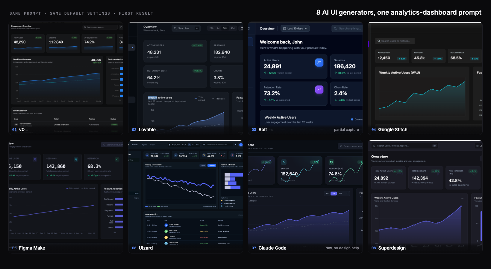
I run Superdesign, which is one of the tools in this test, so I had every reason to rig it. I did the opposite. I gave eight AI UI generators the exact same prompt, used each tool's best available model, took the first result, and did not iterate or cherry-pick. The honest finding surprised me: at the first-draft level, these tools have largely converged. The old "AI UI is always generic slop" story is out of date in 2026. Most of them produced a genuinely usable dark analytics dashboard from one prompt. The real differences show up later, after generation one, and a single screenshot does not capture them.
What I tested
One identical prompt, each tool's best available model, the first result, no iterating, no cherry-picking. That is the whole method, and it is the credibility anchor for everything below: every tool got its strongest shot, and I took the first answer it gave rather than a tuned showcase. I asked every tool for the same dark SaaS analytics dashboard so the comparison would be apples to apples. Here is the exact prompt, word for word:
Design a SaaS analytics dashboard for tracking a product's user engagement. Include: a left sidebar for navigation, a top bar with a date-range filter and a search box, four KPI summary cards (active users, sessions, retention, churn), a large line chart of weekly active users over time, a smaller bar chart of feature adoption, and a recent-activity table below. Use a dark theme. Make it look production-ready.Two honesty notes up front. First, my Bolt capture got cut off above the charts, so I only judge the visible top of that one and say so in its section. Second, I build Superdesign, so weigh its section knowing that; I tried to grade it on the same bar as the rest and name its real limitation, not just its strengths.
The 8 results at a glance
The short version: five of the eight produced a polished, production-looking dashboard on the first try, including the one I least expected (a raw coding agent with no design help). Two had visible first-draft tells. One I could only partly judge. Here is every tool, honestly:
| Tool | Model run (best available) | First-draft verdict | Real feature labels? | Notable tell | Output type |
|---|---|---|---|---|---|
| v0 | v0 Max | Most complete and shippable | Yes | Conventional safe blue dashboard | Hosted React app + code |
| Lovable | Best available | Polished, production-ready | Yes | Slightly more compact layout | Hosted React app + code |
| Bolt | Standard model | Competent (only top visible) | Yes (cards) | My capture was partial | Hosted full-stack app + code |
| Google Stitch | Gemini 3.1 | Fast first draft, unfinished | No (F1 to F4 placeholders) | Purple nav, placeholder labels | HTML and CSS mockup |
| Figma Make | Default (recommended) | Clean and professional | Yes | Conventional indigo | Prototype and code in Figma |
| Uizard | Uizard (proprietary) | Feature-rich but cluttered | Yes | Weekly active line trends down | Editable mockup, limited export |
| Claude Code (raw) | Claude Opus 4.8 | Genuinely strong, not slop | Yes | Multi-color adoption bars | Real code in your repo |
| Superdesign | Gemini 3.1 | Clean, top tier | Yes | The top tools converge here | HTML, editable components (code on handoff) |
Did AI UI converge?
Yes, at the first-draft level it largely has. Six or seven years ago a one-line prompt got you a centered hero, an indigo gradient, and three emoji cards. In 2026, the same dashboard prompt got me real sidebars, real KPI cards with up and down deltas, real charts, and in most cases real feature-adoption labels pulled from a plausible product. That is the genuinely new thing, and it is worth saying plainly even though it is inconvenient for every vendor (me included) who wants to claim a first-draft edge. The tells that remain are subtle, and they are the interesting part, so I will point them out tool by tool.
It helps to know what is under the hood, and the models make the point better than I could. Two tools in this test ran the exact same model: Google Stitch and Superdesign both generated on Gemini 3.1. They did not produce the same screen. One came back with placeholder "F1 to F4" labels, the other with real feature names and prior-period baselines. The rest were a mix: the raw coding agent on Anthropic's Claude (Opus 4.8), Figma Make on its recommended default, Bolt on its standard model, and v0 on its own React-tuned v0 Max. That spread is the real lesson. When two tools call the identical model and still land in different places, the base model is not the differentiator. How each tool frames your prompt, and what it lets you do with the result afterward, is.
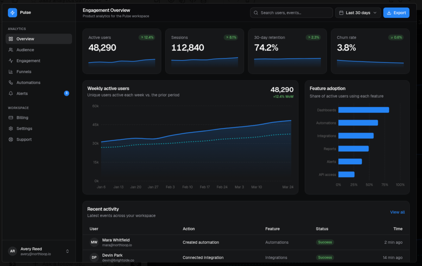
v0
v0 gave me the most complete and shippable result in the set. It called the product "Pulse" and nailed every element in the prompt: real feature-adoption labels (Dashboards, Automations, Integrations, Reports, Alerts, API access), a recent-activity table with avatars, green status badges, and relative timestamps, and a prior-period dotted comparison line on the chart, plus an Export action I did not even ask for. The palette is a restrained blue on near-black. The only mild tell is that it is conventional: this is the safe, well-executed blue dashboard, exactly what a competent team would ship and nothing that surprises you. Execution, though, was flawless.
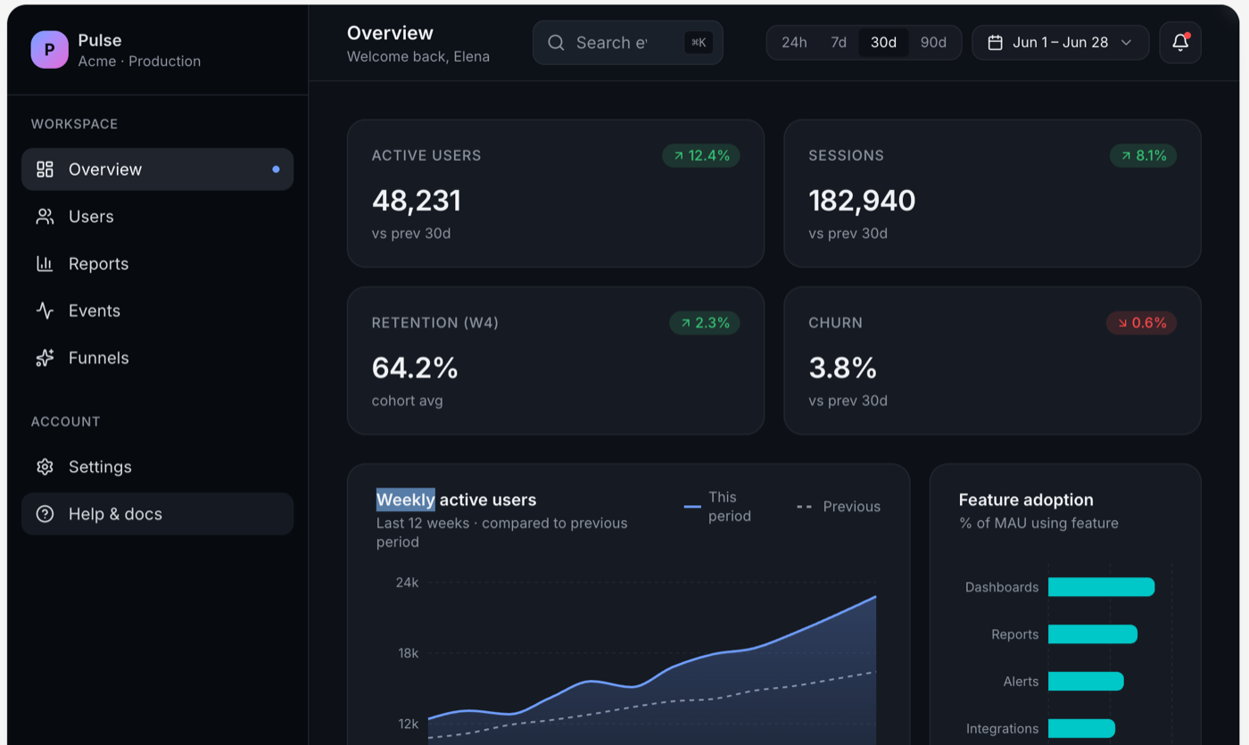
Lovable
Lovable was right there with v0, just slightly more compact. It labeled the product "Pulse / Acme" and marked it Production. It used a teal accent, 24h / 7d / 30d / 90d range pills in the top bar, an area chart with a this-versus-previous legend, and real feature labels. It is polished and production-ready, genuinely comparable to v0. If you put these two side by side without labels, you would be splitting hairs on taste, not quality.
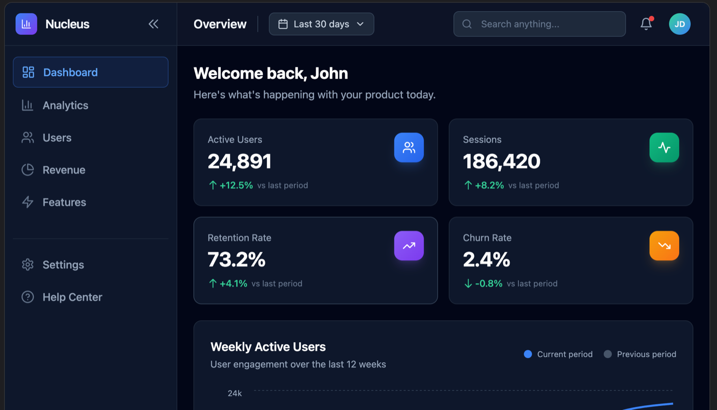
Bolt
Bolt is the one I can only partly judge, so I will be straight about it: my screenshot was cut off above the charts, so I am only grading the visible top. It named the product "Nucleus," opened with a "Welcome back, John" greeting, and laid out four KPI cards with colored icon chips. What I can see is competent, with the cards reading slightly busier than v0's because of the rainbow icon chips. I cannot tell you how its charts or activity table turned out, because I did not capture them, and I am not going to invent them.
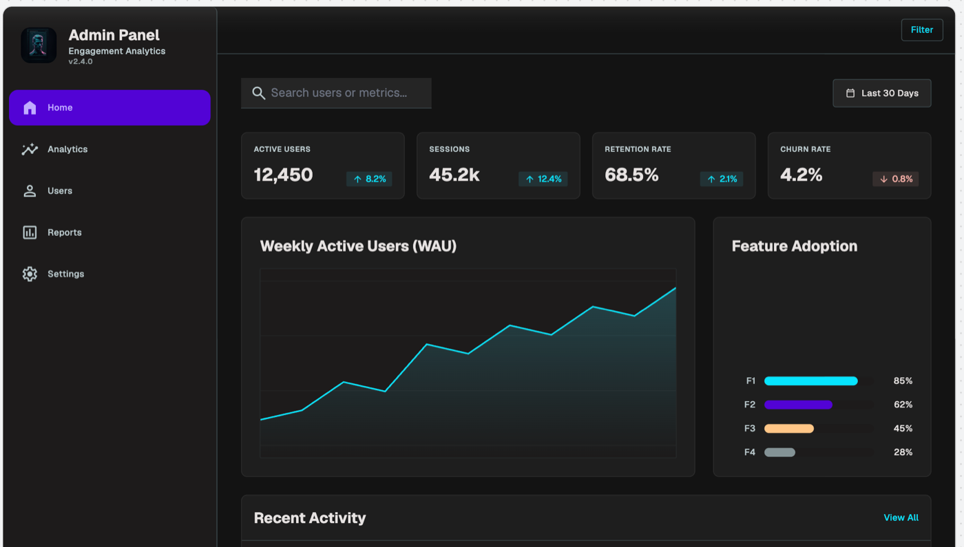
Google Stitch
Google Stitch gave the clearest first-draft tell in the whole set. It titled the page "Admin Panel / Engagement Analytics v2.4.0," used a purple active-nav highlight, and, the giveaway, labeled the Feature Adoption bars with placeholder "F1 / F2 / F3 / F4" instead of real feature names. The fonts are bigger and the title is a generic "Admin Panel." None of this means Stitch is bad; it means this particular output reads as a fast first draft you would keep editing, not a finished screen. With another pass it would close most of that gap. If you are weighing Stitch specifically, I rounded up the Google Stitch alternatives that hand back real code.
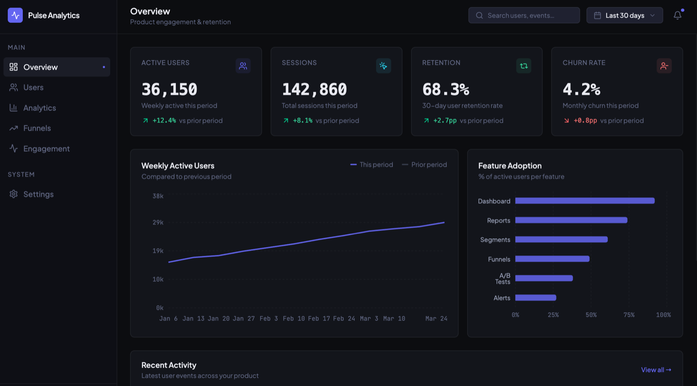
Figma Make
Figma Make produced a clean, complete, professional dashboard called "Pulse Analytics." It used an indigo accent, real feature labels (Dashboard, Reports, Segments, Funnels, A/B Tests, Alerts), and a prior-period dotted comparison on the chart. It sits comfortably in the same tier as v0 and Lovable. Like v0, it leans conventional, but conventional and well-built is a perfectly good place to start a real project.
Uizard
Uizard gave me the busiest and least refined result. It named the product "PulseMetrics," used smaller text and a packed layout, and, oddly for a growth dashboard, its weekly-active-users line actually trends down by default. It is feature-rich but cluttered, and it reads more like a dense wireframe than a polished hi-fi screen. That tracks with what Uizard is built for (fast low-fidelity mockups), but against this prompt it is the most "draft" looking of the bunch alongside Stitch.
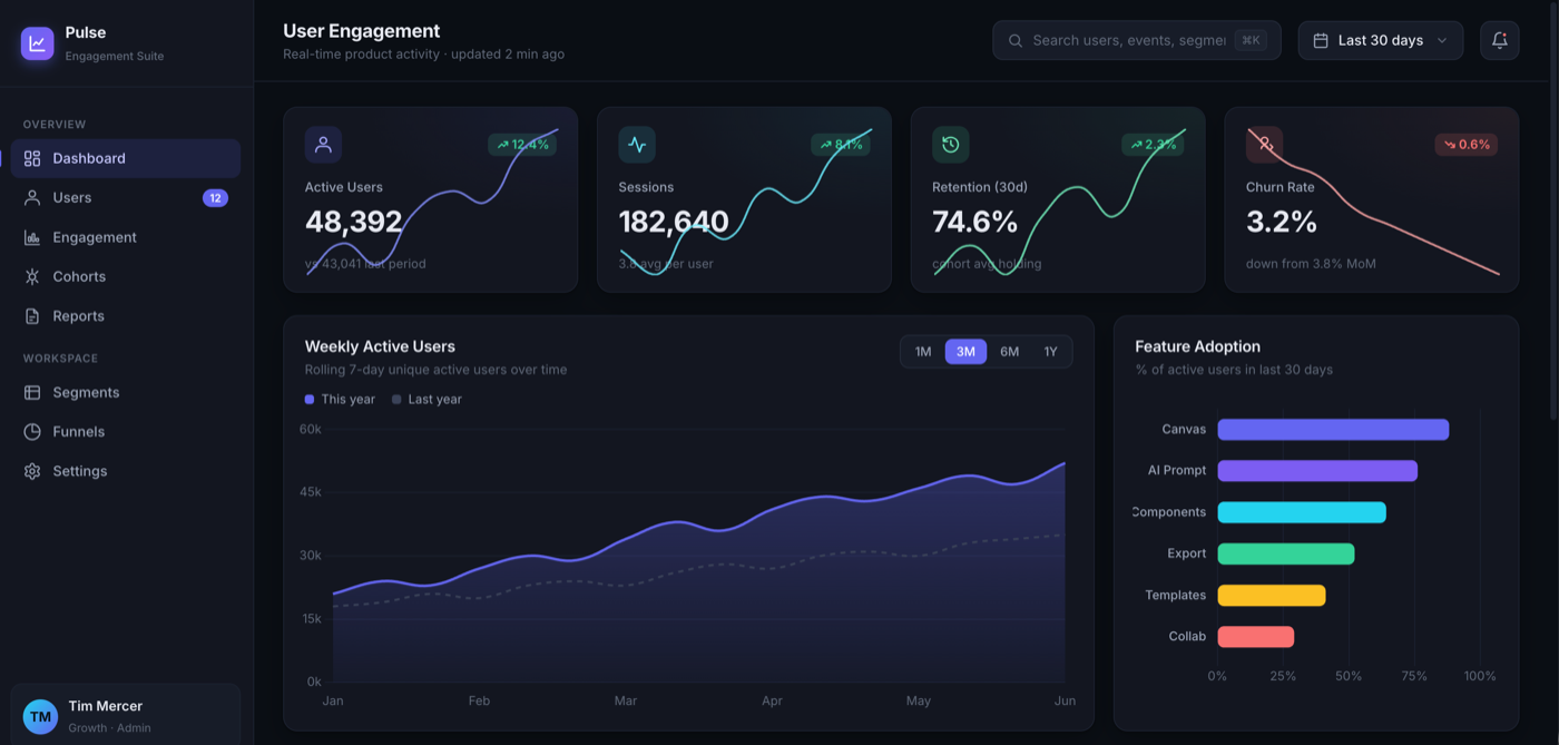
Claude Code (raw)
This was the honest surprise. I gave a raw coding agent, Claude Code with no design help and no design tool involved, the same prompt. The result was genuinely strong, not slop. It named the product "Pulse / Engagement Suite," gave the KPI cards embedded sparklines, put a this-year versus last-year toggle on the chart, and used real feature labels (Canvas, AI Prompt, Components, Export, Templates, Collab). The one mild tell is multi-color adoption bars. The takeaway matters: the lazy claim that "coding agents always make ugly UI" is, in 2026, out of date. A capable coding agent can produce a polished first draft on its own. That is exactly why the interesting question is no longer the first draft.
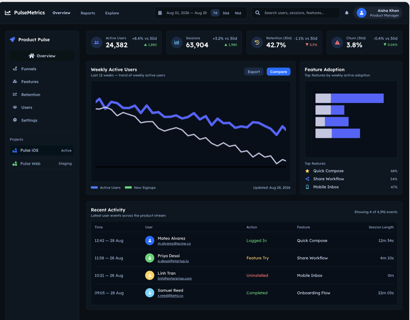
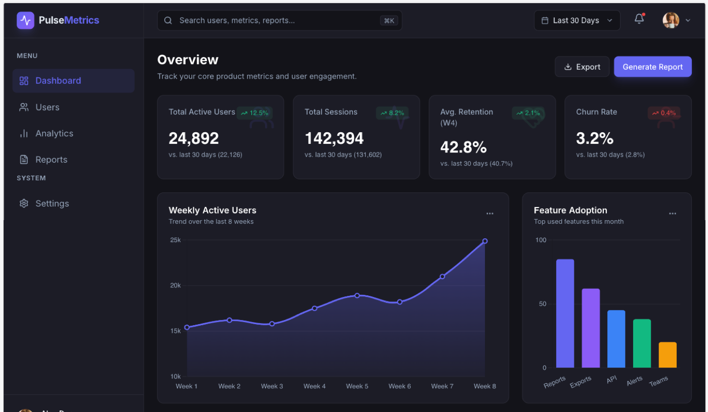
Superdesign
Here is my own tool, graded on the same bar. Superdesign produced a clean, top-tier dashboard called "PulseMetrics," with a few thoughtful touches: the KPI cards show the actual prior-period baseline number (for example "vs last 30 days (22,126)"), there is a "Generate Report" action, the chart axis is tidy, and the vertical feature-adoption bars carry real labels (Reports, Exports, API, Alerts, Teams). And the honest part: it is in the same top tier as v0, Lovable, Figma Make, and the raw Claude Code result. It is not magically prettier at generation one. That is the whole point of this article. At the first draft, the best tools have converged, so I am not going to pretend a single screenshot proves an edge it does not.
Where the real difference shows up
The real differentiator in 2026 is not the first draft, it is everything after it. A single screenshot freezes the one moment where these tools look alike. The work of designing a real product is what happens next: iterating without losing the thread, keeping a design system consistent across twenty screens instead of one, editing the output instead of re-rolling it, and exploring several directions before you commit. That is the gap a one-prompt test cannot show, and it is the actual reason I built a design agent instead of shipping another first-draft generator. I wrote the full argument up separately in design agent vs coding agent; the short version is that a coding agent is graded on "does it run" and a design agent is graded on "is it considered," and those are different jobs once you go past generation one.
For Superdesign specifically, that post-generation edge is concrete: you fork several directions in parallel on an infinite canvas and compare them instead of re-rolling one chat thread, the agent can read your real codebase and extract a design-system file so screen twenty matches screen one, and it hands back real React and Tailwind you own. None of that shows up in the dashboard above. All of it is what you feel on day two. I would rather make that case with this honest test than with a doctored screenshot.
Try the prompt yourself
The fairest way to judge any of these is to run them yourself, so here is the exact prompt again, ready to paste: it is the same dashboard brief I quoted at the top. If you want a faster start than a blank box, the Superdesign prompt library is a large free collection of UI prompts already wrapped in context, and you can take any of them from a prompt to an editable design and on to real React and Tailwind when you want the code. Test a few tools side by side, take the first result on each tool's best model like I did, and see whether your experience matches mine: a converged first draft, and a real difference that only appears once you start iterating.
If you want to feel that post-generation loop, that is the part Superdesign is built for, and there is a free tier to try it on your own project.