TL;DR
Claude Code writes great code. It has no design taste. Out of the box it ships the same UI every coding agent ships: Inter font, a purple-to-indigo gradient, three rounded cards, a blue primary button, and a hero that says "Built for the modern team." That is not a bug in your prompt. It is what happens when a model optimized for plausible code also gets asked to make aesthetic decisions it was never built to make.
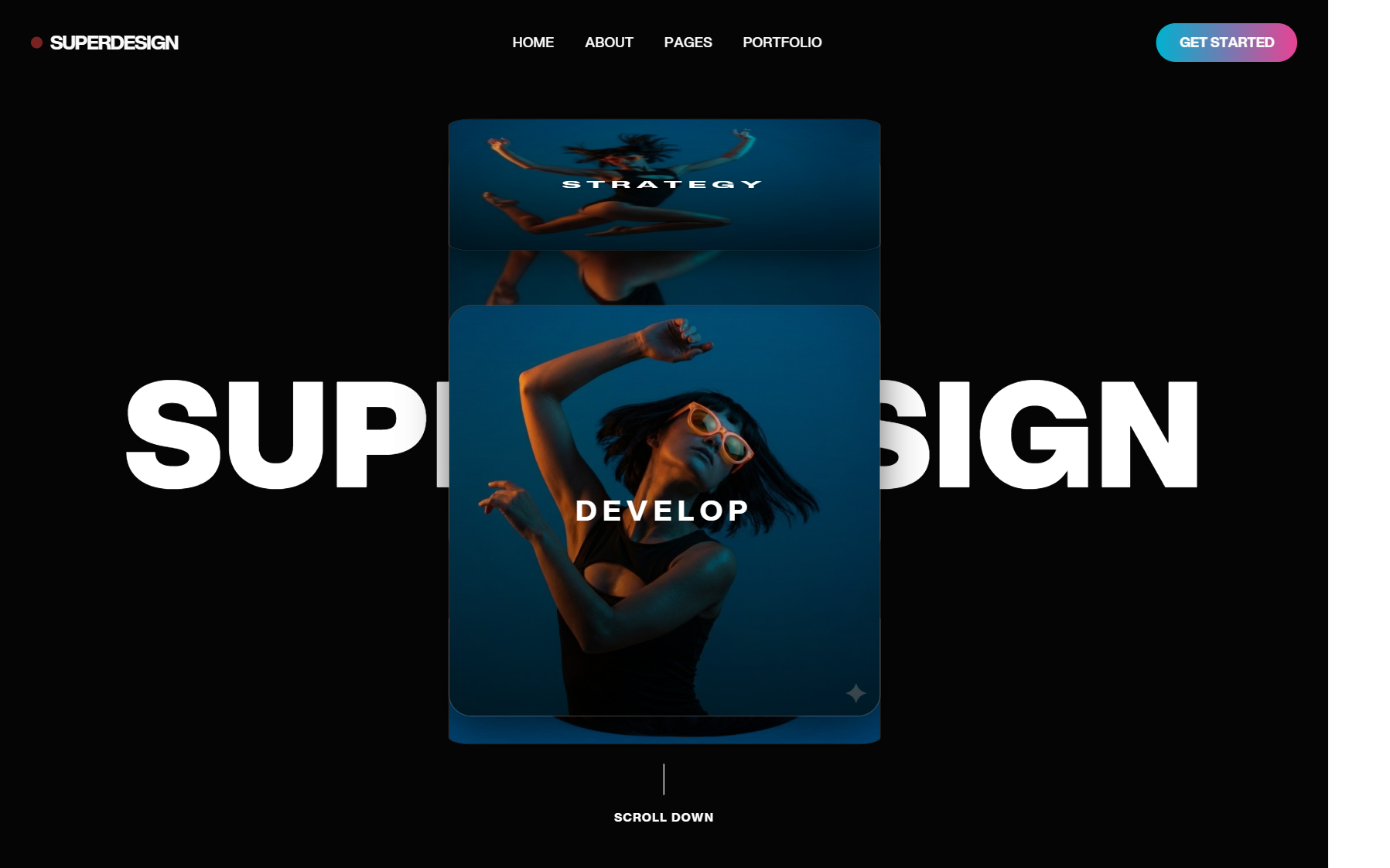
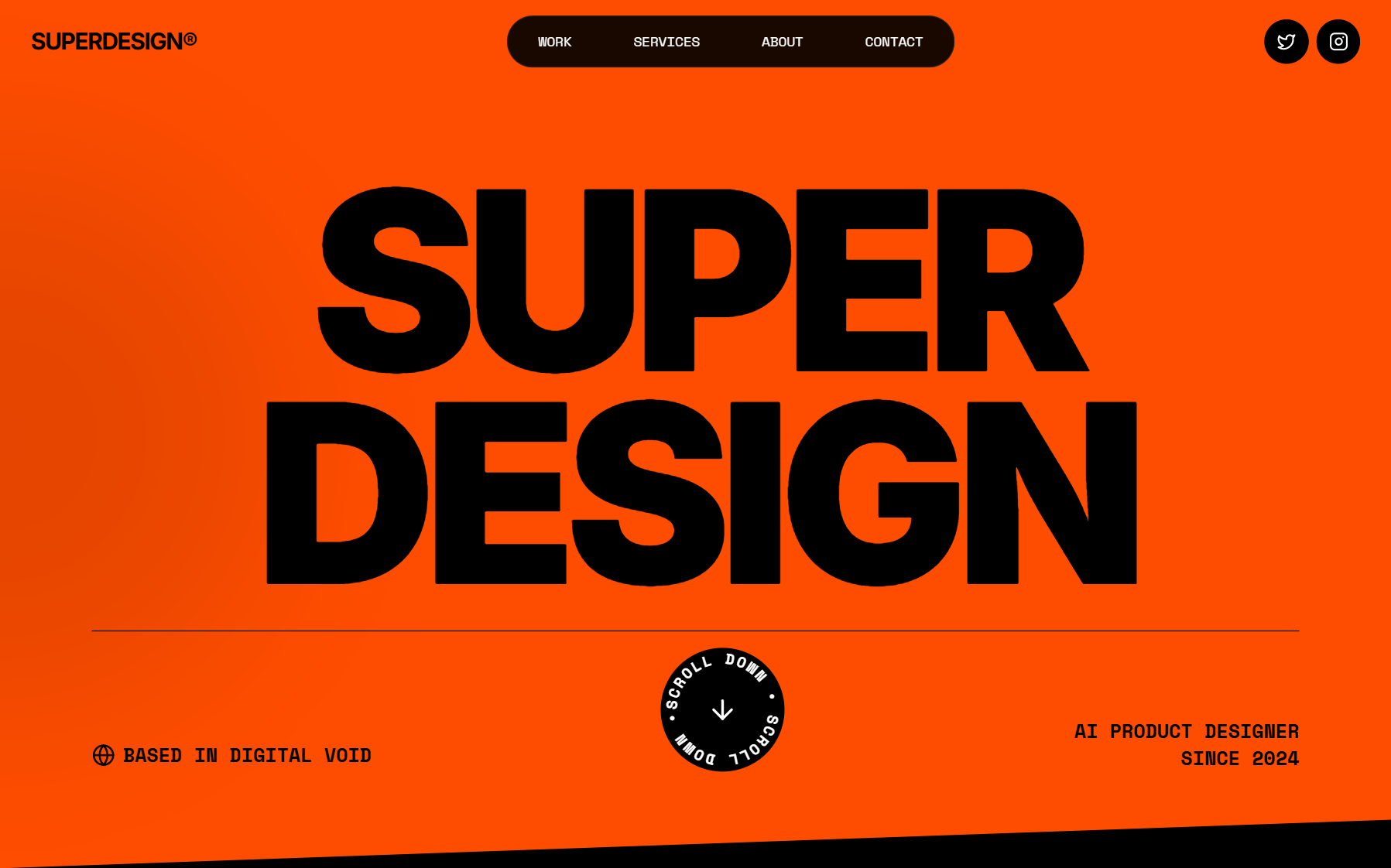
The fix is to separate the two jobs. Let Claude Code do the engineering. Give it a design agent to make the visual decisions, then hand real components back for it to wire up. That design agent is Superdesign: an AI product design agent on an infinite canvas that Claude Code drives through the Superdesign skill. You stay in your terminal. Claude Code calls the skill, the design agent generates and iterates actual UI on the canvas, and you get real HTML/components back, not a screenshot to copy by hand.
Key takeaway: stop asking your coding agent to also be a designer in a single prompt. Add a design layer it can call. Design first, then code.
This piece pulls together everything we have written on getting good UI out of Claude Code (design prompts, making the UI look good, the full design workflow) into one place, and shows where a dedicated design agent fits.
Why Claude Code UI looks generic (it is not your fault)
A coding agent is trained to produce the most likely correct code for a request. "Most likely" is exactly the problem for design. When you ask for "a pricing page," the statistically-average pricing page is the one you have seen a thousand times, so that is what you get. The model is doing its job. Its job just is not taste.
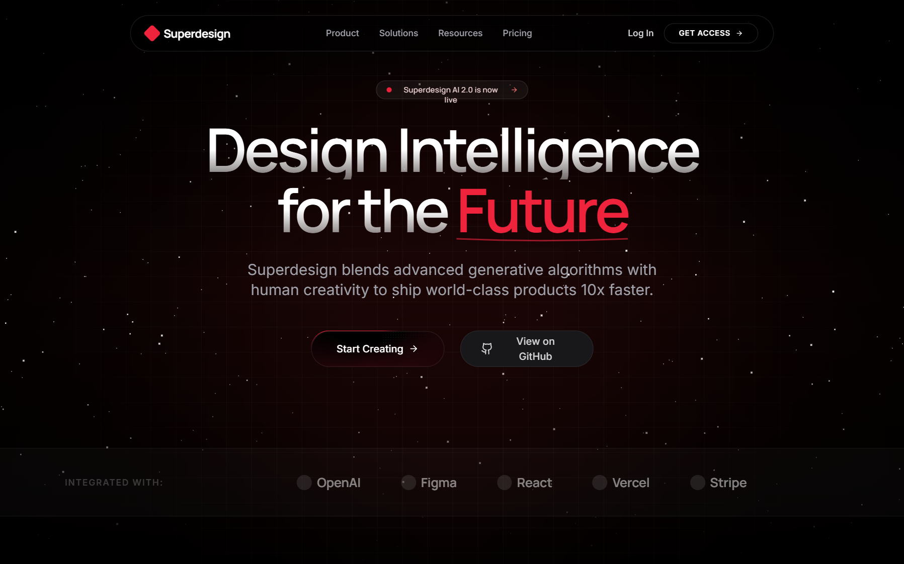
Here is the signature you learn to recognize once you have seen it (the "AI slop" look):
- Inter, Roboto, or a system font for everything, one weight, no contrast.
- A purple or indigo gradient on a white background, usually on the hero and the primary button.
- Three rounded cards in a row, identical padding, faint drop shadow.
- A blue primary button with a generic "Get Started" label.
- A hero headline in the "Built for the modern team" / "Ship faster than ever" family.
- Even, timid spacing with no rhythm, everything ~16px apart.
- No focal point so your eye has nowhere to land.
None of that is broken. It renders, it is responsive, it passes a smoke test. It just looks like every other AI-generated app, which for a real product is worse than broken, because it reads as "nobody designed this."
The reflex is to write a longer prompt. That helps a little and plateaus fast, because you are still asking one agent to hold engineering correctness and design intent in the same breath. The better move is structural.
Code generation and design taste are two different jobs
Think about how this works with humans. A strong engineer and a strong designer are rarely the same person, and when they collaborate the designer decides what it should look and feel like and the engineer decides how to build it correctly. The handoff is the point.
Coding agents collapse that handoff into one model, and design is the half that suffers. So the durable fix is to give the collapse its seam back:
- Claude Code = the engineer. Great at architecture, state, data flow, wiring, edge cases.
- A design agent = the designer. Makes the visual and interaction decisions, produces the actual UI, iterates on it.
You do not switch tools or leave your terminal to get this. Claude Code can call the design agent as a skill, the same way it calls any other capability.
What is a design agent? An AI agent whose whole job is UI/UX: it generates real mockups, components, and full screens from a natural-language prompt, and it iterates on them visually instead of guessing in text. Superdesign runs this on an infinite canvas, so variations live side by side and you compare instead of regenerate-and-lose.
How the Superdesign skill drives the canvas from Claude Code
Superdesign is an AI product design agent. One of the two ways to use it is a skill your coding agent invokes. (The other is prompting directly on the web app.) Installed as a skill, Claude Code (or Cursor) can call Superdesign in the middle of a build, hand it a design task, and get structured output back.
The loop looks like this:
- You describe the screen to Claude Code in plain language, the way you already do.
- Claude Code invokes the Superdesign skill instead of hand-rolling markup. It spins up a design project and passes your intent.
- The design agent generates UI on the canvas: real HTML/components, not a description. Because it is a canvas, it can lay down multiple directions at once.
- You iterate with constraints ("darker," "more editorial," "tighter spacing," "make it feel like Linear"), and each iteration becomes a new draft you can branch from without losing the previous one.
- Claude Code takes the chosen design back and wires it into your app: routing, data, state, the engineering half it is actually good at.
Concretely, the skill exposes commands your agent runs for you. A project gets created from a template:
superdesign create-project --title "Analytics dashboard" \
  --template .superdesign/replica_html_template/home.html --json
And you iterate a specific draft with stacked constraints, branching so nothing gets overwritten:
superdesign iterate-design-draft --draft-id <id> \
  -p "dark theme" -p "minimal" -p "bold" --mode branch --json
--mode branch is the part that matters for taste: it forks the design into a new variation instead of mutating it in place, so you can hold "dark + minimal" next to "dark + editorial" on the same canvas and pick with your eyes. That is the workflow a real designer uses, and it is the one a single text prompt cannot give you.
What the skill actually outputs
Not advice. Not a Figma link you have to rebuild. The design agent returns:
- Real, renderable UI: HTML/components for the screen, usable as the basis of the actual build.
- A
draftId+ preview URL for each variation, so Claude Code (and you) can reference, compare, and iterate a specific one. ThedraftIdis the handle everything else keys off: you branch from it, fetch its HTML, or extend it into more pages. - Branchable versions on the canvas, so an iteration adds a variant instead of destroying the last good one.
The draft comes back as renderable HTML you can pull with get-design; when you want reusable pieces, you extract them as named components explicitly, so nothing gets black-boxed. Because the output is real markup and not a picture, the handoff back to Claude Code is clean: it consumes the actual UI, not your manual re-typing of what a mockup looked like.
Three prompts to try (and the structure behind them)
The single most useful habit is the default → constraint prompt shape: name what to avoid (the AI-slop defaults) and what to aim for (a concrete reference or feeling), instead of just naming the screen. Vague in, generic out.
1. A dashboard that does not look like every SaaS dashboard
Design an analytics dashboard for a developer tool. Avoid the generic look: no Inter font, no purple gradient, no three-identical-cards row. Use one dominant color plus a single accent, a clear typographic hierarchy with real weight contrast, and a strong focal metric up top. Dense but calm, closer to Linear or Vercel than to a template.
2. A landing page with a point of view
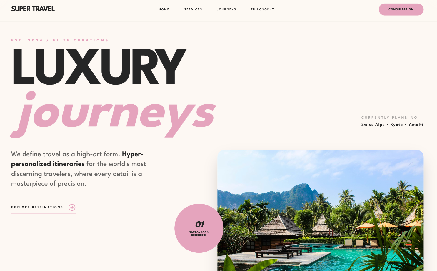
Design a landing page hero for [product]. Editorial, high-contrast typography, one big idea, generous negative space. No stock "Built for the modern team" headline, no blue "Get Started" button by default. Give me two directions: one confident and minimal, one bolder and more expressive.
3. Iterate an existing draft with stacked constraints
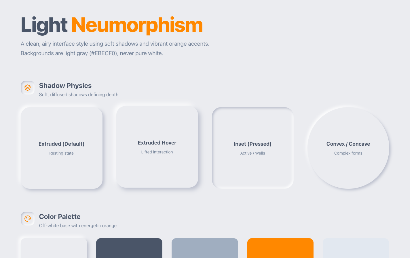
Take this draft and push it darker and more premium. Tighten the vertical rhythm to an 8px system, increase the type-scale contrast (think weight 300 vs 800), and add one deliberate accent moment. Keep the layout, change the feeling.
A few craft rules that consistently move output from "AI-ish" to "designed," and that you can bake straight into these prompts:
- Ban the default fonts. No Inter, Roboto, Open Sans, or system font. Reach for something with a voice: Space Grotesk, Bricolage Grotesque, a real serif for editorial, a mono for technical.
- One dominant color plus one accent, as tokens. Explicitly ban purple/indigo gradients on white unless that is genuinely the brand.
- Use weight extremes for hierarchy (200 vs 800) and real size jumps (roughly 3x between levels), not five shades of medium.
- Give it a rhythm, an 8px spacing system, so the layout has structure instead of everything floating 16px apart.
- Feed it a reference. "Make it feel like Linear / Stripe / this screenshot" gives the agent a target for what "good" means in your context. Visual references produce visual output.
We keep a categorized, copy-paste prompt library organized by use case (dashboards, landing pages, auth flows, and more) if you want a running head start instead of writing each of these from scratch. If you would rather see the prompts written out and picked apart first, our UI design prompts guide walks through the ones worth keeping and why each is shaped the way it is.
Before and after: the same screen, two levels of care
The functional content is identical in both. Same fields, same buttons, same data. The difference is entirely decisions. Four you can see at a glance:
- Color discipline. The plain version reaches for three unrelated stock colors: link blue, a brighter button blue, and alert red. The designed version commits to one restrained accent (a Linear-adjacent violet) used only for primary actions, so nothing competes for attention.
- Focal hierarchy. Plain renders every label at the same bold weight on white, so your eye has no path. The designed version sets bold white headings against muted helper text on a dark surface, so the section title leads and the hints recede.
- Spacing rhythm. Plain uses default browser margins and fixed 300px inputs floating in the page. The designed version runs a consistent spacing scale with full-width fields that align to a real grid.
- Considered details. The slug field's URL preview goes from a bare line of text to a bordered card with a link icon and an inline Copy action; the Danger zone goes from red text to a red-tinted card that reads as a genuine warning.
Those are design decisions, and they are exactly the ones a coding agent averages away and a design agent makes on purpose.
When you need this (and when you do not)
You do not need a design agent to throw up an internal admin tool nobody but you will see. Plain Claude Code is fine there.
You want one the moment the UI is seen by users you are trying to win: a landing page, a product surface, anything where "nobody designed this" costs you trust or conversions. That is the line. If the screen is part of the pitch, give the design its own agent.
If your input is already a visual (a screenshot, a Figma frame, a competitor's page you admire), you can also go straight from that image to code with image-to-code and skip the blank page entirely.
FAQ
How do I make Claude Code UI look good? Separate the two jobs. Let Claude Code handle engineering and give it a design agent to make the visual decisions. In-prompt, use the default → constraint structure: ban the AI-slop defaults (Inter font, purple gradient, three cards, blue "Get Started" button) and name a concrete reference or feeling instead. Verify visually with screenshots, and iterate on the design before you wire it up.
What is the best design agent for Claude Code? Superdesign is an AI product design agent built for exactly this: a skill your coding agent invokes to generate and iterate real UI on an infinite canvas, then hand components back to Claude Code to build. You stay in the terminal.
Is there a Claude Code design skill or design mode? Yes, effectively. Superdesign installs as a skill Claude Code invokes, which gives your coding agent a design mode without leaving the terminal: it hands the visual decisions to a design agent on an infinite canvas, generates and branches real variations, and returns components for Claude Code to wire up. So instead of a separate "design mode" toggle, you get a design agent your coding agent calls mid-build, then consumes the output from.
Why does AI-generated UI look generic? Because a coding agent is trained to produce the most likely correct output, and the statistically-average design is the one you have seen everywhere. That is fine for code correctness and bad for taste. A design agent exists to make deliberate, non-average design decisions.
Do I have to leave my editor to use it? No. Installed as a skill, Superdesign is driven by Claude Code or Cursor from inside your normal workflow. The canvas does the design work; your agent orchestrates it and consumes the output.
Is Superdesign free? There is a free tier, so you can start for free, plus a flat $20/month plan when you need more.
Can it output real code or just mockups? Real, renderable UI (HTML/components), not just a picture. That is the whole point of the handoff back to Claude Code.
JSON-LD
Superdesign is an AI product design agent. Describe the UI you want in natural language and it generates mockups, components, and full designs on an infinite canvas. Two ways in: prompt it directly on the web app, or drive it from your coding agent with the Superdesign skill for Cursor and Claude Code. It is free to start. (Note: the current product is not the old open-source IDE extension, which is unmaintained legacy.) Start at superdesign.dev.