If you code with Claude Code or Cursor, you have probably noticed the agent writes fine logic and ugly UI. "Design skills" are the fix people are reaching for: small packages that hand your agent a point of view about design so its output stops looking like a bootstrap demo from 2013. This review is part of our wider best Claude Code skills roundup, zoomed in on the design ones.
So I cloned and read seven of the most popular ones, from the two big collections (awesome-design-skills, ui-skills) to the heavyweight singles (UI/UX Pro Max, Taste) to the vertical specialists (huashu-design, SwiftUI Pro, Nothing), and ran the collections through two rendered tests. Here is what each is genuinely good at, where each stops, and how to pick. I will be upfront: I work on Superdesign, which plays in the same space from a different angle, so I have kept the comparison concrete and told you exactly where each tool wins.
First, what a design skill actually is
A skill is a Markdown file (a SKILL.md) that your coding agent reads before it writes UI. In most cases it is not an app and it does not render anything. It is a briefing: fonts, spacing, color tokens, do-and-do-not rules. The agent absorbs it and, ideally, produces better-looking code. That shared shape matters, because it is also the shared ceiling, which we will get to.
Reading seven of them back to back, three distinct architectures emerged, and they explain almost everything about what each skill can and cannot do:
- Prompt rulebooks: pure prose the model is asked to obey (most of the field).
- Data-lookup engines: the skill ships a knowledge base the agent queries before designing (UI/UX Pro Max).
- Production pipelines: the skill ships scripts that render and export real artifacts (huashu-design).
Keep that lens in mind as we go.
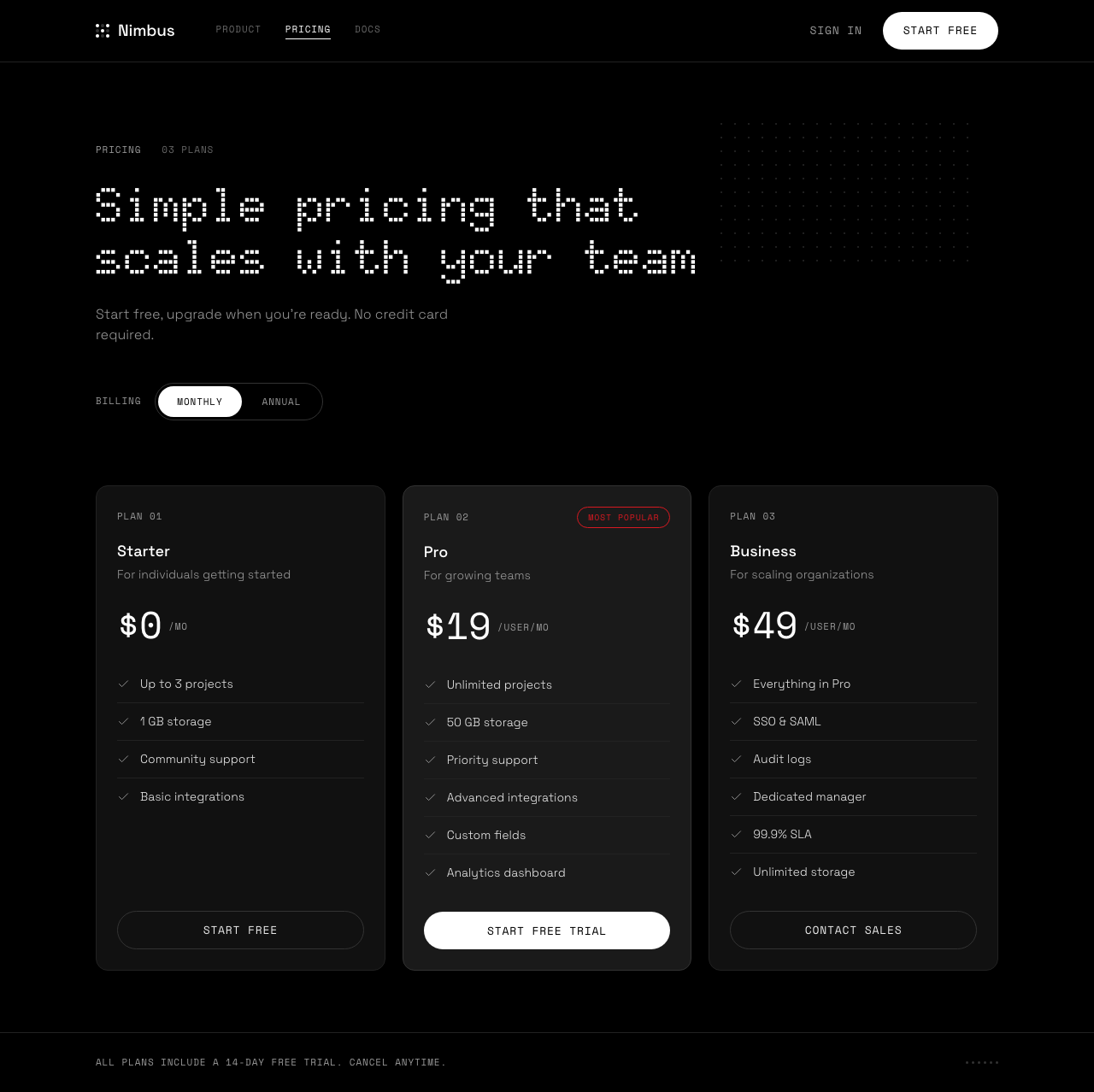
Test 1: a pricing page (the case that proves nothing)
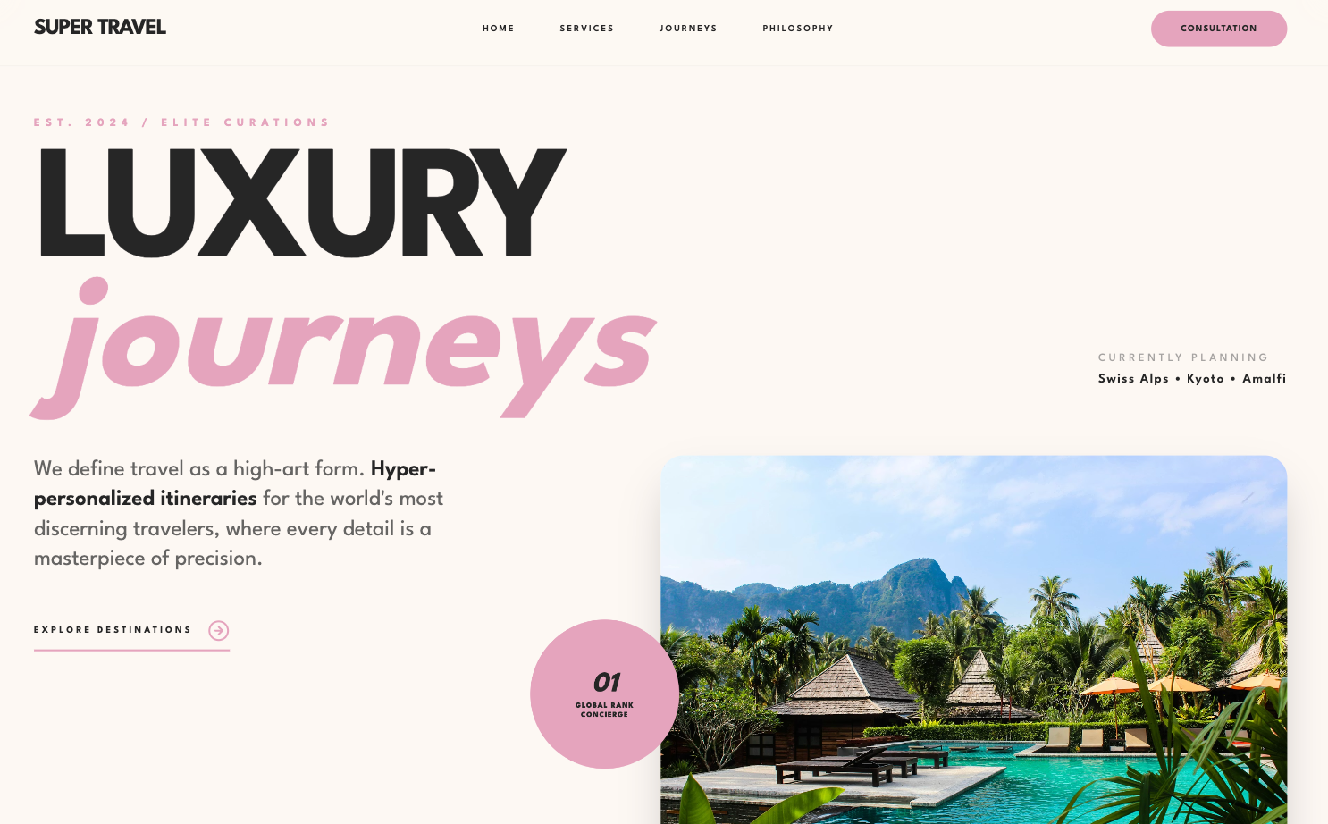
The obvious test first. I gave the same pricing page brief (a made-up SaaS called Nimbus, identical copy everywhere) to four of these skills and to the Superdesign agent, and screenshotted each.
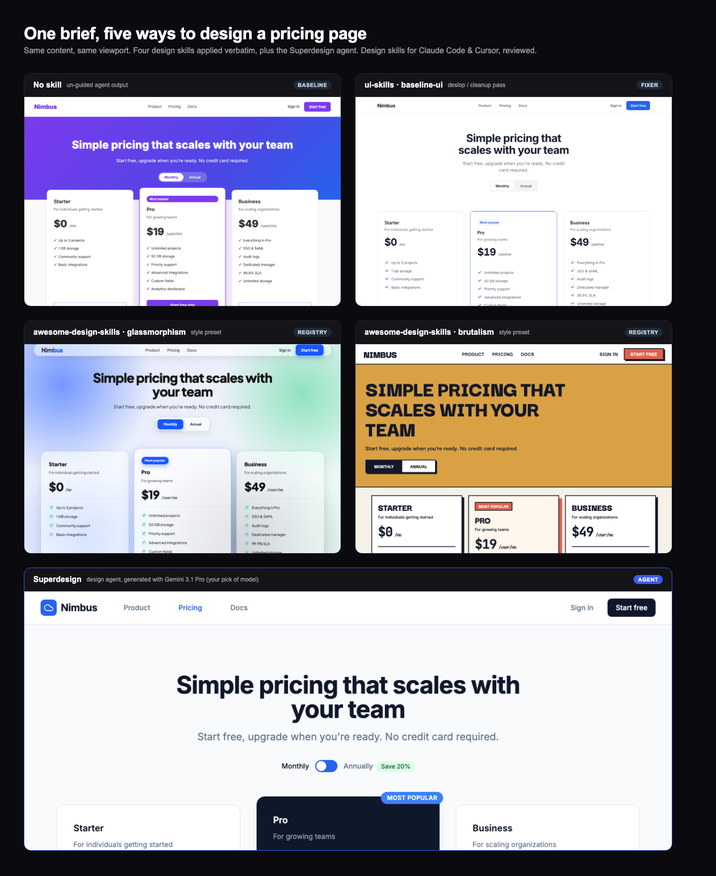
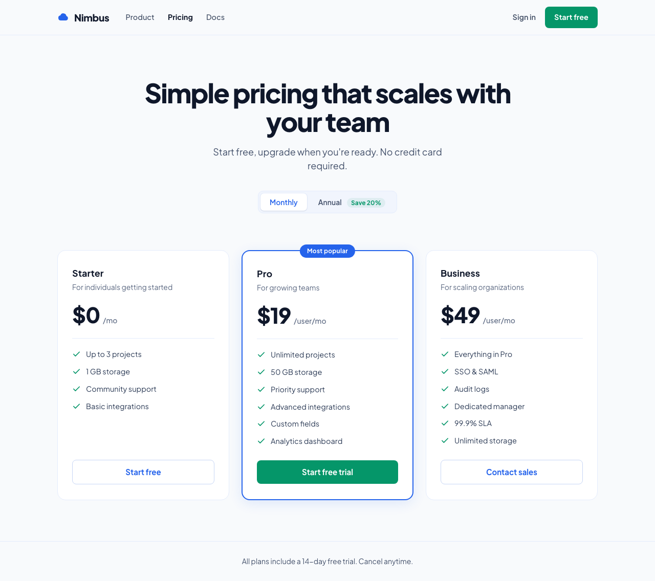
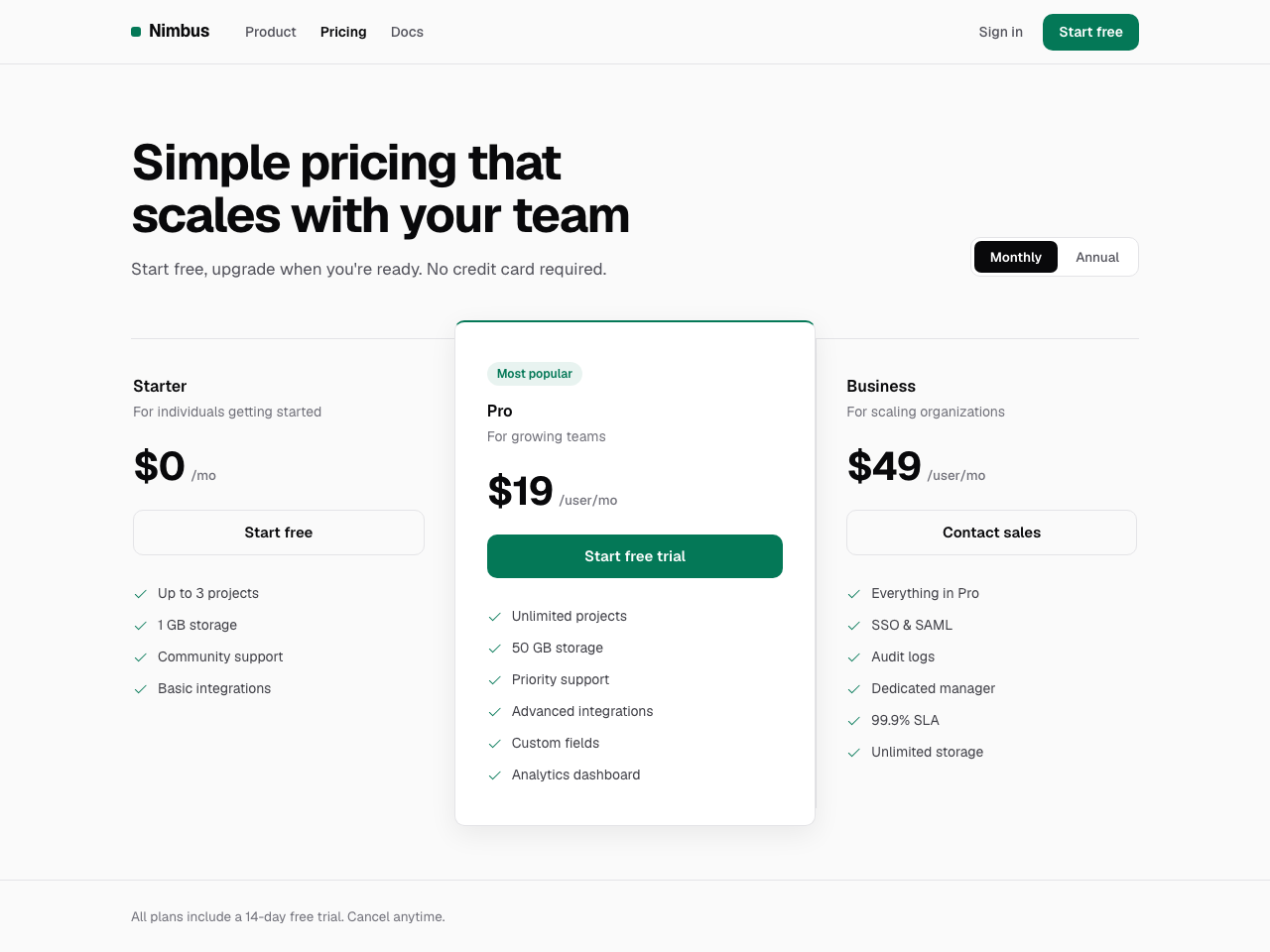
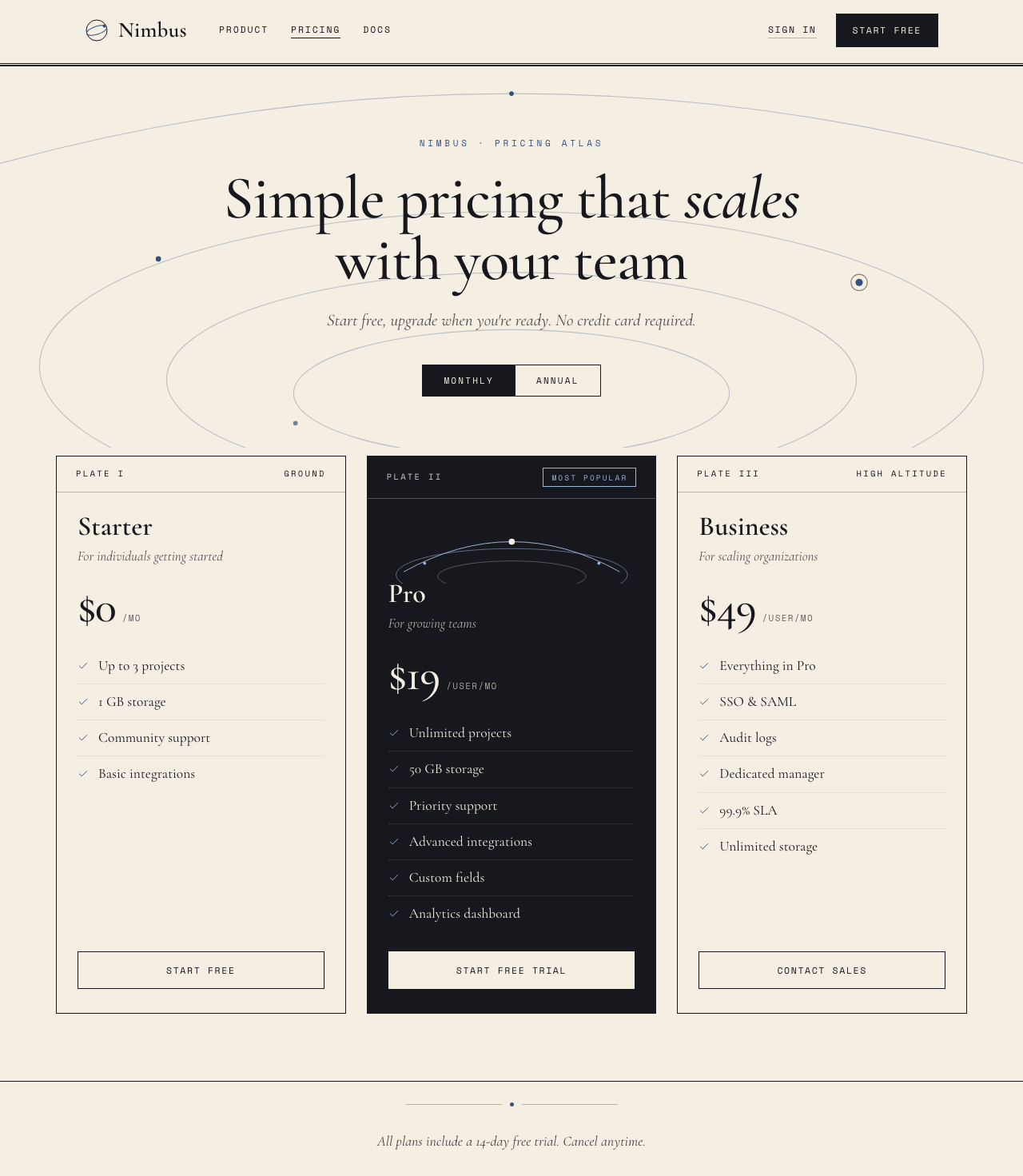
The honest result: they all do fine. Glassmorphism produced a legitimately nice frosted-glass page, ui-skills' baseline-ui turned a generic baseline into a clean, restrained one, and even the no-skill baseline is passable.
That is exactly why a pricing page proves nothing. It is a solved, single-screen pattern with millions of examples in the training data, so everything converges on "fine" and the only differences are cosmetic. A pricing page rewards the one thing a style skill is already good at, applying a look, and it hides everything that actually separates these tools. To see a real difference you need a task that is neither solved nor generic. So I ran a second test.
Test 2: add a page to an existing app (the case that matters)
Real design work is rarely greenfield. You already have an app, and you need a new page that looks like it belongs. So the harder test: an existing product, Ledgerline, a dark, sharp, lime-accented trading app with its own tokens and a monospaced-numbers house style. The brief: "add a Billing and Plan page." Same three approaches.
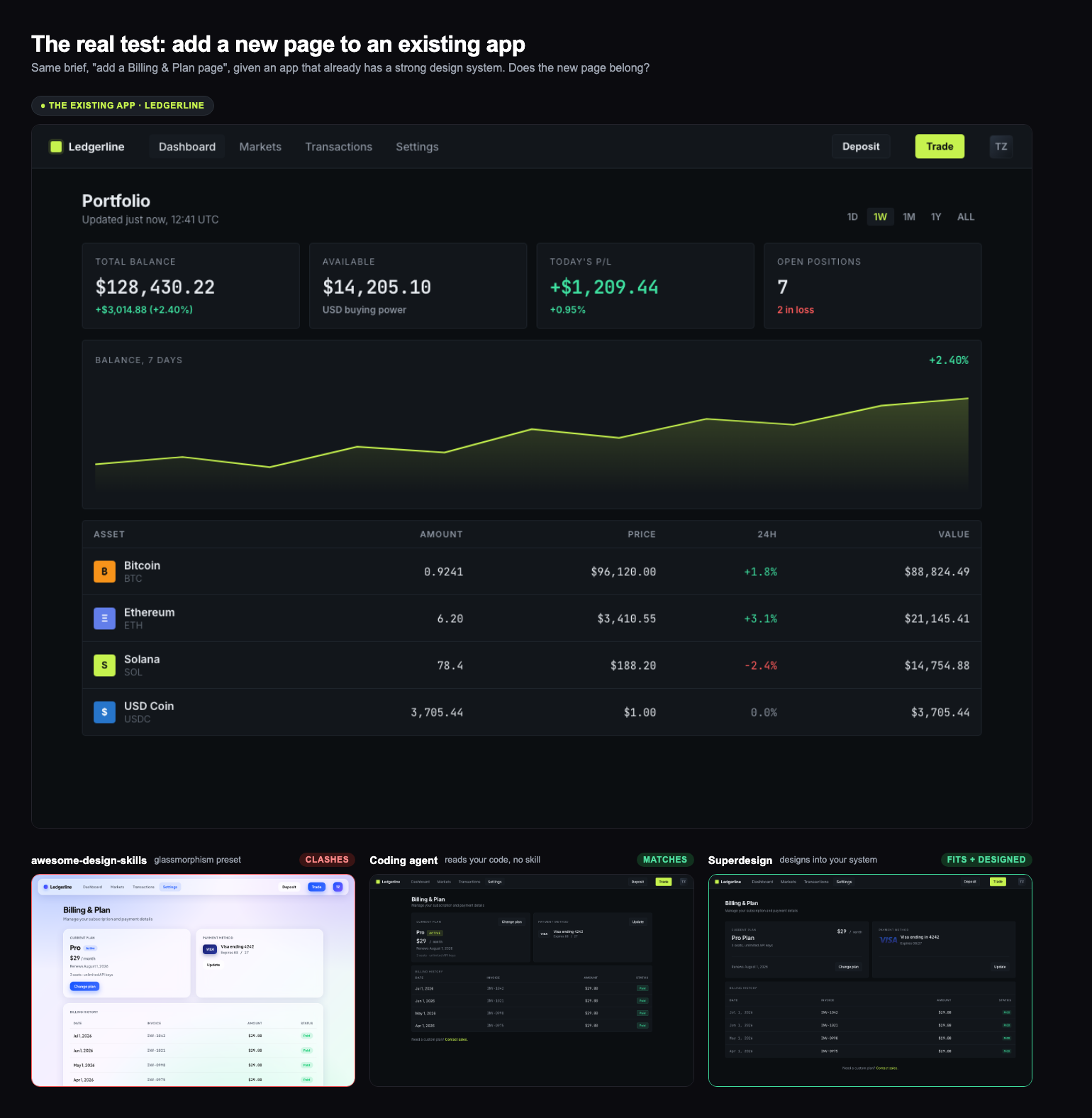
Now the tools separate:
- A style-preset skill fights your app. Pull glassmorphism and you get glassmorphism: a light, frosted, blue page bolted onto a dark trading app. Well made, and completely wrong here. A style skill hands you a look; it has no idea what your look is, because a
SKILL.mdcannot see your codebase. - A coding agent that reads your code can match it. With no skill at all, just the existing files in context, the agent reused Ledgerline's dark palette, lime accent, mono numbers and sharp cards. It belongs. This is the honest baseline, and it is the real reason a style-preset skill is often the wrong tool: your agent already has your code, it does not need someone else's aesthetic on top.
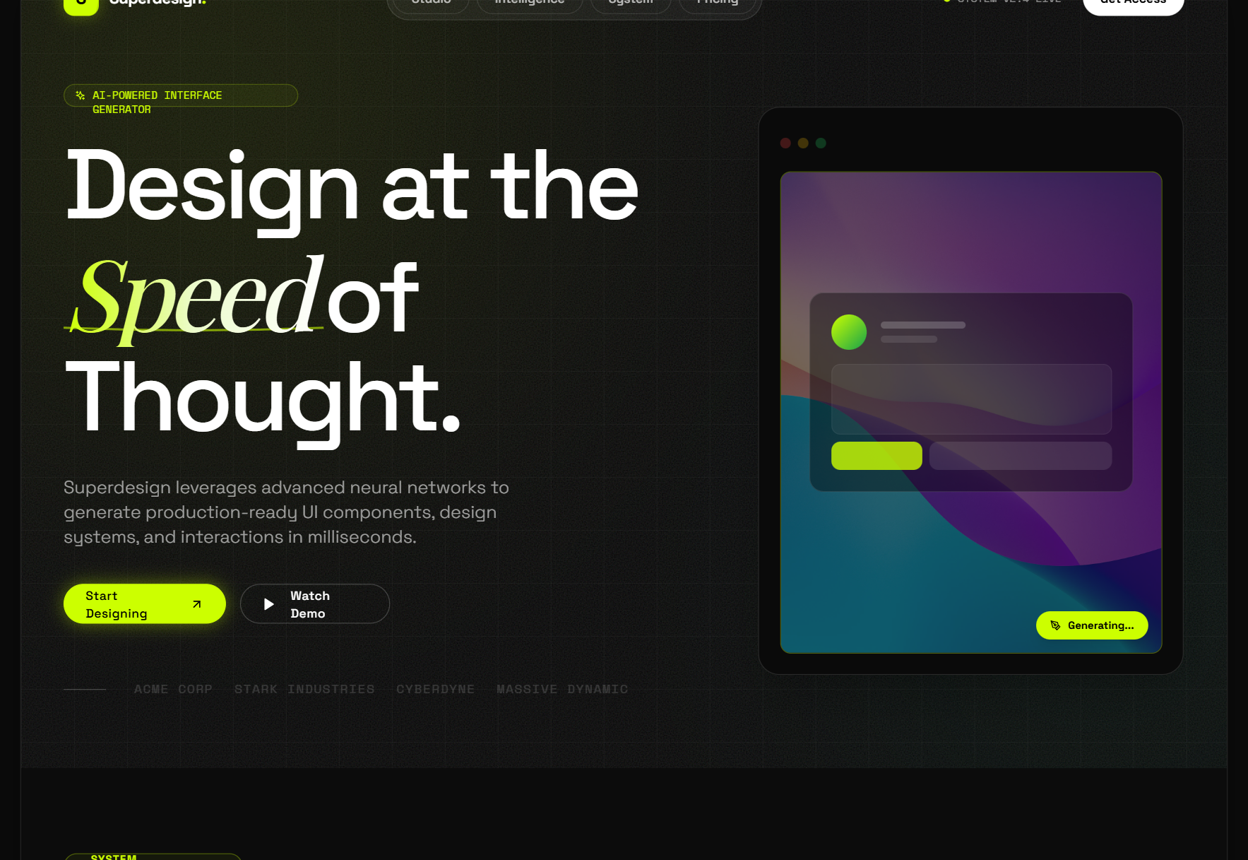
- Superdesign designs into your system. Given the existing app as context, it matched the design language and produced the most considered page of the three, down to the invoice table styled like the app's holdings table and the status pills in the house lime. It is not echoing CSS, it is designing a new page in your system, and it shows you the rendered result so you know it fits before you build it.
The takeaway is not "Superdesign wins the pricing page." It is that the popular style-preset skills, the bulk of what gets marketed as "design skills," are built for choosing a look, and they work against you the moment you have an app to match.
awesome-design-skills (typeui.sh)
What it is: a registry of 67 skills, each one a named aesthetic. Glassmorphism, brutalism, neobrutalism, claymorphism, editorial, bento, vibrant, shadcn, even Sega and Tetris. You install one with a single command:
npx typeui.sh pull glassmorphism
What is inside: I read the source, and each skill is a tidy design-system spec. The glassmorphism one, for example, sets a Plus Jakarta Sans / JetBrains Mono type pairing, a token palette, WCAG 2.2 AA accessibility rules, a writing tone, and explicit do/do-not lists. It is genuinely well-structured, and there is a live preview of every style so you can see the intended look before you pull it.
Best for: you know the aesthetic you want and you want your agent to commit to it consistently. Pulling brutalism or editorial gives the agent a real, coherent set of constraints instead of a vague "make it look modern" that it will interpret differently every prompt.
Where it stops: it is one aesthetic per file, frozen at pull time. It biases the agent's taste, but the agent still writes the screen blind and you still open the browser to find out what you got. There is no rendering, no side-by-side variants, no "try three directions and keep one."
ui-skills (ibelick)
What it is: a smaller, sharper collection with a different philosophy. Five skills, and most of them are fixers rather than styles: baseline-ui (deslop spacing and hierarchy), fixing-accessibility, fixing-motion-performance, fixing-metadata, plus a ui-skills-root router that picks the smallest useful skill for the job. It runs through a clean CLI:
npx ui-skills start
npx ui-skills get baseline-ui
What is inside: these are quality gates, not looks. fixing-motion-performance will take a file, audit it against real rules (layout thrashing, compositor properties, scroll-linked motion), and report each violation with a one-line reason and a concrete fix. The router is a nice touch: instead of dumping every rule into context, it asks one question if the goal is unclear, then loads only the skill you need. Works across Codex, Cursor and Claude Code.
Best for: polishing and QA on UI that already exists. When something ships janky animation or fails a contrast check, ui-skills is a fast, honest cleanup pass.
Where it stops: by design, it does not generate. It fixes what is there. It is the code reviewer, not the designer.
UI/UX Pro Max (nextlevelbuilder)
What it is: the most-starred design skill on GitHub (about 99k stars at the time of writing), and architecturally the most interesting: not a rulebook but a searchable design knowledge base. Under the hood it is roughly 36 CSV files (a 1,775-line design database, 1,924 Google Font pairings, palettes, per-product-type reasoning rules, anti-patterns) plus a small Python BM25 search engine the agent shells out to before writing UI. Install via the Claude Code plugin marketplace or its CLI:
npm install -g ui-ux-pro-max-cli
uipro init --ai claude
The CLI targets 18+ agents (--ai cursor, windsurf, copilot, codex, and more), and Python 3 is required for the search script.
What is inside: the agent runs a search like python3 scripts/search.py "fintech dashboard" --design-system, and gets back a composed recommendation: a style, a hex palette, a font pairing, anti-patterns to avoid, and a checklist, which it can persist as a MASTER.md design system in your project. The reasoning rules have real personality, down to conditionals like "if data heavy, add glassmorphism" with severity ratings.
We ran its actual engine on the Nimbus brief. Fun honest detail: the first query ("SaaS pricing page for project management tool") returned a "book brown + page amber" palette, a keyword mismatch. A reworded query returned a well-matched system: Minimalism and Swiss Style, professional blue with a green CTA accent, Plus Jakarta Sans, plus its pricing-page pattern rules. Here is that recommendation applied:
Best for: breadth. It covers landing pages, dashboards, e-commerce, mobile, charts, banners and slides across 10+ stacks including SwiftUI, Flutter and Jetpack Compose. If you want a defensible starting point ("use this palette, this font pairing, avoid these cliches") for almost any product type, this is the biggest brain available.
Where it stops: the output is a text recommendation, not a design. "Soft Pink #E8B4B8, Cormorant Garamond" still has to be executed by the same blind model, with no rendering and no verification step. And because retrieval is keyword matching, an off-vocabulary brief can pull an irrelevant row. It is a library, not a librarian.
Taste (Leonxlnx)
What it is: the anti-slop movement's flagship (about 54k stars), sponsored by Emil Kowalski and part of the Vercel OSS program. Thirteen pure-prompt skills, no code, no data, whose 1,200-line centerpiece is a behavioral program: the agent must declare a one-line "Design Read" before writing anything, set three numeric dials (variance, motion, density), map the brief to a real design system, and pass a pre-flight checklist before shipping.
npx skills add https://github.com/Leonxlnx/taste-skill --skill "design-taste-frontend"
What is inside: the most empirically grounded rules in the field, clearly written by someone who stared at a lot of AI output. It outright bans the three-identical-feature-cards row, fake-precision stats like 99.99%, version-label heroes like "V0.6 / INVITE-ONLY PREVIEW", and, yes, the em-dash, which it calls the LLM's number one visual tell. There is even a research folder documenting why models ship placeholder code.
Best for: landing pages, portfolios and redesigns where the enemy is genericness. Its own header scopes it honestly: not dashboards, not data tables, not multi-step product UI.
Where it stops: everything rides on the model obeying prose. There is no enforcement layer, no rendering, no screenshot check, and v2 labels itself experimental. It makes the agent's taste better; it cannot check whether the result actually has it.
huashu-design (alchaincyf)
What it is: the outlier of the whole field (about 20k stars), by the Chinese creator 花叔. Its premise: "you are a designer who works in HTML, not a programmer." It produces clickable HTML prototypes in device frames, HTML slide decks, and launch-film style animations, then runs a bundled Playwright + ffmpeg pipeline to export real MP4s (with music and voiceover), PDFs and PPTX files. It is the only skill here that renders and verifies its own output.
npx skills add alchaincyf/huashu-design
What is inside: a 647-line playbook plus 33 reference docs and 19 scripts. The craft depth is remarkable: a 40-style library, an asset protocol that downloads real brand logos before designing, a rule that any factual claim must be web-searched first, and an animation-pitfalls doc whose 14 rules "each come from a real mistake." Two things English-speaking users should know: the skill's instruction set is written in Chinese (agents handle it fine, but you cannot easily audit what you cannot read), and exported videos carry a "Created by Huashu-Design" watermark by default, removable on request.
Best for: design artifacts: pitch decks, product mockups to show a client, launch videos, infographics. As a "landing page skill" in the show-me-something-tomorrow sense, this is the strongest thing in the field.
Where it stops: by its own admission it is not for production apps. Deliverables are HTML artifacts and videos, not code in your codebase, and the full export pipeline assumes Node, Playwright and ffmpeg locally (the voiceover path wants a ByteDance TTS key).
SwiftUI Pro (Paul Hudson)
What it is: proof the category is going vertical (about 4.2k stars). Written by Paul Hudson of Hacking with Swift, it is not an aesthetics skill at all: it is a nine-step code review that catches the SwiftUI mistakes LLMs actually make, deprecated APIs, VoiceOver-invisible buttons, performance traps. The entire knowledge payload is under 400 lines, a bet that curated density beats volume.
npx skills add https://github.com/twostraws/swiftui-agent-skill --skill swiftui-pro
What is inside: dense, opinionated, current. The first core instruction is literally "iOS 26 exists", a blunt correction for models that insist the OS version is fictional. Then rule after rule of the form "always foregroundStyle(), never foregroundColor()", with a mandated output format of file, line, named rule and a before/after diff.
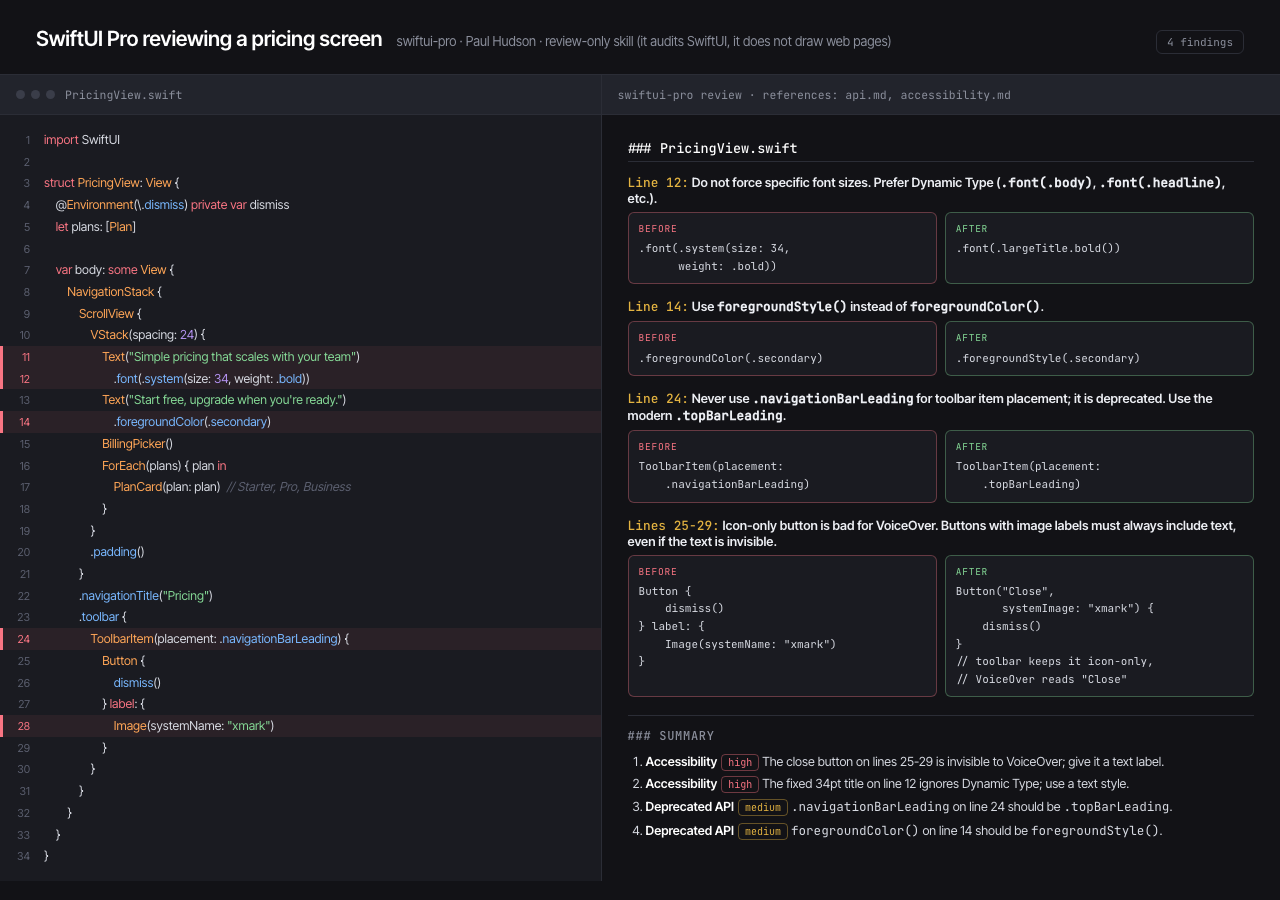
Best for: anyone shipping native Apple apps with an agent. On iOS the design system is Apple's and already decided; what you need is conformance to the Human Interface Guidelines, Dynamic Type, and 44pt tap targets, and that is exactly what this polices.
Where it stops: it reviews, it does not design. Nothing about visual style, color or branding, and it does not build or run your app to verify. Its iOS 26 / Swift 6.2 snapshot will also age.
Nothing design skill (Dominik Martin)
What it is: the purest example of a single-aesthetic skill (about 2.5k stars): the Nothing phone brand's visual language, monochrome, dot-matrix type, instrument-panel labels, codified into tokens, component recipes and craft rules for HTML, SwiftUI and React/Tailwind. Install is a manual copy into ~/.claude/skills/ (Claude Code only).
What is inside: rules that read like a working designer's heuristics rather than a token dump: "Monochrome is the canvas. Color is an event, not a default." "Every screen has exactly three layers of importance. Not two, not five. Three." It even solves the trademark-font problem elegantly, substituting Google fonts from the same foundry as Nothing's real typefaces. Unusually disciplined, it refuses to trigger on generic UI tasks; you must ask for it.
Best for: instrument-style widgets, dashboards, timers and settings screens where you want that exact look, executed consistently.
Where it stops: it is structurally single-note. Everything comes out monochrome Space Grotesk and Doto, and adapting to your existing brand is the opposite of its job.
Also worth a look
- hallmark (Together AI, ~3.5k stars): an anti-slop design skill with a clever
hallmark study <URL>verb that extracts a site's design DNA into a portabledesign.mdwhile refusing pixel-clones. - refactoring-ui-plugin (~180 stars): the principles of the Refactoring UI book as ten applied skills. Genuinely useful material, but note the license is "all rights reserved", not open source, and it is unaffiliated with the book's authors.
- mobile-app-ui-design (~120 stars): a mobile-specific process skill (60/30/10 color rule, 8-point grid, thumb zones) with per-industry conventions.
The ceiling almost all of them share
Across seven skills and three architectures, one pattern holds. Whether the knowledge arrives as prose rules (Taste, Nothing, SwiftUI Pro, the collections) or as a searchable CSV database (UI/UX Pro Max), it ends the same way: a text instruction handed to a model that then designs blind. That is what Test 2 exposed. The skill cannot see your codebase and cannot see its own output, so it cannot match your existing app, compare two options, or iterate toward the one that looks right. You render, you judge, you prompt again.
The exception proves the rule: huashu-design bothered to build a whole Playwright pipeline precisely because seeing the output matters, and it is easily the most artifact-capable skill here as a result. But its loop ends at standalone HTML artifacts and videos; it is not designing inside your product's codebase.
One more thing that jumped out from reading all seven: the anti-slop convergence. Independent authors who have never met all ban the same tells: purple gradients, Inter-by-default, three identical feature cards, fake-precision stats, even the em-dash. The field has collectively diagnosed the disease. The disagreement is only about the cure.
Where a design agent is different
This is the honest line between the rulebooks and what we build. The Superdesign skill is not a SKILL.md that biases the agent; it is a design agent that renders real UI on a canvas, shows you several directions at once, reads your existing codebase for context, then hands a design prompt back to Claude Code or Cursor to ship the code. You are looking at screens and picking, not reading tokens and hoping.
Because it renders and remembers, it can do a pile of things a static file cannot:
- Design from your existing system. Point it at your app and it writes a design-system file plus replica pages of your product, so new screens extend what you have (that is Test 2). You can also pull a brand guide straight from a live URL, or pin brand assets, logos, fonts and colors, so every generation stays on-brand.
- Explore in parallel. Branch a design into several directions at once and keep the one that works, instead of re-prompting a blind model and re-rendering by hand.
- Design whole flows, not one screen. Once a style is locked, it lays out the remaining pages in it and links them into a clickable prototype.
- Edit what you see. Drag, resize and restyle elements directly on the canvas, with version history to roll back any frame.
- Import the real world. A Chrome extension clones any live page or component onto the canvas as a starting point.
- Pick your model. Run a generation on Claude, Gemini 3.1 Pro or others (the Superdesign page in Test 1 above was generated with Gemini 3.1 Pro), so you are not locked to whatever a Markdown file assumes.
And here is what that loop actually buys you on the same Nimbus brief every skill above got. Superdesign's first pass (the Gemini render in Test 1) was already solid. Then we did what you cannot do with a rulebook: branched it into two directions on the canvas ("premium enterprise polish" and "bold high-contrast"), looked at both, and picked. One iteration later:
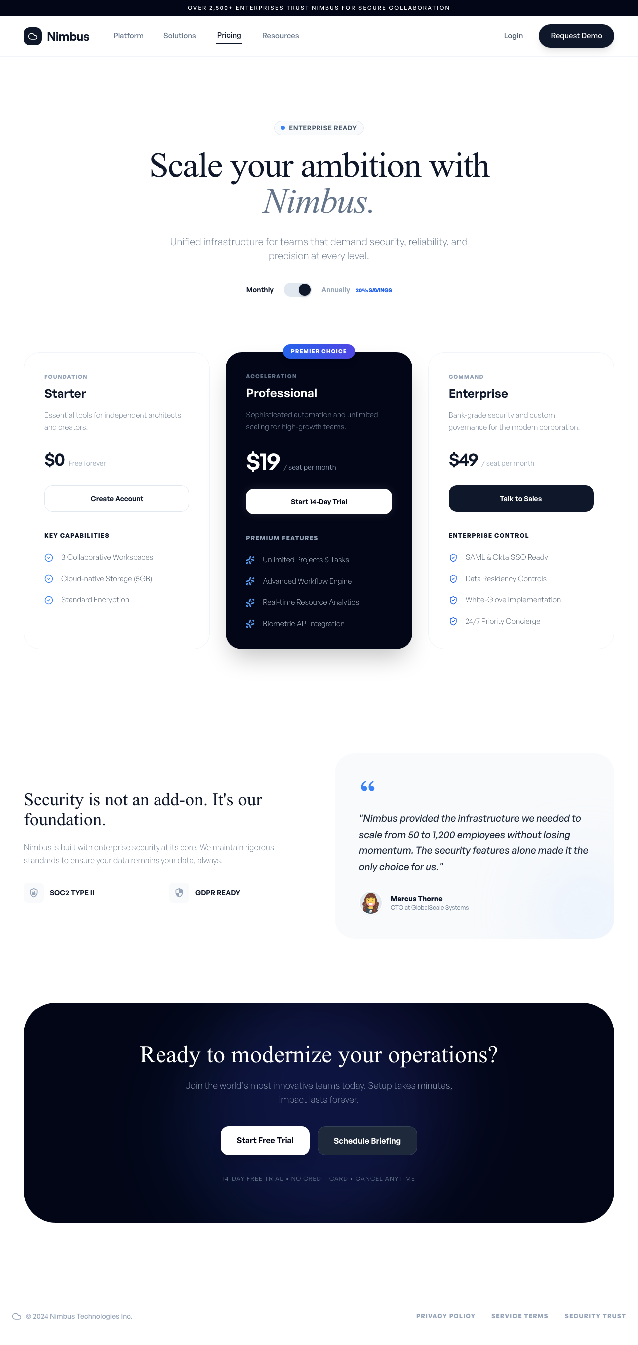
No skill in this review can produce that second step, because no skill can see its own first step. The rulebooks got one competent take each; the agent got a draft, a comparison, and a decision.
That is a real difference, and it is also a real trade-off: the rulebooks are free and instant with nothing to sign into, while a design agent is a heavier tool for when you actually need to see and iterate. Use them together, it is not either/or. Pull a typeui.sh style for a consistent aesthetic, run ui-skills as your QA pass, and reach for the Superdesign skill when you need to design something new, or something that has to fit an app you already have.
How to choose
- You want one specific aesthetic, fast and free:
awesome-design-skills(67 named looks) or the Nothing skill if that exact language is the look. Browse the looks in our design styles encyclopedia first so you know what you are pulling. - You want to fix a11y, motion, or sloppy spacing on existing UI:
ui-skills. - You want a defensible palette, font pairing and style direction for any product type: UI/UX Pro Max.
- You want your landing page to stop looking AI-generated: Taste (or hallmark).
- You want client-ready artifacts, decks, mockups or launch videos: huashu-design.
- You ship native Apple apps: SwiftUI Pro.
- You want to design something new, match your existing app, and see it before you build it: a design agent like the Superdesign skill.
Most of these can live in the same workflow. The rulebooks make your agent tasteful; the agent makes it visual.
How I tested this: I cloned all seven repositories and read the SKILL.md and reference files of each first-hand (for ui-skills I also ran its CLI, and for UI/UX Pro Max I ran its actual Python search engine and kept both raw outputs). Star counts were fetched live from the GitHub API at the time of writing. Every per-skill image above is the same Nimbus brief rendered by applying that skill's own instructions faithfully (SwiftUI Pro's shows its review output instead, since it does not generate web UI); the Superdesign image is its Test 1 draft after one branch-and-pick iteration on the canvas. Test 1 ran the same Nimbus pricing brief through glassmorphism, brutalism, baseline-ui, a no-skill baseline, and the Superdesign CLI. Test 2 built the Ledgerline dashboard as the anchor, then had three approaches add a Billing page: the glassmorphism skill applied verbatim, a coding agent given the app's code with no skill, and the Superdesign CLI given the app as context. Everything screenshotted at the same viewport.